将默认设计主题更改为自定义颜色

3

我对Android Studio非常陌生。作为初学者,我创建了一个简单的应用程序,仅用于测试目的和查看Android Studio材料主题的外观。我目前正在使用最新版本即L预览 - Studio 0.8.2版。

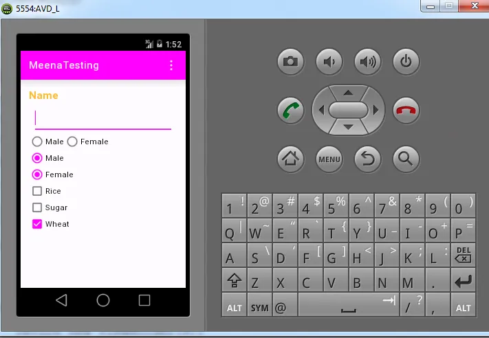
在这里,我只创建了textview,edittext,radio buttons和复选框。当我选择男性或女性时,它显示为天蓝色。我能否将天蓝色更改为绿色或黄色?

我不知道那个颜色的名称。从图片中可以看到,edittext,radio buttons和复选框的选定状态为天蓝色。当我尝试单击或选择任何内容时,那些复选框或单选按钮需要从默认颜色更改为其他颜色,如绿色或黄色!

代码

在res/values/styles.xml中,

<resources>
<!-- Base application theme. -->
<color name="custom_theme_color">#b0b0ff</color>
<style name="CustomTheme" parent="android:Theme.Material">
<item name="android:colorBackground">@color/custom_theme_color</item>
</style>
</resources>

在Android Studio中的Manifest.xml文件中,
android:theme="@style/CustomTheme" >

有没有其他的办法可以将默认的天蓝色改为绿色、黄色或紫色?

Android Studio default color

有没有其他的方法可以将默认的天蓝色主题更改为其他颜色,比如粉色或绿色?

我该怎么做?

2个回答

12

第一种方法:

在 res/values-v21/styles.xml 文件中,

<style name="AppTheme" parent="android:Theme.Material.Light.DarkActionBar">
    <item name="android:colorAccent">@color/custom_theme_color</item>
    <item name="android:colorPrimaryDark">@color/custom_theme_color</item>
    <item name="android:colorPrimary">@color/custom_theme_color</item>
</style>

第一种方法:粉色

第一种方法:绿色

以上代码简单易用,在Android Studio中,可以从默认的天蓝色更改为其他任何颜色,如粉色或绿色!

第二种方法:

在xml下创建3个文件,即res/xml,如checked.xml、unchecked.xml和custom_checkbox.xml。

checked.xml

<shape xmlns:android="http://schemas.android.com/apk/res/android">
<stroke android:width="2px" android:color="#FF00FF" />
<size android:height="20dp" android:width="20dp"/>
</shape>

unchecked.xml

<shape xmlns:android="http://schemas.android.com/apk/res/android">
<stroke android:width="2px" android:color="#ffc0c0c0" />
<size android:height="20dp" android:width="20dp"/>
</shape>

自定义复选框.xml

<?xml version="1.0" encoding="utf-8"?>
<selector xmlns:android="http://schemas.android.com/apk/res/android">
<item android:state_checked="true" 
      android:drawable="@xml/checked" /> 
<item android:state_pressed="true"
      android:drawable="@xml/checked" /> 
<item android:drawable="@xml/unchecked" /> 
</selector>

从上述第二种方法中,(自定义文件)也可以根据我们的要求创建任何形状和颜色。甚至我们可以通过使用第二种方法来自定义小部件的风格、形状和主题。

以上两种方法对我有效!


7

从v23开始,你可以使用android.support.v7.widget.AppCompatCheckBox来改变CheckBox的样式,如下所示:

<android.support.v7.widget.AppCompatCheckBox
    android:layout_width="wrap_content"
    android:layout_height="wrap_content"
    app:theme="@style/CheckBox"
    />

在style.xml中:

<style name="CheckBox" parent="Widget.AppCompat.CompoundButton.CheckBox">
    <item name="colorControlNormal">@color/checkbox_normal</item> <!-- border color -->
    <item name="colorControlActivated">@color/checkbox_activated</item> <!-- fill color -->
    <item name="colorControlHighlight">@color/checkbox_highlight</item> <!-- animation color -->
</style>

网页内容由stack overflow 提供, 点击上面的
可以查看英文原文,
原文链接