我正在使用Google Charts API绘制多部分流程的时间线。目前它是自动调整的;对于下面显示的图表,网格线之间的窗口为两天,如果我放置更多事件,则可能需要一周左右才能使图表无法读取。
如何设置图表每天绘制网格线而不是自动调整?或者是否有替代API可用其源代码进行定制?
请参考以下内容: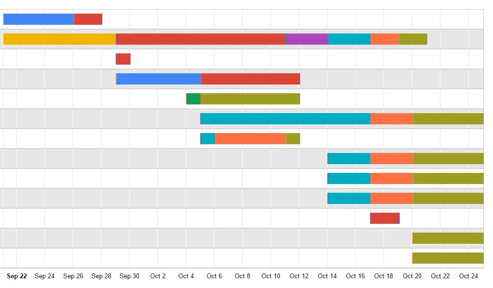
如何设置图表每天绘制网格线而不是自动调整?或者是否有替代API可用其源代码进行定制?
请参考以下内容:
请将它变为响应式,这个链接是一个例子,请查看。
https://codepen.io/flopreynat/pen/BfLkA
HTML:
<div class="row">
  <div class="col-md-12 text-center">
    <h1>Make Google charts responsive</h1>
    <p>Full blog post details <a href="http://flopreynat.com/blog/make-google-charts-responsive.html">on my blog</a></p>
  </div>
  <div class="col-md-4 col-md-offset-4">
    <hr />
  </div>
  <div class="clearfix"></div>
  <div class="col-md-6">
    <div id="chart_div1" class="chart"></div>
  </div>
  <div class="col-md-6">
    <div id="chart_div2" class="chart"></div>
  </div>
</div>
CSS:
.chart {
  width: 100%;
  min-height: 450px;
}
JS:
google.load("visualization", "1", {packages:["corechart"]});
google.setOnLoadCallback(drawChart1);
function drawChart1() {
  var data = google.visualization.arrayToDataTable([
    ['Year', 'Sales', 'Expenses'],
    ['2004',  1000,      400],
    ['2005',  1170,      460],
    ['2006',  660,       1120],
    ['2007',  1030,      540]
  ]);

  var options = {
    title: 'Company Performance',
    hAxis: {title: 'Year', titleTextStyle: {color: 'red'}}
 };

var chart = new google.visualization.ColumnChart(document.getElementById('chart_div1'));
  chart.draw(data, options);
}

google.load("visualization", "1", {packages:["corechart"]});
google.setOnLoadCallback(drawChart2);
function drawChart2() {
  var data = google.visualization.arrayToDataTable([
    ['Year', 'Sales', 'Expenses'],
    ['2013',  1000,      400],
    ['2014',  1170,      460],
    ['2015',  660,       1120],
    ['2016',  1030,      540]
  ]);

  var options = {
    title: 'Company Performance',
    hAxis: {title: 'Year',  titleTextStyle: {color: '#333'}},
    vAxis: {minValue: 0}
  };

  var chart = new google.visualization.AreaChart(document.getElementById('chart_div2'));
  chart.draw(data, options);
}

$(window).resize(function(){
  drawChart1();
  drawChart2();
});
// 提醒:您需要将 https://www.google.com/jsapi 放在您的文档头部或作为Codepen上的外部资源 //
gridlines:{count: }。