我想使用Matplotlib在我的图表上实现所有文本反锯齿渲染。我的图表将导出为pdf文件。我在matplotlibrc文件中允许了所有带有antialiased参数的设置:
### MATPLOTLIBRC FORMAT

lines.antialiased   : True         # render lines in antialiased (no jaggies)
patch.antialiased   : True    # render patches in antialiased (no jaggies)
font.family         : serif
font.weight         : normal
font.size           : 12.0
font.serif          : Computer modern, DejaVu Serif, Bitstream Vera Serif,New Century Schoolbook, Century Schoolbook L, Utopia, ITC Bookman, Bookman, Nimbus Roman No9 L, Times New Roman, Times, Palatino, Charter, serif

text.usetex         : True  # use latex for all text handling. The following fonts
text.latex.preamble :  \usepackage{amsmath},\usepackage{pgfplots},\usepackage[T1]{fontenc}

text.antialiased : True # If True (default), the text will be antialiased.
                     # This only affects the Agg backend.


mathtext.fontset : cm # Should be 'dejavusans' (default),
                           # 'dejavuserif', 'cm' (Computer Modern), 'stix',
                           # 'stixsans' or 'custom'


axes.unicode_minus  : True    # use unicode for the minus symbol
                           # rather than hyphen.  See
                           # http://en.wikipedia.org/wiki/Plus_and_minus_signs#Character_codes

legend.loc           : best
legend.frameon       : False     # if True, draw the legend on a background patch
legend.framealpha    : 0.7      # legend patch transparency
legend.facecolor     : inherit  # inherit from axes.facecolor; or color spec
legend.edgecolor     : 0      # background patch boundary color
legend.fancybox      : False     # if True, use a rounded box for the
                             # legend background, else a rectangle

figure.autolayout : True  # When True, automatically adjust subplot
                        # parameters to make the plot fit the figure
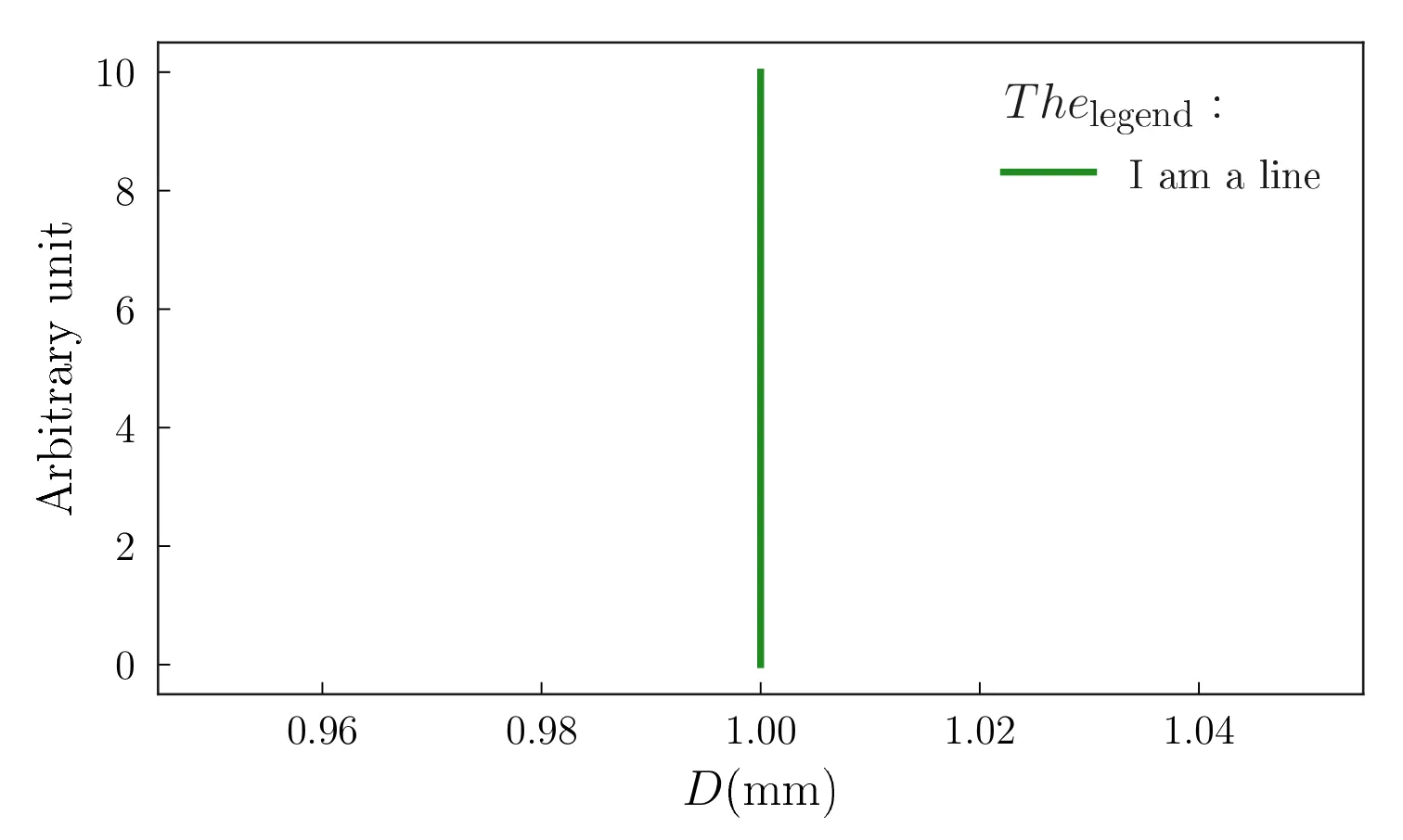
以下是一个最简单但不起作用的示例,生成了一个丑陋的图形:
import numpy as np
import matplotlib.pyplot as plt
plt.plot([1,1],[0,10], linewidth=2, label = r'I am a line')
leg = plt.legend(title=r'$The_{\text{legend}}$ : ' ,ncol=1)
leg._legend_box.align = 'left'
plt.xlabel(r'$D \text{(mm)}$')
plt.ylabel(r'Arbitrary unit')
plt.savefig('example.pdf')
plt.close()
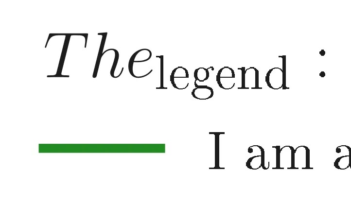
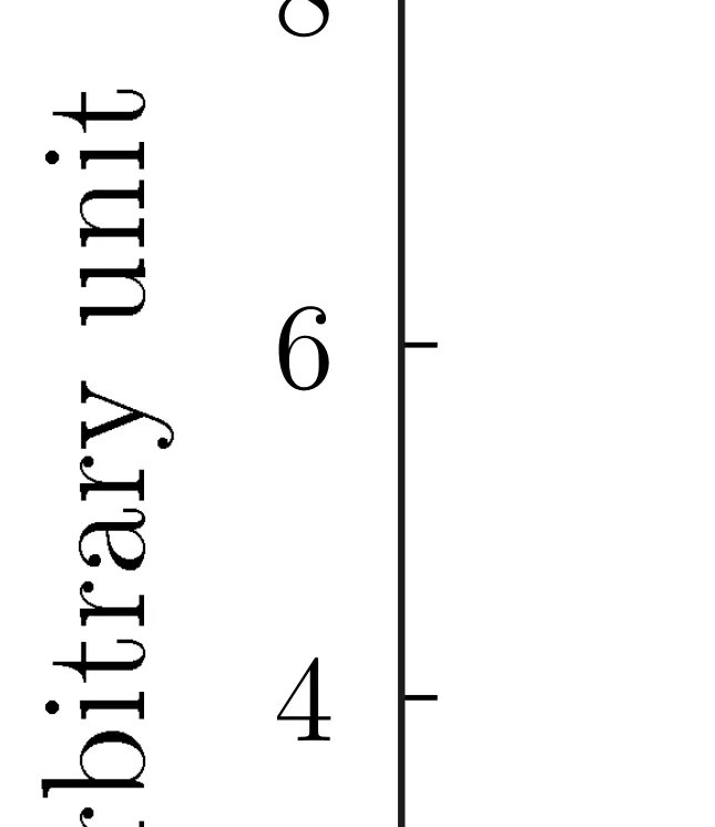
这样就得到了这个图: 链接到PDF文件,仅有效期为10天 该图 当放大时,我们清晰地看到文本在数学模式下真的很像素化: 放大图例 放大坐标轴标签 如何避免这种情况?
另外:
- 我知道SVG、Tikz和PGF导出,但我真的希望有一种易于与他人共享的文件类型。 - 由于打字规则,我不能将所有文本都切换到数学模式。在图表上,变量必须呈现为数学对象,文本必须呈现为文本对象。 - 在LaTex预导言中添加
\usepackage{lmodern, mathtools}以使用Latin Modern而不是Computer Modern无效。可能是因为Matplotlib在数学模式以外的标签中没有使用LaTex渲染。
\usepackage{lmodern, mathtools},但这并没有起作用。渲染效果完全相同。我还尝试更改所使用的字体大小,因为他说这可能是问题所在,但我尝试的所有文本大小(从9到13pt)都无法正确呈现文本。 - Manon