使用纯CSS创建上下箭头图标或按钮

5

我正在尝试使用纯CSS和无背景图像创建下面显示的“上下”控制按钮。
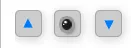
enter image description here

但是,当我在“li.className:afterli.className:before”中添加箭头的CSS时,主框的位置移动了。

这里是我遇到的问题的Fiddle > http://jsfiddle.net/8usFk/

以下是相同的代码:

HTML

<div class="positionCameras">
    <ul>
        <li title="Move Up" class="cameraLeft" id="cameraUp"></li>
        <li title="Camera" class="cameraIcon"></li>
        <li title="Move Down" class="cameraRight" id="cameraDown"></li>
    </ul>
</div>

CSS

.positionCameras ul, .positionCameras li {
    margin: 0;
    padding: 0;
    list-style: none;
    display: inline-block;
}
.positionCameras li.cameraLeft, .positionCameras li.cameraIcon, .positionCameras li.cameraRight {
    width: 25px;
    height: 25px;
    cursor: pointer;
    background: #cccccc;
    margin: 5px;
    border-radius: 5px;
    border: 1px solid #aaaaaa;
    box-shadow: 1px 2px 15px #cccccc;
}
.positionCameras li.cameraLeft:before {
    content:" ";
    width: 0;
    height: 0;
    border-style: solid;
    border-width: 0 5px 10px 5px;
    border-color: transparent transparent #007bff transparent;
}
.positionCameras li.cameraIcon {
    cursor: default;
}
.positionCameras li.cameraRight:before {
    width: 0;
    height: 0;
    border-style: solid;
    border-width: 8.7px 5px 0 5px;
    border-color: #007bff transparent transparent transparent;
}

请告诉我是否需要其他信息。
请提建议。

1
你可以考虑使用一些字符代码来代替箭头 - 参见:https://dev59.com/m3E85IYBdhLWcg3wmEpV - user319940
有点取巧,但在.positionCameras li.cameraLeft:before中设置position: fixed; left: 21px; top: 21px;可以解决它。 - TylerH
6个回答

5
如果你将伪元素的 display 属性设置为 inline-block(或其他任何值,但不包括 inline),那么你可以对其进行尺寸调整。
然后,
  1. 要使其水平居中:text-align:center 在父元素上。
  2. 要使其垂直居中:在伪元素上设置 line-height:20px(25px - 5px,即伪元素高度的一半)并设置 vertical-align:middle
DEMO
.positionCameras ul, .positionCameras li {
    margin: 0;
    padding: 0;
    list-style: none;
    display: inline-block;
    vertical-align:top;/* UPDATE*/
}
.positionCameras li.cameraLeft, .positionCameras li.cameraIcon, .positionCameras li.cameraRight {
    width: 25px;
    height: 25px;
    cursor: pointer;
    background: #cccccc;
    margin: 5px;
    border-radius: 5px;
    border: 1px solid #aaaaaa;
    box-shadow: 1px 2px 15px #cccccc;
    text-align:center;/* UPDATE*/
    line-height:20px;/* UPDATE*/
}
.positionCameras li.cameraLeft:before {
    content:"";
    display:inline-block;/* UPDATE*/
    width: 0;
    height: 0;
    vertical-align:middle;/* UPDATE*/
    border-style: solid;
    border-width: 0 5px 10px 5px;
    border-color: transparent transparent #007bff transparent;
}
.positionCameras li.cameraIcon {
    cursor: default;
}
.positionCameras li.cameraRight:before {
    width: 0;
    height: 0;
    border-style: solid;
    border-width: 8.7px 5px 0 5px;
    border-color: #007bff transparent transparent transparent;
}

3

这个选项始终将箭头居中,不需要固定的值边距。

JSfiddle演示

CSS

.positionCameras ul, .positionCameras li {
    margin: 0;
    padding: 0;
    list-style: none;
    display: inline-block;
    vertical-align: top; /* added */

}
.positionCameras li.cameraLeft, 
.positionCameras li.cameraIcon, 
.positionCameras li.cameraRight {
    position: relative; /* added */
    width: 25px;
    height: 25px;
    cursor: pointer;
    background: #cccccc;
    margin: 5px;
    border-radius: 5px;
    border: 1px solid #aaaaaa;
    box-shadow: 1px 2px 15px #cccccc;
}

.positionCameras li.cameraIcon {
    cursor: default;
}
.positionCameras li.cameraLeft:before,
.positionCameras li.cameraRight:before{
    content:""; 

    /* added for positioning magic */
    position: absolute; 
    top:50%;
    left:50%;
    -webkit-transform: translate(-50%, -50%);    
    transform: translate(-50%, -50%);  
    /* end added */

    width: 0;
    height: 0;
    border-style: solid;
}

.positionCameras li.cameraLeft:before {
    border-width: 0 5px 10px 5px;
    border-color: transparent transparent #007bff transparent;
}

.positionCameras li.cameraRight:before {
    border-width: 10px 5px 0 5px;
    border-color: #007bff transparent transparent transparent;
}

0

你也可以使用 HTML 字符代码,并像这样在 Fiddle 中进行操作。


0

添加

vertical-align:top;
应用的CSS样式。
例如,你的CSS类应该如此:
.positionCameras li.cameraLeft, .positionCameras li.cameraIcon, .positionCameras li.cameraRight {
    width: 25px;
    height: 25px;
    cursor: pointer;
    background: #cccccc;
    margin: 5px;
    border-radius: 5px;
    border: 1px solid #aaaaaa;
    box-shadow: 1px 2px 15px #cccccc;
    vertical-align:top;
}

那会很好地发挥作用。

您可以在这里查看:http://jsfiddle.net/rhX87/

更新

添加以下 CSS 以使图像居中正确:

position:relative;
bottom:11px;
left:7px;

.positionCameras li.cameraLeft:before类中。

这样可以将图像居中显示。

在这里查看:http://jsfiddle.net/rhX87/1/

希望有所帮助!!!


谢谢!我在<li>标签中添加了“vertical-align:top;”,现在所有的框都对齐了...但箭头仍然在底部。 - UID
为箭头添加边距。让我试一下并发布代码。 - Satwik Nadkarny
1
请查看答案的更新部分。这应该也解决了图像居中的问题!! - Satwik Nadkarny

0

演示

HTML

<div class="positionCameras">
    <ul>
        <li title="Move Up" class="cameraLeft" id="cameraUp"></li>
        <li title="Camera" class="cameraIcon"></li>
        <li title="Move Down" class="cameraRight" id="cameraDown"></li>
    </ul>
</div>

CSS

.positionCameras ul, .positionCameras li {
    margin: 0;
    padding: 0;
    list-style: none;
    display: inline-block;
}
.positionCameras li.cameraLeft, 
.positionCameras li.cameraIcon, 
.positionCameras li.cameraRight {
    width: 25px;
    height: 25px;
    cursor: pointer;
    background: #cccccc;
    margin: 5px;
    border-radius: 5px;
    border: 1px solid #aaaaaa;
    box-shadow: 1px 2px 15px #cccccc;
    vertical-align:top;
}
.positionCameras li.cameraLeft:before,
.positionCameras li.cameraRight:before{
    padding:5px;
    color:#007bff;
    font-size:16px;
    line-height:25px;
}
.positionCameras li.cameraLeft:before{
    content:"▼";
}
.positionCameras li.cameraRight:before{
    content:"▲";
}
.positionCameras li.cameraIcon:before{
    content:"•";
    padding:5px;
    color:#111;
    font-size:48px;
    line-height:25px;
}

酷炫的三角形字符!在不同浏览器或语言环境下是否存在渲染问题? - Peter
@Peter 浏览器可以很好地处理它们。您只需要确保用于呈现它们的字体包含这些字符。这些是相当通用的符号,存在于大多数字体中。微软推荐使用 Segroe UI。 - DreamTeK

0
这是我的纯 HTML 版本。 您需要添加 JavaScript 函数“incrementMyNumber()”来处理 onclick 事件。 关键是包含箭头的 div 的负边距。 您可能需要调整数字,但在 IE 和 Chrome 中看起来很好。
<table>
<td>
    <input type="text" id="myNumber" style="width:50px" value="5" />
</td>
<td>
    <table style="border-spacing:0px;margin-left:-2px;width:20px;">
        <tr>
            <td style="border:1px solid black;height:8px;background-color:#dcdcdc;cursor:pointer" onclick="incrementMyNumber(1)">
                <div style="margin:-5px;font-size:8px;">&#x25B2;</div>
            </td>
        </tr>
        <tr>
            <td style="border: 1px solid black; height: 8px; background-color: #dcdcdc;cursor:pointer" onclick="incrementMyNumber(-1)">
                <div style="margin:-5px;font-size:8px;">&#x25BC;</div>
            </td>
        </tr>
    </table>
</td>


网页内容由stack overflow 提供, 点击上面的
可以查看英文原文,
原文链接