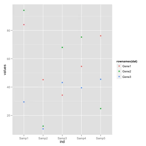
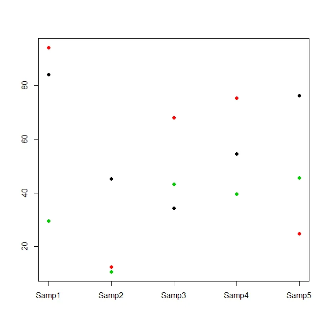
在R中为多行创建散点图

6

我有一个数据框,看起来像这样:

        Samp1    Samp2    Samp3     Samp4    Samp5
Gene1    84.1     45.2     34.3      54.6     76.2
Gene2    94.2     12.4     68.0      75.3     24.8
Gene3    29.5     10.5     43.2      39.5     45.5
...

我想创建一个散点图,其中x轴是样本(Samp1-5),y轴是行(Gene1-3等),但我希望每一行的数据以不同的颜色绘制在同一张图中。

有什么想法如何在R中实现这个功能?我非常愿意使用ggplot2、lattice、car或任何其他R包。


1
当你得到一个解决问题的答案时,如果你点击解决方案旁边的小复选框,对于整个网站来说非常有帮助。这样未来的读者就可以确定那个答案确实解决了你的问题。(但是当然,只有在答案真正解决了你的问题时才应该这样做。) - joran
好的,谢谢@joran。我会尝试解决这个问题,虽然我还没有找到解决方法。 - Sheila
4个回答

1

这里有一个使用ggplot2的解决方案:

数据如下:

dat <- read.table(text="Samp1    Samp2    Samp3     Samp4    Samp5
  Gene1    84.1     45.2     34.3      54.6     76.2
  Gene2    94.2     12.4     68.0      75.3     24.8
  Gene3    29.5     10.5     43.2      39.5     45.5", header = TRUE)

情节:

library(ggplot2)  
ggplot(stack(dat), aes(x = ind, y = values, colour = rownames(dat))) +
  geom_point()

enter image description here


2
嗨,我为什么在尝试复制你的示例时会收到这个错误?错误:美学必须是长度为一或与数据问题相同的长度:rownames(dat)。 - Geekuna Matata

1

如果您想在lattice或ggplot2中进行此操作,则可能需要将数据重塑为长格式,请参见reshape函数或reshape2包。

对于基本图形,matplot函数可能会做你想要的事情,如果您不希望仅使用数字1到5作为轴刻度标记,则可能需要抑制x轴并使用axis函数添加自己的轴。


0
将数据放入矩阵中:
foo <- as.matrix(structure(list(Samp1 = c(84.1, 94.2, 29.5),
    Samp2 = c(45.2, 12.4, 10.5),Samp3 = c(34.3, 68, 43.2),
    Samp4 = c(54.6, 75.3, 39.5),Samp5 = c(76.2, 24.8, 45.5)),
  .Names = c("Samp1", "Samp2","Samp3", "Samp4", "Samp5"),
  class = "data.frame", row.names = c("Gene1","Gene2", "Gene3")))

并绘制:

plot(seq(1,ncol(foo)),foo[1,],xlab="",ylab="",xaxt="n",
  pch=21,bg=1,ylim=c(min(foo),max(foo)))
axis(side=1,at=seq(1,ncol(foo)),labels=colnames(foo))
for ( ii in 2:nrow(foo) ) points(seq(1,ncol(foo)),foo[ii,],pch=21,col=ii,bg=ii)

请注意,我正在通过它们的数字循环使用颜色(col=ii,bg=ii)。请参见?palette
您可能还想查看?legend

scatterplot


0

在引入tidyverse之后,推荐的方法是使用tidyr将数据转换为长格式。例如:

dat <- read.table(text="Gene Samp1    Samp2    Samp3     Samp4    Samp5
  Gene1    84.1     45.2     34.3      54.6     76.2
  Gene2    94.2     12.4     68.0      75.3     24.8
  Gene3    29.5     10.5     43.2      39.5     45.5", header = TRUE)

dat %>% 
  # transform data to long form
  tidyr::gather("sample", "value", contains("Samp")) %>%
  # plot the data
  ggplot(aes(x = sample, y = value, col = Gene)) + geom_point()

网页内容由stack overflow 提供, 点击上面的
可以查看英文原文,
原文链接