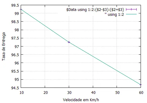
我有一个文件,其中记录了模拟的交付率及其置信区间。我需要在图表上绘制误差线。需要将折线图和误差线绘制在同一张图表上。
样本数据:
V   D         IC
10 99.2373 0.000200729
30 97.2515 0.00649952
60 94.6761 0.00950475
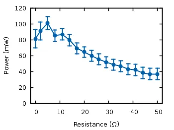
我希望它看起来像下面的示例一样:
Here is my code:
set nokey
set grid
set key right inside
set xlabel 'Velocidade em Km/h'
set ylabel 'Taxa de Entrega'
set autoscale
set yr[0:100]
set style data lines
plot 'taxa_entrega-AODV-50-250.txt' using 1:2:($2-$3):($2+$3) with yerrorbars