我想为WPF日历样式化BlackoutDates。默认的可视化效果是在日期数字上方显示一个灰色十字。如何只将它们变成灰色,比如变灰?
2个回答
7
给你:
<Calendar>
    <Calendar.CalendarDayButtonStyle>
        <Style TargetType="CalendarDayButton" BasedOn="{StaticResource {x:Type CalendarDayButton}}">
            <Style.Triggers>
                <Trigger Property="IsBlackedOut" Value="True">
                    <Setter Property="Background" Value="LightGray"/>
                </Trigger>
            </Style.Triggers>
        </Style>
    </Calendar.CalendarDayButtonStyle>
    <Calendar.BlackoutDates>
        <CalendarDateRange Start="24-June-2014" End="25-June-2014"/>
    </Calendar.BlackoutDates>
</Calendar>
我已经为`CalendarDayButtonStyle`指定了自定义样式,而在该样式中,我通过`IsBlackedOut`触发器将`Background`设置为`LightGray`。
结果:
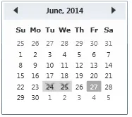
你可以根据需要选择操作其他属性。
移除现有的黑色遮罩
要移除现有的黑色遮罩,你可以选择为日历日期按钮定义一个自定义模板,但缺点是你必须针对每个主题(如Luna、Classic等)进行维护。
我将提出一种解决方案,帮助你利用现有的模板,因此无需担心此类问题。
我使用了附加属性来实现同样的效果。
类名:CalenderHelper
namespace CSharpWPF
{
    class CalenderHelper : DependencyObject
    {
        public static bool GetIsBlackOutDisabled(DependencyObject obj)
        {
            return (bool)obj.GetValue(IsBlackOutDisabledProperty);
        }

        public static void SetIsBlackOutDisabled(DependencyObject obj, bool value)
        {
            obj.SetValue(IsBlackOutDisabledProperty, value);
        }

        // Using a DependencyProperty as the backing store for IsBlackOutDisabled.  This enables animation, styling, binding, etc...
        public static readonly DependencyProperty IsBlackOutDisabledProperty =
            DependencyProperty.RegisterAttached("IsBlackOutDisabled", typeof(bool), typeof(CalenderHelper), new PropertyMetadata(false, OnIsBlackOutDisabledChanged));

        private static void OnIsBlackOutDisabledChanged(DependencyObject d, DependencyPropertyChangedEventArgs e)
        {
            CalendarDayButton dayButton = d as CalendarDayButton;
            if (dayButton.IsLoaded)
            {
                SetBlackout(dayButton, (bool)e.NewValue);
            }
            else
            {
                dayButton.Loaded += (s, ee) =>
                {
                    SetBlackout(dayButton, (bool)e.NewValue);
                };
            }
        }

        static void SetBlackout(CalendarDayButton dayButton, bool collapsed)
        {
            ControlTemplate template = dayButton.Template;
            Path blackoutPath = template.FindName("Blackout", dayButton) as Path;
            if (collapsed)
                blackoutPath.Visibility = System.Windows.Visibility.Collapsed;
            else
                blackoutPath.Visibility = System.Windows.Visibility.Visible;
        }
    }
}
我创建了一个名为
CalenderHelper的类,并添加了一个附加属性IsBlackOutDisabled,其可以隐藏现有模板中的黑出元素。
XAML
<Calendar x:Name="cal" xmlns:l="clr-namespace:CSharpWPF">
    <Calendar.CalendarDayButtonStyle>
        <Style TargetType="CalendarDayButton" BasedOn="{StaticResource {x:Type CalendarDayButton}}">
            <Style.Triggers>
                <Trigger Property="IsBlackedOut" Value="True">
                    <Setter Property="Background" Value="LightGray"/>
                    <Setter Property="l:CalenderHelper.IsBlackOutDisabled" Value="True"/>
                </Trigger>
            </Style.Triggers>
        </Style>
    </Calendar.CalendarDayButtonStyle>
    <Calendar.BlackoutDates>
        <CalendarDateRange Start="24-June-2014" End="25-June-2014"/>
    </Calendar.BlackoutDates>
</Calendar>
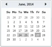
我已在触发器中启用了我的新创建的属性
l:CalenderHelper.IsBlackOutDisabled,这将隐藏默认的黑色视觉效果。结果
 这种方法使它适用于许多目的,您可以编写其他复杂功能的代码,这些功能无法通过简单的xaml轻松实现。
- pushpraj
1
默认的可视化效果是在日期数字上方显示一个灰色的十字。如何只将它们变成灰色,而不是被划掉呢?我相信这意味着“如何将日期变为灰色,而不是被划掉”。 - Sheridan
0
我的解决方案是纯XAML,使用视觉状态:
<Style TargetType="CalendarDayButton" x:Key="CalendarDayButtonStyle">
    <Setter Property="MinWidth" Value="5" />
    <Setter Property="MinHeight" Value="5" />
    <Setter Property="FontSize" Value="14" />
    <Setter Property="HorizontalContentAlignment" Value="Center" />
    <Setter Property="VerticalContentAlignment" Value="Center" />
    <Setter Property="Template">
        <Setter.Value>
            <ControlTemplate TargetType="CalendarDayButton">
                <Grid>
                    <VisualStateManager.VisualStateGroups>

                        <VisualStateGroup Name="CommonStates">
                            <VisualStateGroup.Transitions>
                                <VisualTransition GeneratedDuration="0:0:0.1" />
                            </VisualStateGroup.Transitions>
                            <VisualState Name="Normal" />
                            <VisualState Name="MouseOver">
                                <Storyboard>
                                    <DoubleAnimation Storyboard.TargetName="HighlightBackground" Storyboard.TargetProperty="Opacity" To="1" Duration="0" />
                                </Storyboard>
                            </VisualState>
                            <VisualState Name="Pressed">
                                <Storyboard>
                                    <DoubleAnimation Storyboard.TargetName="HighlightBackground" Storyboard.TargetProperty="Opacity" To="1" Duration="0" />
                                </Storyboard>
                            </VisualState>
                            <VisualState Name="Disabled">
                                <Storyboard>
                                    <DoubleAnimation Storyboard.TargetName="HighlightBackground" Storyboard.TargetProperty="Opacity" To="0" Duration="0" />
                                    <DoubleAnimation Storyboard.TargetName="NormalText" Storyboard.TargetProperty="Opacity" To=".35" Duration="0" />
                                </Storyboard>
                            </VisualState>
                        </VisualStateGroup>

                        <VisualStateGroup Name="SelectionStates">
                            <VisualStateGroup.Transitions>
                                <VisualTransition GeneratedDuration="0" />
                            </VisualStateGroup.Transitions>
                            <VisualState Name="Unselected" />
                            <VisualState Name="Selected">
                                <Storyboard>
                                    <DoubleAnimation Storyboard.TargetName="SelectedBackground" Storyboard.TargetProperty="Opacity" To="1" Duration="0" />
                                </Storyboard>
                            </VisualState>
                        </VisualStateGroup>

                        <VisualStateGroup Name="ActiveStates">
                            <VisualStateGroup.Transitions>
                                <VisualTransition GeneratedDuration="0" />
                            </VisualStateGroup.Transitions>
                            <VisualState Name="Active" />
                            <VisualState Name="Inactive">
                                <Storyboard>
                                    <ColorAnimation Duration="0" Storyboard.TargetName="NormalText" Storyboard.TargetProperty="(TextElement.Foreground).(SolidColorBrush.Color)"
                                                    To="#FFCBCBCB" />
                                </Storyboard>
                            </VisualState>

                        </VisualStateGroup>

                        <VisualStateGroup Name="DayStates">
                            <VisualStateGroup.Transitions>
                                <VisualTransition GeneratedDuration="0" />
                            </VisualStateGroup.Transitions>
                            <VisualState Name="RegularDay" />
                            <VisualState Name="Today">
                                <Storyboard>
                                    <DoubleAnimation Storyboard.TargetName="TodayBackground" Storyboard.TargetProperty="Opacity" To="1" Duration="0" />
                                    <ColorAnimation Duration="0" Storyboard.TargetName="NormalText" Storyboard.TargetProperty="(TextElement.Foreground).(SolidColorBrush.Color)"
                                                    To="#FFFFFFFF" />
                                </Storyboard>
                            </VisualState>

                            <VisualState Name="BlackoutDay">
                                <Storyboard>
                                    <DoubleAnimation Storyboard.TargetName="HighlightBackground" Storyboard.TargetProperty="Opacity" To="0" Duration="0" />
                                    <DoubleAnimation Storyboard.TargetName="NormalText" Storyboard.TargetProperty="Opacity" To=".35" Duration="0" />
                                </Storyboard>
                            </VisualState>

                        </VisualStateGroup>

                    </VisualStateManager.VisualStateGroups>
                    <Rectangle x:Name="TodayBackground" RadiusX="1" RadiusY="1" Opacity="0" Fill="Blue"/>
                    <Rectangle x:Name="SelectedBackground" RadiusX="1" RadiusY="1" Opacity="0" Fill="Silver"/>
                    <Rectangle x:Name="HighlightBackground" RadiusX="1" RadiusY="1" Opacity="0" Fill="LightGray"/>
                    <ContentPresenter x:Name="NormalText" HorizontalAlignment="{TemplateBinding HorizontalContentAlignment}"
                        VerticalAlignment="{TemplateBinding VerticalContentAlignment}" Margin="5,1,5,1" TextElement.Foreground="Black"/>
                </Grid>
            </ControlTemplate>
        </Setter.Value>
    </Setter>

</Style>
解决方案在于定义自己的ControlTemplate及其可视状态。最重要的是在DayStates可视组内 - 名为"BlackoutDay"的VisualState。
这样就不需要附加属性来覆盖默认的黑屏样式,每个控件状态的所有按钮颜色都可以完全自定义。
- Lucy82
网页内容由stack overflow 提供, 点击上面的可以查看英文原文,
原文链接
原文链接
Calendar类的默认ControlTemplate(http://msdn.microsoft.com/en-us/library/ff468218(v=vs.110).aspx)并根据自己的需求进行微调。 - SheridanCalendar.CalendarDayButtonStyle来创建自定义模板,以处理你想要的BlackoutDay可视状态。请注意,您还需要处理其他状态。 - dkozl