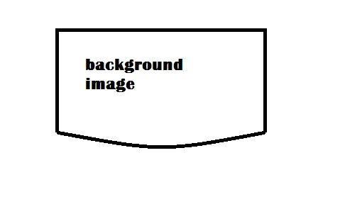
我需要在CSS中使用这张图片,并在边框内添加一个背景图片。
我已经尝试过:
border-radius:0 0 50% 50%;
-webkit-border-radius:0 0 50% 50%;
但是没有得到所需的形状。
任何帮助都将不胜感激。
我需要在CSS中使用这张图片,并在边框内添加一个背景图片。
我已经尝试过:
border-radius:0 0 50% 50%;
-webkit-border-radius:0 0 50% 50%;
但是没有得到所需的形状。
任何帮助都将不胜感激。
使用边框半径:
您可以在X轴和Y轴上为元素设置不同的border-radius值,以获得带有边框和背景图像的曲线底部。
.curved-border {
  height: 200px;
  width: 400px;
  background: url(http://lorempixel.com/400/200/nature/1);
  border: 3px solid;
  box-shadow: inset 0px -1px 0px black; /* just to make the bottom border look thicker */
  margin-bottom: 4px;
}
.sample1 {
  border-radius: 0% 0% 150% 150%/0% 0% 40% 40%;
}
.sample2 {
  border-radius: 0% 0% 100% 100%/0% 0% 30% 30%;
}<div class='curved-border sample1'></div>
<div class='curved-border sample2'></div>注意:正如您在评论中观察到的,使用此方法时底部边框往往会变得更细,即使将border-bottom-width设置为更高的值也无法解决。为了在一定程度上克服这个问题,您可以添加一个虚假的box-shadow(与边框颜色相同)。
box-shadow: inset 0px -1px 0px black;
使用裁剪路径:
您还可以使用clip-path(以及内联SVG)使用背景图像创建此形状。对于这种特殊情况,我认为与border-radius方法相比,使用此方法没有太多优势(事实上,由于IE不支持,这是一个缺点),但对于复杂的形状,SVG允许更多地控制曲线、半径等。
.curved-border {
  position: relative;
  height: 200px;
  width: 400px;
  background: black;
  -webkit-clip-path: url(#clipper);
  clip-path: url(#clipper);
}
.curved-border:before {
  position: absolute;
  content: '';
  height: calc(100% - 6px);
  width: calc(100% - 6px);
  top: 3px;
  left: 3px;
  background: url(http://lorempixel.com/400/200/nature/3);
  -webkit-clip-path: url(#clipper);
  clip-path: url(#clipper);
  z-index: -1;
}<script src="https://cdnjs.cloudflare.com/ajax/libs/prefixfree/1.0.7/prefixfree.min.js"></script>
<div class='curved-border'></div>
<svg width='0' height='0'>
<defs>
<clipPath id='clipper' clipPathUnits='objectBoundingBox'>
<path d='M0,0 0,0.8 A.5,0.2 0 1,0 1,0.8 L1,0z' />
</clipPath>
</defs>
</svg>使用SVG路径:
这也可以通过仅使用SVG path 而不是 clip-path 来实现。浏览器对此的支持比剪辑路径版本更好。
.curved-border {
  position: relative;
  height: 200px;
  width: 400px;
}
svg {
  position: absolute;
  height: 100%;
  width: 100%;
  top: 0px;
  left: 0px;
}
svg path {
  fill: url(#g-image);
  stroke: black;
  stroke-width: 4;
}<div class='curved-border'>
<svg viewBox='0 0 200 100' preserveAspectRatio='none'>
<defs>
<pattern id='g-image' width='200' height='100' patternUnits='userSpaceOnUse'>
<image xlink:href='http://lorempixel.com/400/200/nature/4' width='200' height='100' />
</pattern>
</defs>
<path d='M2,2 2,78 A98,20 0 1,0 198,78 L198,2z' vector-effect='non-scaling-stroke' />
</svg>
</div>box-shadow: inset 0px -1px 0px black;来在底部产生一个虚拟的额外边框效果。(*注意:*即使增加底部边框的宽度也不起作用。) - Harry