我有一个带有反馈中心图标(Segoe MDL2 Assets)的按钮,我想在图标后面添加文本:“反馈”,但由于我已经有了图标,所以是否可能添加文本呢?
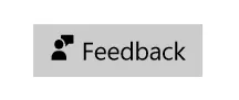
以下是我的按钮示例:
以下是我的按钮示例:
尝试将图标文本和文本分别放在TextBlock的不同Run中,像这样 -
<Button>
<TextBlock>
<Run Text=""
FontFamily="Segoe MDL2 Assets" />
<Run Text="Feedback" />
</TextBlock>
</Button>
这不是原帖作者想要的吗?为什么会有负评??
WPF 应用程序上也有效。值得点赞。感谢您分享您的知识。 - nam <Button x:Name="feedbackButton" Click="feedbackButton_Click">
<StackPanel Orientation="Horizontal">
<TextBlock Text="" FontFamily="Segoe MDL2 Assets" VerticalAlignment="Center"/>
<TextBlock Text="Feedback" VerticalAlignment="Center" Margin="8,0,0,0"/>
</StackPanel>
</Button>
您可以使用内置的https://learn.microsoft.com/en-us/uwp/api/Windows.UI.Xaml.Controls.AppBarButton AppBarButton 控件,或使用其样式。
<Button>
<StackPanel>
<TextBlock Grid.Column="0" FontFamily="Segoe MDL2 Assets"
Text="" VerticalAlignment="Center"/>
<TextBlock Grid.Column="1" Text="Feedback" Margin="10,0,0,0"
VerticalAlignment="Center" />
</StackPanel>
</Button>
我修改了代码。希望这就是你想要的。
我会这样做:
Define a custom control ButtonWithIcon:
public class ButtonWithIcon : Button
{
    public static readonly DependencyProperty IconContentProperty =
        DependencyProperty.Register("IconContent", typeof(string), typeof(ButtonWithIcon), new PropertyMetadata(default(Icon)));

    public string IconContent
    {
        get => (string)GetValue(IconContentProperty);
        set => SetValue(IconContentProperty, value);
    }
}
特别地,我添加了一个DependencyProperty来启用图标代码的特定绑定。
Then, I would define the style for that control in App.xaml:
<Style x:Key="buttonWithIconStyle" TargetType="customControls:ButtonWithIcon">
    <Setter Property="FocusVisualStyle" Value="{x:Null}" />
    <Setter Property="Background" Value="Transparent" />
    <Setter Property="BorderBrush" Value="#cccccc" />
    <Setter Property="BorderThickness" Value="0" />
    <Setter Property="FontFamily" Value="Segoe UI" />
    <Setter Property="Foreground" Value="#333333" />
    <Setter Property="HorizontalContentAlignment" Value="Center" />
    <Setter Property="VerticalContentAlignment" Value="Center" />
    <Setter Property="Padding" Value="16,3,16,3" />
    <Setter Property="Template">

        <Setter.Value>
            <ControlTemplate TargetType="{x:Type customControls:ButtonWithIcon}">
                <Border
                    Name="Chrome"
                    Background="{TemplateBinding Background}"
                    BorderBrush="{TemplateBinding BorderBrush}"
                    BorderThickness="{TemplateBinding BorderThickness}"
                    SnapsToDevicePixels="true">

                    <StackPanel
                        Margin="8,0"
                        HorizontalAlignment="Center"
                        VerticalAlignment="Center"
                        Orientation="Vertical">

                        <TextBlock
                            x:Name="Icon"
                            Foreground="White"
                            HorizontalAlignment="Center"
                            FontFamily="Segoe UI Symbol"
                            Text="{Binding IconContent, RelativeSource={RelativeSource TemplatedParent}}"/>
                        <TextBlock
                            x:Name="Text"
                            Text="{TemplateBinding Content}"
                            FontFamily="Segoe UI Light"
                            FontSize="10"
                            HorizontalAlignment="Center"
                            Foreground="White" />

                    </StackPanel>

                </Border>

                <ControlTemplate.Triggers>
                    <Trigger Property="IsEnabled" Value="false">
                        <Setter Property="Foreground" Value="White" />
                    </Trigger>
                    <Trigger Property="IsMouseOver" Value="True">
                        <Setter Property="Background" Value="#000000" />
                        <Setter Property="BorderBrush" Value="#cccccc" />
                        <Setter Property="Foreground" Value="White" />
                    </Trigger>
                    <Trigger Property="IsPressed" Value="True">
                        <Setter Property="Background" Value="#999999" />
                        <Setter Property="BorderBrush" Value="{StaticResource MainColor}" />
                        <Setter Property="Foreground" Value="White" />
                    </Trigger>
                    <Trigger Property="IsFocused" Value="true">
                        <Setter TargetName="Chrome" Property="BorderBrush" Value="{StaticResource MainColor}" />
                    </Trigger>
                </ControlTemplate.Triggers>
            </ControlTemplate>
        </Setter.Value>
    </Setter>
</Style>
特别地,我添加了一个 StackPanel 来容纳带有普通文本的 Content 属性和图标代码的 IconContent 属性。
At the end, you can use it like this:
<customControls:ButtonWithIcon
Style="{StaticResource "buttonWithIconStyle"}"
IconContent=""
Content="Some text" />
Remember to reference the custom control in your Window's references:
xmlns:customControls="clr-namespace:MyProjectNamespace.Controls"