Chart.js如何将散点图和折线图结合显示?

4
我刚接触chart.js,尝试将散点图和折线图组合在一起。
我遇到了两个问题:
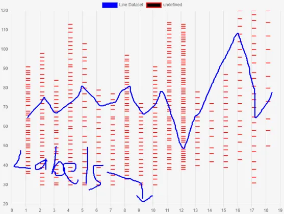
1. 我已经成功绘制了散点图,但是折线图没有显示。没有出现错误消息。
2. 我想在底部添加一些标签,但经过多次尝试,图表只显示x轴上的数字。
我附上一张图片,您可以看到我的进展。我手动绘制了折线图。
这是我使用的代码:
<script>
const ctx = document.getElementById('myChart');

Chart.defaults.elements.point.pointStyle = 'dash';
Chart.defaults.elements.point.borderWidth = 2;
Chart.defaults.elements.point.radius = 12;

const labels1 = ['A', 'B','C','T','GW','RT','MJ','JY','YJ','TR','UY','IY','TR','RE','WE','WE','WE','BV','CS', 'EW'];

const data1 = {
    datasets: [
        {
        type: 'line',
        label: 'Line Dataset',
        data: [10, 10, 10, 10],
        backgroundColor: 'rgb(0, 0, 255)',
        borderColor: 'rgb(0, 0, 255)'
        },
        {
        type: 'scatter',
        backgroundColor: 'rgb(0, 0, 0)',
        borderColor: 'rgb(255, 0, 0)',
        data: [{x:1, y:36}, {x:1, y:37}, {x:1, y:40}, {x:1, y:40}, //.... and many more!!
        }

    ],

};


const myChart = new Chart(ctx, {
    type: 'scatter',
    data: data1,
    labels: labels1,
    options: {
        scales: {
            x: {
                min: 0,
                max: 19,
                ticks: {stepSize: 1}
            },
            y: {
                min: 20,
                max: 120,
                ticks: {stepSize: 10},
                grid:{display:false}
            },
        }
    }
});

</script>

我尝试将“标签:labels1”放在许多地方,但它们从未显示出来。正如您在附加的图像中所看到的那样,折线图也没有显示出来。
Chart.js 版本为 3.6.2
任何帮助都将不胜感激。
最好的问候!

chart

1个回答

3
这是因为散点图默认使用线性轴作为x轴,而折线图使用类别轴,它们之间不兼容,因此您需要使用第二个X轴。另外,您的标签数组放置位置错误,应该在配置文件的data部分中:

const labels1 = ['A', 'B', 'C', 'T', 'GW', 'RT', 'MJ', 'JY', 'YJ', 'TR', 'UY', 'IY', 'TR', 'RE', 'WE', 'WE', 'WE', 'BV', 'CS', 'EW'];

const data1 = {
  labels: labels1, // place labels array in correct spot
  datasets: [{
      type: 'line',
      label: 'Line Dataset',
      data: [10, 10, 10, 10],
      backgroundColor: 'rgb(0, 0, 255)',
      borderColor: 'rgb(0, 0, 255)',
      xAxisID: 'x2' // Specify to which axes to link
    },
    {
      type: 'scatter',
      backgroundColor: 'rgb(0, 0, 0)',
      borderColor: 'rgb(255, 0, 0)',
      data: [{
        x: 1,
        y: 36
      }, {
        x: 1,
        y: 37
      }, {
        x: 1,
        y: 40
      }, {
        x: 1,
        y: 40
      }]
    }
  ],
}


const myChart = new Chart('chartJSContainer', {
  type: 'scatter',
  data: data1,
  options: {
    scales: {
      x: {
        min: 0,
        max: 19,
        ticks: {
          stepSize: 1
        }
      },
      x2: { // add extra axes
        position: 'bottom',
        type: 'category'
      },
      y: {
        min: 0,
        max: 120,
        ticks: {
          stepSize: 10
        },
        grid: {
          display: false
        }
      },
    }
  }
});
<body>
  <canvas id="chartJSContainer" width="600" height="400"></canvas>
  <script src="https://cdnjs.cloudflare.com/ajax/libs/Chart.js/3.6.2/chart.js"></script>
</body>


哇!!非常感谢!!我只是通过“试错”永远也想不出来这个。所以两个x轴都会显示吗?我只需要带标签的那一个。无论如何,我会尝试一下并让您知道。 - Sergio
它起作用了!也许我要求太多了,但是有没有一种方法可以隐藏x轴标签?我的意思是线性轴标签(即从0到19的数字)。 - Sergio
请忽略我的上一个问题,我已经解决了。再次感谢! - Sergio
有没有其他方法可以传递数据,而不是将其分解成{x,y}对象的数组?对于大型数据集,这似乎很疯狂! - Nevermore

网页内容由stack overflow 提供, 点击上面的
可以查看英文原文,
原文链接