:hover 伪元素背景揭示效果

19

摘要

  • 目标设备 (设备宽度+600像素-请 忽略移动/xs屏幕)
  • 纯CSS 图片悬停效果使用:hover:after
  • 可用但不理想
  • 问题
    • 图像比例(图像将是800px/600px)未得到维护-宽度被裁剪而不是图像缩小
    • 图片位于主容器之外.outercontainer
    • :hover 工作的 图像淡入效果,但在:hover状态结束后不会淡出。我尝试使用单独动画/相同动画的反向运行,但没有成功
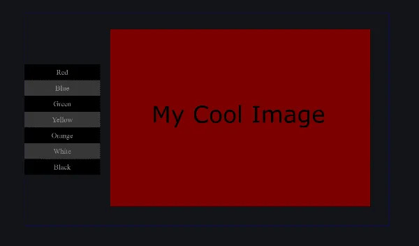
期望效果:

  • 所有内容适应带有蓝色边框标记的容器.outercontainer

  • 编辑: 图像应该有自己的空间-大约为容器宽度的80%,选项/菜单将占据另外20%的宽度-不重叠(如果图像覆盖选项,平板电脑用户将被困在:hover状态中)

  • .outercontainer 和其内部的所有内容根据屏幕宽度自动调整

  • 支持的最小设备宽度为600像素(忽略小于600像素的屏幕)

  • 步骤:

    • 图像在:hover时淡入
    • 只要元素仍处于:hover状态,图像保持可见
    • 在取消悬停后,图像淡出

类似帖子/问题

SO上有很多类似的问题。我没有找到一个解决将图像作为假元素的背景的问题的帖子。


我的问题

  1. 如何使使用:hover:after显示的图像适应其父容器? (我希望它不超过该容器宽度的80%-85% - 其余空间应分配给选项/菜单/列表项)

  2. 如何使使用:hover:after

    /* Start Miscellaneous stuff */
    
    body {
     background: #131418;
     color: #999;
     text-align: center;
    }
    
    .optionlist a {
     color: #999;
     text-decoration: none;
    }
    
    @keyframes mycoolfade {
     from {
      opacity: 0;
     }
     to {
      opacity: 1;
     }
    }
    
    /* End Miscellaneous stuff */
    
    .outercontainer {
     border: 1px solid blue; /*This needs to be in the middle of the screen and everthing should fit inside it*/
     position: fixed; /*border to highlight only - not part of final product*/
     top: 50%;
     left: 50%;
     transform: translate(-50%, -50%);
     width: 1200px;
     max-width: 80%
    }
    
    .optioncontainer {
     width: 250px;
     max-width: 20vw;
    }
    
    .optionlist li {
     background: #fff;
     padding: .5em;
     box-shadow: inset 10px 10px 100px 25px rgba(0, 0, 0, .8);
     list-style-type: none;
    }
    
    .optionlist li:nth-child(odd) {
     background: #000;
    }
    
    .optionlist li:hover {
     background: red;
    }
    
    .optionlist li:hover:after { /* The part the needs to be fixed */
     content: '';
     width: 800px;
     height: 600px;
     position: fixed;
     top: 50%;
     left: 50%;
     transform: translate(-50%, -50%);
     animation: mycoolfade 1s;
    }
    
    /* Start Background Control */
    
    #red:after {background: url(http://lorempixel.com/800/600/)}
    
    #blue:after {background: url(http://lorempixel.com/800/601/)}
    
    #green:after {background: url(http://lorempixel.com/801/600/)}
    
    #yellow:after {background: url(http://lorempixel.com/801/601/)}
    
    #orange:after {background: url(http://lorempixel.com/799/600/)}
    
    #white:after {background: url(http://lorempixel.com/800/599/)}
    
    #black:after {background: url(http://lorempixel.com/801/599/)}
    
    /* End Background Control */
    <body>
     The initial hiccup when the images load is not an issue 
     <div class="outercontainer">
      <div class="optioncontainer">
       <div class="optionlist">
        <li id="red">Red</li>
        <li id="blue">Blue</li>
        <li id="green">Green</li>
        <li id="yellow">Yellow</li>
        <li id="orange">Orange</li>
        <li id="white">White</li>
        <li id="black">Black</li>
       </div>
      </div>
     </div>
    </body>

    编辑:这是整个设置的理想外观图像。 输入图像描述

    谢谢。


7
感谢您在 Stack Overflow 上提问时完美而详细地表述问题,我已为此投上赞成票。 - Shobhit Srivastava
请按照此问题进行操作! - Deepak Yadav
5个回答

3
只需将您的 outercontainer 放在任何位置即可。 将 outercontainer position 样式更改为 relative ,并将伪元素样式设置为 position:absolute; left: 0; top: 0; width: 100%; height: 100%; 看起来可以正常工作。 使用CSS动画,您可以应用淡入效果。
=============最新更改==============
添加了针对 outercontainer 的定位和边距相关样式,添加了伪元素 background 样式,如 no-repeat background-size:cover 。 更改了 div 标记为 ul flex 样式以适用于 ul

/* Start Miscellaneous stuff */

body {
 background: #131418;
 color: #999;
 text-align: center;
}

.optionlist a {
 color: #999;
 text-decoration: none;
}

@keyframes mycoolfade {
 from {
  opacity: 0;
 }
 to {
  opacity: 1;
 }
}

/* End Miscellaneous stuff */

.outercontainer {
 border: 1px solid blue; /*This needs to be in the middle of the screen and everthing should fit inside it*/
 position: absolute; /*border to highlight only - not part of final product*/
    top: 0;
    left: 0;
    right: 0;
    bottom: 0;
    margin: auto;
    min-width: 50%;
    min-height: 50%;
    width: 80%;
    height: 80%;
 transform: translate(-50%, -50%);
}

.optioncontainer {
 width: 250px;
 max-width: 20vw;
    height: 100%;
}

.optionlist {
 padding: 0;
    margin: 0;
    display: flex;
    flex-direction: column;
    height: 100%;
}

.optionlist li {
 background: #fff;
 padding: .5em;
 box-shadow: inset 10px 10px 100px 25px rgba(0, 0, 0, .8);
 list-style-type: none;
}

.optionlist li:nth-child(odd) {
 background: #000;
}

.optionlist li:hover {
 background: red;
}

.optionlist li:hover:after { /* The part the needs to be fixed */
 content: '';
 width: 100%;
 height: 100%;
 position: absolute;
 top: 0;
 left: 0;
 transform: translate(-50%, -50%);
 animation: mycoolfade 1s;
    z-index:-1;
}

/* Start Background Control */

#red:after {
    background: url(http://lorempixel.com/800/600/)  no-repeat center center fixed; 
    -webkit-background-size: cover;
    -moz-background-size: cover;
    -o-background-size: cover;
    background-size: cover;
}

#blue:after {
    background: url(http://lorempixel.com/800/601/)  no-repeat center center fixed; 
    -webkit-background-size: cover;
    -moz-background-size: cover;
    -o-background-size: cover;
    background-size: cover;
}

#green:after {
    background: url(http://lorempixel.com/801/600/)  no-repeat center center fixed; 
    -webkit-background-size: cover;
    -moz-background-size: cover;
    -o-background-size: cover;
    background-size: cover;
}

#yellow:after {
    background: url(http://lorempixel.com/801/601/)  no-repeat center center fixed; 
    -webkit-background-size: cover;
    -moz-background-size: cover;
    -o-background-size: cover;
    background-size: cover;
}

#orange:after {
    background: url(http://lorempixel.com/799/600/)  no-repeat center center fixed; 
    -webkit-background-size: cover;
    -moz-background-size: cover;
    -o-background-size: cover;
    background-size: cover;
}

#white:after {
    background: url(http://lorempixel.com/800/599/)  no-repeat center center fixed; 
    -webkit-background-size: cover;
    -moz-background-size: cover;
    -o-background-size: cover;
    background-size: cover;
}

#black:after {
    background: url(http://lorempixel.com/801/599/)  no-repeat center center fixed; 
    -webkit-background-size: cover;
    -moz-background-size: cover;
    -o-background-size: cover;
    background-size: cover;
}

/* End Background Control */
<body>
 The initial hiccup when the images load is not an issue 
 <div class="outercontainer">
  <div class="optioncontainer">
   <ul class="optionlist">
    <li id="red">Red</li>
    <li id="blue">Blue</li>
    <li id="green">Green</li>
    <li id="yellow">Yellow</li>
    <li id="orange">Orange</li>
    <li id="white">White</li>
    <li id="black">Black</li>
   </ul>
  </div>
 </div>
</body>


非常感谢您的回答。我已经在Chrome、FF和IE上尝试过了,但它们都无法正常工作。主容器固定在页面顶部,图片也无法以全尺寸显示。 - user7234396
在这里运行代码片段,告诉我它与你的期望有何不同?现在将鼠标悬停在分配给伪元素的图像上,该图像仅在outercontainer内可见。 - aavrug
是的,我在不同的浏览器上运行了它,图片没有以全尺寸显示,它们水平重复显示,而.outercontainer也没有居中于屏幕中央,而是固定在页面顶部。 - user7234396
现在看一下新的更改。 - aavrug
再次感谢。我又尝试了一遍,还是不行。 - user7234396
显示剩余2条评论

2
您的问题中涉及到的淡入/淡出部分:

/* Start Miscellaneous stuff */

body {
 background: #131418;
 color: #999;
 text-align: center;
}

.optionlist a {
 color: #999;
 text-decoration: none;
}

/* End Miscellaneous stuff */

.outercontainer {
 border: 1px solid blue; /*This needs to be in the middle of the screen and everthing should fit inside it*/
 position: fixed; /*border to highlight only - not part of final product*/
 top: 50%;
 left: 50%;
 transform: translate(-50%, -50%);
 width: 1200px;
 max-width: 80%
}

.optioncontainer {
 width: 250px;
 max-width: 20vw;
}

.optionlist li {
 background: #fff;
 padding: .5em;
 box-shadow: inset 10px 10px 100px 25px rgba(0, 0, 0, .8);
 list-style-type: none;
}

.optionlist li:nth-child(odd) {
 background: #000;
}

.optionlist li:hover {
 background: red;
}

.optionlist li:after {
    content: '';
 width: 800px;
 height: 600px;
 position: fixed;
 top: 50%;
 left: 50%;
 transform: translate(-50%, -50%);
    transition: opacity 1s;
    opacity: 0;
    pointer-events: none;
}

.optionlist li:hover:after {
 opacity: 1;
    pointer-events: auto;
}

/* Start Background Control */

#red:after {background: url(http://lorempixel.com/800/600/)}

#blue:after {background: url(http://lorempixel.com/800/601/)}

#green:after {background: url(http://lorempixel.com/801/600/)}

#yellow:after {background: url(http://lorempixel.com/801/601/)}

#orange:after {background: url(http://lorempixel.com/799/600/)}

#white:after {background: url(http://lorempixel.com/800/599/)}

#black:after {background: url(http://lorempixel.com/801/599/)}

/* End Background Control */
<body>
 The initial hiccup when the images load is not an issue 
 <div class="outercontainer">
  <div class="optioncontainer">
   <div class="optionlist">
    <li id="red">Red</li>
    <li id="blue">Blue</li>
    <li id="green">Green</li>
    <li id="yellow">Yellow</li>
    <li id="orange">Orange</li>
    <li id="white">White</li>
    <li id="black">Black</li>
   </div>
  </div>
 </div>
</body>


这正是我所想的!我记下了你是如何做到的(而且你是第一个实现这种方法的人)。愿意尝试解决剩下的难题吗?我无法分割赏金,但这个答案绝对值得一提。 - user7234396

2

这是我的尝试

可能我漏掉了什么,如果是这样,请告诉我

关键是使选项列表元素的宽度始终为容器宽度的20%。

这样,我们可以使伪元素的父元素的400%,相当于容器减去选项列表后剩余的80%。

为了处理淡出效果,我们需要使伪元素始终存在(不仅在悬停时)。因此,我们在基本状态下声明它们的不透明度为0,并在悬停时将其更改为1。

这会导致您检测到的错误,因为即使不透明度为0,悬停在伪元素上也会触发,然后冒泡到元素。这可以通过在伪元素上使用pointer-events: none来解决。

body, html {
  height: 100%;  
}

body {
  background: #131418;
  color: #999;
  text-align: center;
}
.optionlist a {
  color: #999;
  text-decoration: none;
}
/* End Miscellaneous stuff */

.outercontainer {
  border: 1px solid blue;
  /*This needs to be in the middle of the screen t*/
  position: relative;
  /*border to highlight only - not part of final product*/
  top: 50%;
  left: 50%;
  transform: translate(-50%, -50%);
  width: 1200px;
  max-width: 80%;
}
.optioncontainer {
  width: 20%;
}
.optionlist {
  position: relative;
  width: 100%;
}
.optionlist li {
  background: #fff;
  padding: .5em;
  box-shadow: inset 10px 10px 100px 25px rgba(0, 0, 0, .8);
  list-style-type: none;
}
.optionlist li:nth-child(odd) {
  background: #000;
}
.optionlist li:hover {
  background: red;
}
.optionlist li:after {
  content: '';
  width: 400%;
  height: 100%;
  position: absolute;
  top: 0px;
  left: 100%;
   /*background-size: cover;   */
  background-position: center;
  background-repeat: no-repeat;
  opacity: 0;
  transition: opacity 1s;
  pointer-events: none;   /* do not trigger a hover */
}
.optionlist li:hover:after {
  opacity: 1;
}
/* Start Background Control */

#red:after {
  background-image: url(http://lorempixel.com/800/600/)
}
#blue:after {
  background-image: url(http://lorempixel.com/800/601/)
}
#green:after {
  background-image: url(http://lorempixel.com/801/600/)
}
#yellow:after {
  background-image: url(http://lorempixel.com/801/601/)
}
#orange:after {
  background-image: url(http://lorempixel.com/799/600/)
}
#white:after {
  background-image: url(http://lorempixel.com/800/599/)
}
#black:after {
  background-image: url(http://lorempixel.com/801/599/)
}
<div class="outercontainer">
  <div class="optioncontainer">
    <div class="optionlist">
      <li id="red">Red</li>
      <li id="blue">Blue</li>
      <li id="green">Green</li>
      <li id="yellow">Yellow</li>
      <li id="orange">Orange</li>
      <li id="white">White</li>
      <li id="black">Black</li>
    </div>
  </div>
</div>


非常感谢Val!你成功地让图片在框内显示,我非常喜欢!是否可能让图片以其原始纵横比显示而不被缩放?800像素/ 600像素。请查看我添加到问题中的图像。 - user7234396
我已经移除了background-size: cover,并添加了background-position来将图像居中。现在,就不会有任何图像缩放了。这是您的想法吗? - vals
做得好,Val!我喜欢它,我认为它可以作为一个答案。只有一个小错误发生。当图像为空时,如果你在图像应该出现的位置上 :hover ,最后一个选项的图像会显示出来。当图像可见时,如果你将光标悬停在任何一个图像上,它也会显示出来。如果你能解决这个问题,我会选择这个作为答案 - 你也可以添加几行来解释它是如何工作的,但这完全是可选的。 - user7234396
1
完成了!很高兴你喜欢它! - vals
太好了,非常感谢你的时间和解释。结果比我预期的要好得多!我选择了这个答案,因为它完全回答了我的问题。唯一改变的是增加了选项列表项的填充到1em。除此之外,完美无缺! - user7234396
再次感谢您。既然我相信这就是您想要的,我将把赏金的一半给丹尼斯·谢梅特。 - vals

1
很好的问题。我通过在.outercontainer中使用vhvw单位并稍微调整样式,实现了这个效果。具体来说,是将样式从:hover::after移动到::after
.optionlist li:hover::after {
  /* Just toggling visibility and setting animation here */
  animation: mycoolfadein 1s;
  display: block;
}


/* Start Background Control -changed style names for testing */

.listitem::after {
  content: "";
  width: 80vw;
  height: 70vh;
  background-image: url(http://lorempixel.com/800/600/);
  background-size: 80vw 70vh;
  position: fixed;
  top: 50%;
  left: 50%;
  display: none;
  transform: translate(-50%, -50%);
}

就需求而言。
  • 如何在父容器内使用:hover:after显示图片?- 通过了解父容器的宽度并将相同值设置为content伪元素,在这种情况下使用vh和vw,并将其用于图像尺寸
  • 如何使使用:hover:after显示的图像具有响应性?- 与上一个问题相同,但您还可以查看background-size以拉伸图像到正确位置。
  • 如何使元素在取消悬停后淡出?- 不幸的是,我认为我们必须使用JS来实现这一点。

附上参考的fiddle。fiddle here

注意:为了演示目的,少数li元素不可悬停。

其他参考链接,CSS-Tricks articleSO question on pseudo element visibility


谢谢!我看了一下这个fiddle,它确实非常接近所需的效果。是否可能在显示图像时将其放在自己的位置而不是其他选项的顶部?现在,触摸屏会在:hover中卡住,除非用户点击其他地方。即使图像占据自己的空间,这仍然是情况,但其他选项仍然可见,用户可以单击它们。 - user7234396
我也想避免使用js。 - user7234396

0

body {
background: #ccd;
color: #fff;

}

.damn {
width:80%;
height:80%;
border: 1px solid black;
position:absolute;
top:50%;
left: 50%;
transform: translate(-50%, -50%);
display:flex;
align-items:center;
justify-content:center;
}
.controller{
padding:0;
margin:0;
list-style:none;
width:100%;
height:100%;
display:flex;
flex-direction:column;
flex-Wrap:wrap;
align-items:center;
justify-content:center;
}
.controller li {
background: #ddd;
list-style-type: none;
width:20%;
}
.controller li:nth-child(odd) {
 background: #000;
}
.controller li:hover {
 background: red;
}
.controller li:last-child{
background:#ccc;
width:80%;
height:100%;
padding:1%;}


/* content Control */
.imgWrap{
  border:1px solid blue;
  display:flex;
  overflow:hidden;
  align-items:center;
  justify-content:center;
}
#red:hover~.imgWrap{
content:url("http://www.markgray.com.au/images/gallery/large/desert-light.jpg");
}

#blue:hover~.imgWrap {
 content:url("https://www.hlf.org.uk/sites/default/files/styles/siftgroups_media_fullsize/public/media/programmes/landscape_partnerships_overlooking_the_wye_.jpg?itok=HOgiVAEW&width=800&height=600")}

#green:hover~.imgWrap { content:url("http://www.markgray.com.au/images/gallery/large/desert-light.jpg");
}
#yellow:hover~.imgWrap {
content:url("https://www.hlf.org.uk/sites/default/files/styles/siftgroups_media_fullsize/public/media/programmes/landscape_partnerships_overlooking_the_wye_.jpg?itok=HOgiVAEW&width=800&height=600")}

#orange:hover~.imgWrap { content:url("http://www.markgray.com.au/images/gallery/large/desert-light.jpg");
}
#white:hover~.imgWrap {
content:url("https://www.hlf.org.uk/sites/default/files/styles/siftgroups_media_fullsize/public/media/programmes/landscape_partnerships_overlooking_the_wye_.jpg?itok=HOgiVAEW&width=800&height=600")}

#black:hover~.imgWrap { content:url("http://www.markgray.com.au/images/gallery/large/desert-light.jpg");
}
<body>
 <div class="damn">
  <ul class="controller">
   <li id="red">Red</li>
   <li id="blue">Blue</li>
   <li id="green">Green</li>
   <li id="yellow">Yellow</li>
   <li id="orange">Orange</li>
   <li id="white">White</li>
   <li id="black">Black</li>
            <li id="showImg" class="imgWrap">a</li>
  </ul>
       
 </div>
</body>

目前还没有过渡效果,也不具备响应式设计,只是一个简单的展示。您想要我加上吗?


Obnik,感谢您的回答。容器确实按照我想要的方式改变了大小,但是如果您调整它的大小,您会注意到它不会保持纵横比。另外,如果能够添加我在问题中描述的所有元素,那么对我来说选择完整的答案将变得更加容易。 - user7234396

网页内容由stack overflow 提供, 点击上面的
可以查看英文原文,
原文链接