将元素居中直到遇到障碍物。

5

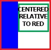
一个容器内有两个元素,其中一个蓝色的需要靠左,另一个绿色的相对于外部的红色居中。但是,如果屏幕太小,居中的容器(绿色)不能与左侧的容器(蓝色)重叠,它应该始终在蓝色的右侧。有没有办法实现这个呢?如果不是用CSS,那么可能是用JS吗?

大屏幕

enter image description here

小屏幕

enter image description here

到目前为止我得到了:

Fiddle

<div class="red">   
    <div class="blue">
        texttexttexttext
    </div>
    <div class="centered">
        Centered Container of fixed width
    </div>    
</div>

.red {
    height: 100px;
    text-align: center;
    border: 3px solid red;
    position: relative;
}
.blue {
    background: blue;
    height: 100%;
    float: left;

}
.centered {
    display: inline-block;
    border: 1px solid green;
    position: absolute;
    left: calc(50% - 70px);
    width: 140px;
    top: 0;
}

这会将绿色容器居中,但在较小的屏幕上会与蓝色重叠。

编辑:添加一些中心标记以便更容易看到中心位置


我已经更新了答案,请告诉我这是否是您要寻找的? - UID
9个回答

4
您可以使用绝对居中的变体技术:
.centered {
    position: absolute;
    left: 150px;  /* This is the position of the collision with the obstacle */
    right: 150px; /* Same value as above, in order to center */
    margin: auto; /* This centers */
    width: 140px; /* It needs a width */
}

演示

这种技术仅适用于障碍物在左侧而不是右侧的情况。

考虑向容器添加min-width以防止.centered溢出。


太棒了!看起来是完美的解决方案。 - nrodic
太好了!如果蓝色的宽度未知,是否可能使其工作? - skyisred
@skyisred 我不这么认为,除非使用JavaScript。 - Oriol
1
如果你不知道蓝色的宽度,那么这个JSFiddle可能是你需要的。尽管在我看来,Oriol已经回答了你最初的问题。 - nrodic
@skyisred 如果蓝色的宽度未知但不会变化,您可以尝试使用http://jsfiddle.net/cxbtv6z6/25/。 - Oriol

3

使用JavaScript,

var blue = document.getElementById('blue'),
    red = document.getElementById('red'),
    centered = document.getElementById('centered');
window.onresize = function() {
    centered.style.left = Math.max(
        blue.offsetWidth,
        (red.clientWidth-centered.offsetWidth) / 2
    ) + 'px';
}

Demo


2
如果蓝色框应该具有灵活的宽度,我认为唯一的解决方案是使用JavaScript。以下是你的fiddle的分支,将类更改为id并添加了window.onresize事件:http://jsfiddle.net/rf0zLpcs/
window.onresize= function() {
  var blue= document.getElementById('blue');
  var red=  document.getElementById('red');
  var centered= document.getElementById('centered');
  blue.style.width= Math.min(150,(red.offsetWidth-centered.offsetWidth)/2)+'px';
}

我觉得我没有表达清楚。蓝色的大小可以根据文本或其内部的其他元素而改变,但当屏幕变小时,它不能变得更小。我编辑了问题。 - skyisred

1

按照最佳实践:

首先创建“两个”盒子,使用“float:left”或“display:inline-block”将它们放在同一行。

现在第二步,在每个盒子中放置进一步的内容,然后相应地对齐它们。

以下是更新后的代码:

HTML

<div class="red">
    <div class="blue"></div>
    <div class="yellow">
        <div class="green">Centered container</div>
    </div>
</div>

CSS
* {
    box-sizing: border-box;
}
html, body {
    width:100%;
    height:100%;
    margin:0;
    padding:0;
}
.red {
    height: 100%;
    width: 100%;
    border: 1px solid red;
}
.blue {
    float:left;
    background: blue;
    width: 200px;
    height: 100%;
}
.yellow {
    float:left;
    border: 1px solid yellow;
    width: 75.5%;
    /* fallback if needed */
    width: calc(100% - 200px);
    height: 100%;
}
.green {
    background-color:green;
    width :200px;
    height:200px;
    margin: 0 auto;
}

这是更新后的Fiddle链接: http://jsfiddle.net/cxbtv6z6/3/


1
这将元素相对于黄色容器居中,绿色在遇到蓝色之前就远离红色的中心。 - skyisred
@skyisred - 看看我的答案,它正是你正在寻找的。 - Weafs.py
2
我更新了你的fiddle,以展示需要对齐的容器中心。 http://jsfiddle.net/cxbtv6z6/9/ 这些中心不匹配。 - skyisred

1
尝试一下这个:

演示:fiddle

HTML:

<div class="red large">
  <div id="centered">
    Centered container
  </div>
  <div class="blue">
  </div>
</div>

CSS:
.red {
    height: 100px;
    text-align: center;
    max-width: 300px;
    min-width: 130px;
    border: 3px solid red;
}
.blue {
    background: blue;
    width: 50px;
    height: 100px;
    position: absolute;
    top: 11px;
}

#centered {
    position: relative;
    text-align: center;
    width: 80px;
    left: 40%;
}

绿色容器相对于白色空间居中,而不是整个容器。我在你的fiddle上标记了元素中心,这些需要匹配,直到绿色与蓝色相遇。 http://jsfiddle.net/cxbtv6z6/10/ - skyisred

1

与@Oriol之前的JS解决方案相同,只是用jQuery包装,并在窗口加载时触发,以便在小屏幕上启动。 (请参见fiddle)。

var $blue   = $("#blue");
var $red    = $("#red");
var $center = $("#centered");

$(window).on("load resize", function () {
    var minLeft = Math.max(
        $blue.outerWidth(), 
        ($red.outerWidth() - $center.outerWidth()) / 2
    );

    $center.css("left",  minLeft + "px");
});

1

看起来这是可以用在页面头部,旁边有项目和标题在中间的东西。因此,我采取了一种非常不同且更简单的方法。当宽度不够时,视口居中不好看。使用媒体查询在居中模式之间切换。Fiddle演示

#main {
    position: relative;
    overflow: hidden;
    text-align: center;
}
#center {
    position: absolute;
    display: inline-block;
    left: 50%;
    transform: translateX(-50%);
}

@media (max-width: 500px) {
    #center {
        position: static;
        transform: none;
    }
}

0

尝试使用

.red {
    height: 100px;
    text-align: center;
    width: 300px;
    border: 3px solid red;
    position: relative;
}
.blue {
    background: blue;
    position: absolute;
    left: 0;
    top:0;
    width: 50px;
    height: 100%;
}
.centered{
    margin-left: 50px;
}

已更新 jsfiddle


2
那不是 OP 所要求的。当窗口大小调整时,红色边框的 div 应该被重新调整大小。 - Weafs.py

0
一个可能的解决方案是这样的: HTML:
<div class="red">   
    <div class="blue">
    </div>
    <div>
    <div class="centered">
        Centered Container of fixed width
    </div>    
</div>
<br/>
The pink and light geen background sides mark centers of the containers. These centers should align until green container meets blue container.

CSS

.red {
    height: 100px;
    text-align: center;
    border: 3px solid red;
    position: relative;
    background: linear-gradient(to right, #ffffff 50%,#ffe2e2 50%,#ffe2e2 100%);
}
.blue {
    background: blue;
    width: 150px;
    height: 100%;
}
.centered {
    display:inline-block;
    height: 50px;
    border: 3px solid green;
    position: absolute;
    left: calc(50% - 73px);
    width: 140px;
    top: 0;
     background: linear-gradient(to right, #ffffff 50%,#CDF2DD 50%,#CDF2DD 100%);
}

jQuery

var width = 0;
var sizeBlue = $(".blue").width();

$(window).resize(function() {
    var offset = $(".centered").offset();
    var right = $(window).width()-sizeBlue;
    if (offset.left <= sizeBlue){
        $(".centered").css("left",sizeBlue);
        width = $(window).width()-sizeBlue;
    } else if (right > width){
        $(".centered").css("left","calc(50% - 73px)");
    }
});

请查看此链接jsfiddle以了解其工作原理。

希望它对您有用!


这里的文本相对于黄色容器居中,而不是红色容器。 - skyisred
你想让它相对于红色的居中吗? - Academia
好的!我更新了 Fiddle 以显示一些中心标记。 http://jsfiddle.net/cxbtv6z6/12/ 这些应该对齐,直到绿色与蓝色相遇。 - skyisred

网页内容由stack overflow 提供, 点击上面的
可以查看英文原文,
原文链接