如何强制内联div保持在同一行?

51

我正在尝试制作一个三列布局。我希望左右两列的宽度仅为其子内容的宽度。我希望中间列扩展以填满剩余空间。

我正在尝试以下方法(概述,包含jsfiddle链接):

#colLeft {
  display: inline;
  float: left;
}
#colCenter {
  float: left;
  display: inline;
  overflow: none;
  white-space: nowrap;
}
#colRight {
  display: inline;
  float: right;
}

<div id="parent" style="width:100%">
  <div id="colLeft">left</div>
  <div id="colCenter">Some really long text in the center. Some really long text in the center.</div>
  <div id="colRight">right</div>
</div>

fiddle: http://jsfiddle.net/5kszQ/

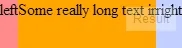
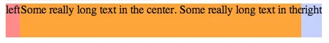
但当中间列的内容过长时,中间列会将右侧列推到下方。我希望三列都在同一行,并且中间列根据需要缩小。这是上面链接给我的效果:
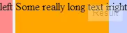
enter image description here

而我希望得到的是:

enter image description here

谢谢您的帮助。


1
任何一个宽度是否固定? - Arun P Johny
1
所有的宽度都没有固定。 - user1219278
1
你必须为每个 div 设置 max-width。移除 white-space 属性,然后添加 word-break: break-all; - Hensembryan
6个回答

25

下面是一种使用inline-block方法来放置左侧和中间元素,同时使用position:absolute方法来放置右边元素的方式。

示例

jsFiddle链接

HTML代码:

<div id="parent" style="width:100%">
    <div id="colLeft">left</div><!--
    --><div id="colCenter">Some really long text in the center. Some really long text in the center.</div>
    <div id="colRight">right</div>
</div>

CSS

html, body {
    margin: 0px;
    padding: 0px;
}
#parent {
    background-color: #eee;
    height: 48px;
    position:relative;
    overflow:hidden;
    white-space: nowrap;
}
#colLeft {
    background-color: #ff8b8b;
    height: 48px;
    display: inline-block;
}
#colCenter {
    background-color: orange;
    height: 48px;
    display: inline-block;
    overflow: hidden;
}
#colRight {
    background-color: #c3d0ff;
    height: 48px;
    display: inline;
    float: right;
    position:absolute;
    top:0;
    right:0;
}

由于它依赖于 inline-block,因此在两个 <div> 之间加入注释以消除如下图所示的空格:

丑陋的间距

text-overflow:ellipsis

当使用 text-overflow:ellipsis 时,为了实现这一点,您可能需要回退到 JavaScript,以下是一个可能的解决方案 (jsFiddle)。

使用JavaScript的省略号

window.onresize = updateDimensions;

function updateDimensions() {
    var parent = document.getElementById('parent');
    var left = document.getElementById('colLeft');
    var right = document.getElementById('colRight');
    var middle = document.getElementById('colCenter');

    middle.style.width = (parent.offsetWidth - right.offsetWidth - left.offsetWidth)  + 'px';
}

为了修复inline-block元素之间的空格,您可以将父容器中的字体大小设置为0,然后在子元素中重新声明所需的字体大小 :) - Terry
有几种不同的解决方法,但说实话它们都不太好:P - Daniel Imms
使用这种方法,那么在colCenter上使用"text-overflow: ellipsis"是不起作用的,对吧?如果我理解正确,colCenter的一部分处于z-order下面的colRight之下,对吧?谢谢。 - user1219278
是的。在这种情况下使用inline-block的问题在于内容容器(在此情况下有三个)仅宽到其内容所需的宽度 - 因此,当视口变得太窄时,宽度不会正确折叠:溢出,文本溢出都无法解决,除非设置了最小宽度,而这必须要进行一定的计算。我可以想到一个JS + CSS组合解决方案,但没有纯CSS解决方案。 - Terry

20

如果您可以接受一些HTML更改,那么这应该会给您所需的东西:

<div id="parent" style="width:100%">  
  <div id="colLeft">left</div>
  <div id="colwrap">
      <div id="colRight">right</div>
      <div id="colCenter">Some really long text in the center. Some really long text in the center.</div>  
    </div>
</div>

并且 CSS 应该如下:

html, body {
  margin: 0px;
  padding: 0px;
}
#parent {
  background-color: #eee;
  height: 48px;
}
#colLeft {
  background-color: #ff8b8b;
  height: 48px;
  float: left;
}
#colwrap{
    overflow:hidden;
    background-color: orange;      
}
#colCenter {
  height: 48px;  
}
#colRight {
  background-color: #c3d0ff;
  height: 48px;
  float: right;
}

jsFiddle: http://jsfiddle.net/gajbhiye/ZX97K/ 希望这能有所帮助。


你为什么要用"#"代替"."? - user5306470
3
“#”是用于表示id的CSS选择器(http://www.w3schools.com/cssref/css_selectors.asp),而“.”则是类选择器。 - deseosuho
为什么使用其中一个而不是另一个? - user5306470
3
ID用于定位特定元素,而class可用于定位一组元素。 - Mhluzi Bhaka
ID应该只在页面上使用一次,而在整个网页中使用类来定位多个需要相同样式的元素是可以的。 - Emma Earl Kent

3
通过为中间和右侧元素添加一些大的边距,并使用相对定位来补偿,以使浏览器认为所有内容都适合单行。请参见更新后的fiddle
标记:保持不变。
样式:
#parent {
  background-color: #eee;
  height: 48px;
  overflow: hidden;
}
#colLeft {
  background-color: #ff8b8b;
  height: 48px;
  float: left;
}
#colCenter {
  background-color: orange;
  height: 48px;
  float: left;
  margin-left: -2000px;
  position: relative;
  left: 2000px;
}
#colRight {
  background-color: #c3d0ff;
  height: 48px;
  float: right;
  margin-right: -2000px;
  position: relative;
  left: -2000px;
}

我喜欢这个解决方案。此外,如果右列的宽度是固定的,有一种很好的方法可以使中间列的溢出效果更好:在colRight的背景中添加左填充,并添加一个从完全透明到完全不透明的渐变。http://jsfiddle.net/a52fm2am/1/ - Viljo Viitanen

0
通过设置DIV的display、float和position属性的组合,我使得三个子DIV保持在同一行。
父DIV的display属性设置为inline-block。 前两个子DIV的float属性设置为left。 右侧子DIV的float属性设置为right,display属性设置为inline,position属性设置为absolute。

.parent {
           width:100%;
            margin: 0 auto 10;
            clear:both; 
            margin-top:3px;
            display:inline-block;
            padding: 0.5em 0 0.5em 0;
        }
        .colLeft {
          float: left; 
          margin: 5px auto;
        }
        .colCenter {
          float:left; 
         position:relative;
          width:85%;
          margin: 5px auto 5px 5px;
        }
        .colRight {
           float: right;            
           display: inline; 
           position:absolute;
           margin-left: 2px;
        }
    <body>
    <div class="parent">
      <div class="colLeft">[0002]</div>
      <div class="colCenter">Very long text. Input the paragraph which describes the technical field here.Input the paragraph which describes the technical field here.Input the paragraph which describes the technical field here.Input the paragraph which describes the technical field here.Input the paragraph which describes the technical field here.Input the paragraph which describes the technical field here.</div>
      <div class="colRight"><b>*Note:123</b></div>
    </div>
    </body>


0

试一下这个

<html>
<head>
    <style type="text/css">
        #parent {
          word-break:break-all;
        }
        #colLeft {
          float:left;
          max-width: 5%;
        }
        #colCenter {
          float:left;
          max-width: 90%;
        }
        #colRight {
          float: right;
          max-width: 5%;
        }
    </style>
</head>
<body>
    <div id="parent" style="width:100%">
      <div id="colLeft">leftawefawefawefawef</div>
      <div id="colCenter">Some really long text in the center. Some really long text in the center.khjjjjjjjjjjjjjjjjjjjjjjjkjhkjhklkjlSome really long text in the center. Some really long text in the center.khjjjjjjjjjjjjjjjjjjjjjjjkjhkjhklkjlSome really long text in the center. Some really long text in the center.khjjjjjjjjjjjjjjjjjjjjjjjkjhkjhklkjlSome really long text in the center. Some really long text in the center.khjjjjjjjjjjjjjjjjjjjjjjjkjhkjhklkjlSome really long text in the center. Some really long text in the center.khjjjjjjjjjjjjjjjjjjjjjjjkjhkjhklkjlSome really long text in the center. Some really long text in the center.khjjjjjjjjjjjjjjjjjjjjjjjkjhkjhklkjlSome really long text in the center. Some really long text in the center.khjjjjjjjjjjjjjjjjjjjjjjjkjhkjhklkjlSome really long text in the center. Some really long text in the center.khjjjjjjjjjjjjjjjjjjjjjjjkjhkjhklkjlSome really long text in the center. Some really long text in the center.khjjjjjjjjjjjjjjjjjjjjjjjkjhkjhklkjlSome really long text in the center. Some really long text in the center.khjjjjjjjjjjjjjjjjjjjjjjjkjhkjhklkjl</div>
      <div id="colRight">rightaewfaewfawefawef</div>
    </div>
</body>


-1
只需将子div放入表格单元格中,而将表格放入父div中。不需要样式。
<div id="parent" style="width: 100%">
 <table>
  <tr>
   <td><div id="colLeft">left</div></td>
   <td><div id="colCenter">Some really long text in the center. Some really long text in the center.</div></td>
   <td><div id="colRight">right</div></td>
  </tr>
 </table>
</div>

1
请记住问题的年龄是“7+年”,因此请提供您的解决方案适用的版本。评论结束。 - ZF007

网页内容由stack overflow 提供, 点击上面的
可以查看英文原文,
原文链接