如何将echart的x轴类型设置为时间,以显示一天的时间段

7

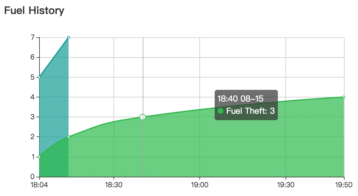
我正在使用 echarts,但在尝试将一天的时间段显示在 X 轴上时遇到了问题。以下是我的代码:

this.area = {
    color: ["#009C95","#21ba45"],
    title : {
        text: 'Fuel History',
        textStyle: {
            fontFamily: 'lato'
        }
    },
    tooltip : {
        trigger: 'axis'
    },
    calculable : true,
    xAxis : [
        {
            type: 'time',
            boundaryGap:false,
            axisLabel: {
                formatter: (function(value){
                    return moment(value).format('HH:mm');
                })
            },
            data : dates
        }
    ],
    yAxis : [
        {
            type : 'value'
        }
    ],
    series : [
        {
            backgroundColor: '#4D86FF',
            name:'Refuelling',
            type:'line',
            smooth:true,
            itemStyle: {normal: {areaStyle: {type: 'default'}}},
            data: historyRefuelling
        },
        {
            name:'Fuel Theft',
            type:'line',
            smooth:true,
            itemStyle: {normal: {areaStyle: {type: 'default'}}},
            data: historyTheft
        }
    ]
}

以下是样例日期和历史数据:`

`
    let dates = [
      "2018-08-15T10:04:01.339Z",
      "2018-08-15T10:14:13.914Z",
      "2018-08-15T10:40:03.147Z",
      "2018-08-15T11:50:14.335Z",
      "2018-08-15T12:04:05.655Z",
      "2018-08-15T15:00:19.441Z"
    ]

    let historyRefuelling = [1,1]

    let historyTheft = [
        1,1,1,1
    ]

图表显示正确,但X轴跨度从2017年12月31日到2018年1月2日,导致结果显示为点图而不是具有两个系列数据的面积图。是否有方法告诉echarts在指定时间开始和结束X轴? 或者说,我该如何解决这个问题?
1个回答

34

xAxis.minxAxis.max 这两个可以设置来实现这个目标;

查看 xAxis.minxAxis.max 的文档 以获取更多详细信息。

xAxis.minInterval 可以设置轴标签之间的间隔,例如一小时或一天。

如果使用 type=time,则不需要设置 Axis 的数据,只需设置系列数据,轴范围将根据给定的时间自动设置,例如:

let historyRefuelling = [["2018-08-15T10:04:01.339Z",5],["2018-08-15T10:14:13.914Z",7]]

let historyTheft = [
    ["2018-08-15T10:04:01.339Z",1],[ "2018-08-15T10:14:13.914Z",2],[ "2018-08-15T10:40:03.147Z",3],[ "2018-08-15T11:50:14.335Z",4]
]

option =    {
    color: ["#009C95","#21ba45"],
    title : {
        text: 'Fuel History',
        textStyle: {
            fontFamily: 'lato'
        }
    },
    tooltip : {
        trigger: 'axis'
    },
    calculable : true,
    xAxis : [
        {
            type: 'time',
            boundaryGap:false,
            axisLabel: {
                formatter: (function(value){
                    return moment(value).format('HH:mm');
                })
            }
        }
    ],
    yAxis : [
        {
            type : 'value'
        }
    ],
    series : [
        {
            backgroundColor: '#4D86FF',
            name:'Refuelling',
            type:'line',
            smooth:true,
            itemStyle: {normal: {areaStyle: {type: 'default'}}},
            data: historyRefuelling
        },
        {
            name:'Fuel Theft',
            type:'line',
            smooth:true,
            itemStyle: {normal: {areaStyle: {type: 'default'}}},
            data: historyTheft
        }
    ]
}

检查这个演示 在这里输入图像描述

@IanZhong 如果我们使用dataZoom选项,所有数据点都会成为一条垂直线(xAxis的值会转换为日期)。 - Chaitanya
链接已经失效,演示也无法运行。 - Jason Sturges

网页内容由stack overflow 提供, 点击上面的
可以查看英文原文,
原文链接