作为非线性回归分析的输出图表,来自此链接
有没有一种方法可以在ggplot中绘制拟合值,比如smooth()函数的特定功能?
https://stats.stackexchange.com/questions/209087/non-linear-regression-mixed-model
使用此数据集:zz <-(" iso temp diam
Itiquira 22 5.0
Itiquira 22 4.7
Itiquira 22 5.4
Itiquira 25 5.8
Itiquira 25 5.4
Itiquira 25 5.0
Itiquira 28 4.9
Itiquira 28 5.2
Itiquira 28 5.2
Itiquira 31 4.2
Itiquira 31 4.0
Itiquira 31 4.1
Londrina 22 4.5
Londrina 22 5.0
Londrina 22 4.4
Londrina 25 5.0
Londrina 25 5.5
Londrina 25 5.3
Londrina 28 4.6
Londrina 28 4.3
Londrina 28 4.9
Londrina 31 4.4
Londrina 31 4.1
Londrina 31 4.4
Sinop 22 4.5
Sinop 22 5.2
Sinop 22 4.6
Sinop 25 5.7
Sinop 25 5.9
Sinop 25 5.8
Sinop 28 6.0
Sinop 28 5.5
Sinop 28 5.8
Sinop 31 4.5
Sinop 31 4.6
Sinop 31 4.3"
)
df <- read.table(text=zz, header = TRUE)
这个拟合模型有四个参数:
thx:最佳温度
thy:最佳直径
thq:曲率
thc:偏度
library(nlme)

df <- groupedData(diam ~ temp | iso, data = df, order = FALSE)

n0 <- nlsList(diam ~ thy * exp(thq * (temp - thx)^2 + thc * (temp - thx)^3),
      data = df,
      start = c(thy = 5.5, thq = -0.01, thx = 25, thc = -0.001))

> n0
# Call:
#  Model: diam ~ thy * exp(thq * (temp - thx)^2 + thc * (temp - thx)^3) | iso

# Coefficients:
              thy          thq      thx           thc
# Itiquira 5.403118 -0.007258245 25.28318 -0.0002075323
# Londrina 5.298662 -0.018291649 24.40439  0.0020454476
# Sinop    5.949080 -0.012501783 26.44975 -0.0002945292

# Degrees of freedom: 36 total; 24 residual
# Residual standard error: 0.2661453
有没有一种方法可以在ggplot中绘制拟合值,比如smooth()函数的特定功能?
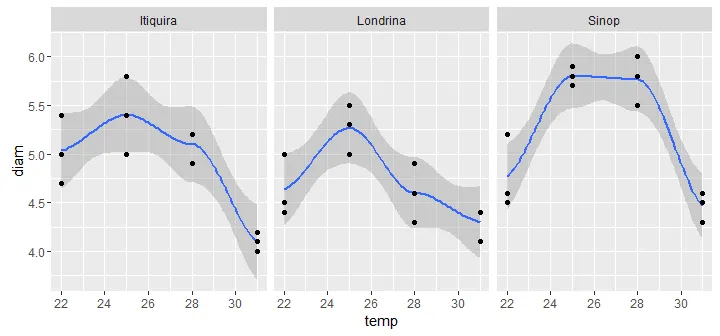
我想我找到了它...(基于http://rforbiochemists.blogspot.com.br/2015/06/plotting-two-enzyme-plots-with-ggplot.html)
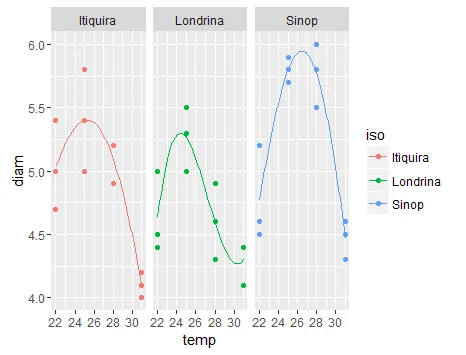
ip <- ggplot(data=daf,  aes(x=temp, y=diam, colour = iso)) +
  geom_point() + facet_wrap(~iso)

ip + geom_smooth(method = "nls",
                method.args = list(formula = y ~ thy * exp(thq * (x-thx)^2 + thc * (x - thx)^3),
                                   start = list(thy=5.4, thq=-0.01, thx=25, thc=0.0008)),
                se = F, size = 0.5, data = subset(daf, iso=="Itiquira")) +

  geom_smooth(method = "nls",
              method.args = list(formula = y ~ thy * exp(thq * (x-thx)^2 + thc * (x - thx)^3),
                                 start = list(thy=5.4, thq=-0.01, thx=25, thc=0.0008)),
              se = F, size = 0.5, data = subset(daf, iso=="Londrina")) +

  geom_smooth(method = "nls",
              method.args = list(formula = y ~ thy * exp(thq * (x-thx)^2 + thc * (x - thx)^3),
                                 start = list(thy=5.4, thq=-0.01, thx=25, thc=0.0008)),
              se = F, size = 0.5, data = subset(daf, iso=="Sinop"))
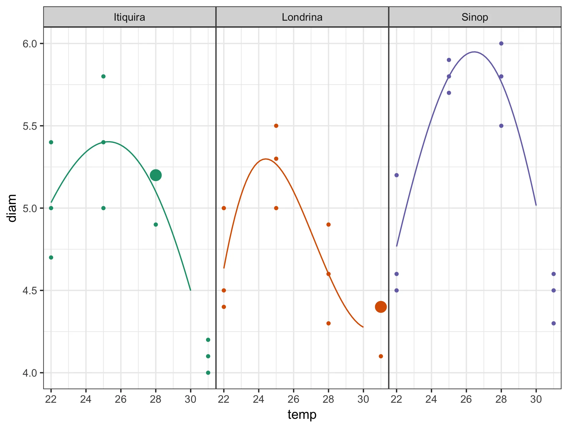
predict和geom_line来连接变量的最小值和最大值之间的大量点?这样做是否可以得到你需要的结果? - shrgmgeom_smooth中的基本nls代码开始(例如这里),然后添加一个group或color美学来适应每个组的单独模型。 - aosmith