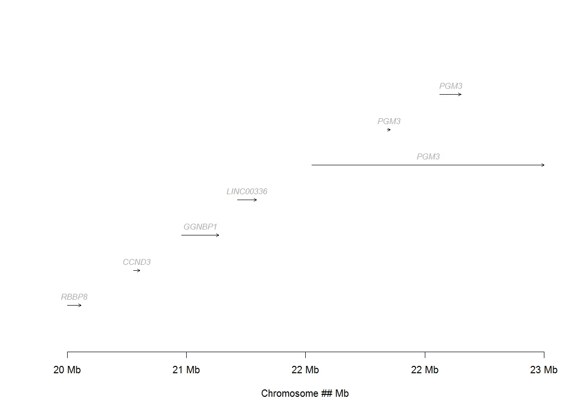
由于范围非常广,我无法为您的数据找出如何实现。我已经使用arrows为虚假数据制作了一个类似的图表。但是,这可能需要进一步修改才能适用于您的数据。
数据
mydata = structure(list(GENE = structure(c(5L, 1L, 2L, 3L, 4L, 4L, 4L), .Label = c("CCND3",
"GGNBP1", "LINC00336", "PGM3", "RBBP8"), class = "factor"), CHR = structure(c(1L,
1L, 1L, 1L, 1L, 1L, 1L), .Label = "chr18", class = "factor"),
    txStart = c(20500000L, 20780190L, 20982780L, 21218290L, 21533530L,
    21851180L, 22073300L), txEnd = c(20557770L, 20806930L, 21140420L,
    21299010L, 22513330L, 21863505L, 22162610L), Size = c(57770L,
    26740L, 157640L, 80720L, 979800L, 12325L, 89310L), STRAND = structure(c(1L,
    1L, 2L, 1L, 1L, 1L, 1L), .Label = c("-", "+"), class = "factor")), .Names = c("GENE",
"CHR", "txStart", "txEnd", "Size", "STRAND"), class = "data.frame", row.names = c(NA,
-7L))
代码
graphics.off()
windows(width = 10, height = 7)
plot(x = c(min(mydata$txStart), max(mydata$txEnd)), y = c(0,nrow(mydata)+1),
type = "p", pch = NA, axes = FALSE, xlab = "Chromosome ## Mb", ylab = "")
x_label = seq(min(mydata$txStart),max(mydata$txEnd),(max(mydata$txEnd) - min(mydata$txStart))/4)
axis(1, at = x_label, labels = paste(as.character(round(x_label/1000000),2)," Mb",sep =""))
y_pos = 1
for (i in 1:nrow(mydata)){
arrows(x0 = mydata$txStart[i], x1 = mydata$txEnd[i], y0 = y_pos, y1 = y_pos, length = 0.05)
x_pos = mydata$txStart[i] + (mydata$txEnd[i] - mydata$txStart[i])/2
gene_label = paste(mydata$GENE[i])
text(x_pos, y_pos, bquote(italic(.(gene_label))), pos = 3, col = "darkgrey", cex = 0.8)
y_pos = y_pos + 1
}
绘图