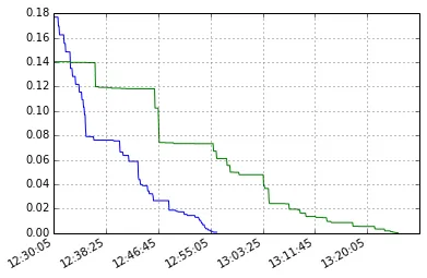
我有两个不同的时间序列,想在同一张图上绘制它们。
它们都是在12:30:00~1:25:00之间的序列,但它们的时间序列不同:一个是5秒,另一个约为10.3秒。两个序列的类型均为“pandas.core.series.Series”。时间索引的类型为字符串,由strftime生成。 例如, A序列将是:
12:30:05    0.176786
12:30:15    0.176786
12:30:26    0.176786
...
13:22:26    0.002395
13:22:37    0.002395
13:22:47    0.001574
而B系列将是:
12:30:05    0.140277
12:30:10    0.140277
12:30:15    0.140277
...
13:24:20    0.000642
13:24:25    0.000642
13:24:30    0.000454
我尝试将这两个系列绘制在同一个图表上:
import matplotlib.pyplot as plt
A.plot()
B.plot()
plt.gcf().autofmt_xdate()
plt.show()
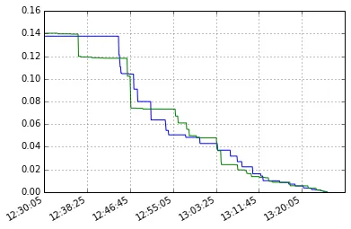
而它的工作原理如下:
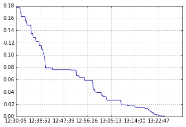
如果我只绘制A系列,那就很清楚了。
a和x是什么?你是如何存储这两个序列的?你能将其转换为 MCVE 吗? - tmdavisonA和B的类型是什么?是Pandas数据框吗?如果是,您应该提到它... - Bas Swinckels