原因
问题在于浮动元素是脱离文档流的:
如果一个元素浮动、绝对定位或者是根元素,那么它就被称为脱离文档流。
因此,它们不像行内元素那样影响周围的元素。
这在9.5 浮动中有解释:
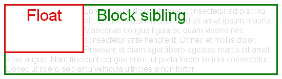
由于浮动元素不在文档流中,所以在浮动框之前和之后创建的非定位块级盒子会垂直地流动,就好像浮动元素不存在一样。但是,与浮动元素相邻的当前和随后的行级盒子会缩短,以便为浮动元素的边距盒留出空间。
html {
  width: 550px;
  border: 1px solid;
}
body {
  font-family: sans-serif;
  color: rgba(0,0,0,.15);
}
body:after {
  content: '';
  display: block;
  clear: both;
}
div {
  position: relative;
}
div:after {
  font-size: 200%;
  position: absolute;
  left: 0;
  right: 0;
  top: 0;
  text-align: center;
}
.block-sibling {
  border: 3px solid green;
}
.block-sibling:after {
  content: 'Block sibling';
  color: green;
}
.float {
  float: left;
  border: 3px solid red;
  height: 90px;
  width: 150px;
  z-index: 1;
}
.float:after {
  content: 'Float';
  color: red;
}
<div class="float"></div>
<div class="block-sibling">
  Lorem ipsum dolor sit amet, consectetur adipiscing elit. Donec a diam lectus. Sed sit amet ipsum mauris. Maecenas congue ligula ac quam viverra nec consectetur ante hendrerit. Donec et mollis dolor. Praesent et diam eget libero egestas mattis sit amet vitae augue. Nam tincidunt congue enim, ut porta lorem lacinia consectetur. Donec ut libero sed arcu vehicula ultricies a non tortor.
</div>
这也在
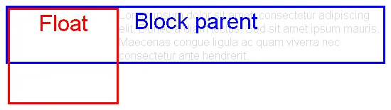
10.6计算高度和边距中有所说明。对于
"正常"块,
只有正常流中的子元素会被考虑进去(即浮动框和绝对定位框将被忽略[...]
html {
  width: 550px;
  border: 1px solid;
}
body {
  font-family: sans-serif;
  color: rgba(0,0,0,.15);
}
body:after {
  content: '';
  display: block;
  clear: both;
}
div {
  position: relative;
}
div:after {
  font-size: 200%;
  position: absolute;
  left: 0;
  right: 0;
  top: 0;
  text-align: center;
}
.block-parent {
  border: 3px solid blue;
}
.block-parent:after {
  content: 'Block parent';
  color: blue;
}
.float {
  float: left;
  border: 3px solid red;
  height: 130px;
  width: 150px;
}
.float:after {
  content: 'Float';
  color: red;
}
<div class="block-parent">
  <div class="float"></div>
  Lorem ipsum dolor sit amet, consectetur adipiscing elit. Donec a diam lectus. Sed sit amet ipsum mauris. Maecenas congue ligula ac quam viverra nec consectetur ante hendrerit.
</div>
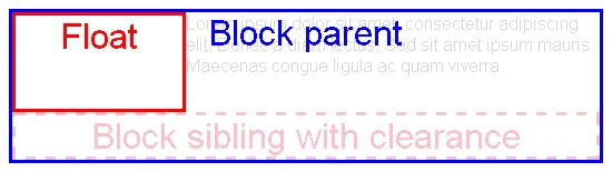
妙招:清除浮动
解决问题的方法是强制某些内联元素放置在所有浮动元素下方。然后,父元素的高度将增长以包裹该元素(因此也包裹了浮动元素)。
可以使用 clear 属性来实现:
此属性指示元素框的哪些边缘可能不与之前的浮动框相邻。
html {
  width: 550px;
  border: 1px solid;
}
body {
  font-family: sans-serif;
  color: rgba(0,0,0,.15);
}
body:after {
  content: '';
  display: block;
  clear: both;
}
div {
  position: relative;
}
div:after {
  font-size: 200%;
  position: absolute;
  left: 0;
  right: 0;
  top: 0;
  text-align: center;
}
.block-parent {
  border: 3px solid blue;
}
.block-parent:after {
  content: 'Block parent';
  color: blue;
}
.float {
  float: left;
  border: 3px solid red;
  height: 84px;
  width: 150px;
}
.float:after {
  content: 'Float';
  color: red;
}
.clear {
  clear: both;
  text-align: center;
  height: 37px;
  border: 3px dashed pink;
}
.clear:after {
  position: static;
  content: 'Block sibling with clearance';
  color: pink;
}
<div class="block-parent">
  <div class="float"></div>
  Lorem ipsum dolor sit amet, consectetur adipiscing elit. Donec a diam lectus. Sed sit amet ipsum mauris. Maecenas congue ligula ac quam viverra.
  <div class="clear"></div>
</div>
因此,解决方案是在浮动元素的最后一个兄弟元素后添加一个具有clear: both属性的空元素。
<div style="clear: both"></div>
然而,这不是语义化的。因此最好在父元素末尾生成一个伪元素:
.clearfix::after {
  clear: both;
  display: block;
}
这种方法有多个变体,例如使用已弃用的单冒号语法
:after来支持旧版浏览器,或使用其他
块级显示方式,如
display: table。
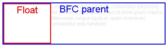
解决方案:BFC根
在开头定义的问题行为中有一个例外:如果块元素建立了
块级格式化上下文(是BFC根),那么它也会包装其浮动内容。
根据
10.6.7“自动”高度的块级格式化上下文根,
如果该元素具有任何浮动后代,其底部边缘低于元素的底部内容边缘,则将增加高度以包括这些边缘。
html {
  width: 550px;
  border: 1px solid;
}
body {
  font-family: sans-serif;
  color: rgba(0,0,0,.15);
}
body:after {
  content: '';
  display: block;
  clear: both;
}
div {
  position: relative;
}
div:after {
  font-size: 200%;
  position: absolute;
  left: 0;
  right: 0;
  top: 0;
  text-align: center;
}
.block-parent {
  border: 3px solid blue;
}
.block-parent.bfc-root:after {
  content: 'BFC parent';
  color: blue;
}
.float {
  float: left;
  border: 3px solid red;
  height: 127px;
  width: 150px;
}
.float:after {
  content: 'Float';
  color: red;
}
.bfc-root {
  overflow: hidden;
}
<div class="block-parent bfc-root">
  <div class="float"></div>
  Lorem ipsum dolor sit amet, consectetur adipiscing elit. Donec a diam lectus. Sed sit amet ipsum mauris. Maecenas congue ligula ac quam viverra nec consectetur ante hendrerit.
</div>
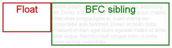
此外,正如
9.5浮动所解释的那样,BFC根据以下原因也非常有用:
表格的边框盒子、块级替换元素或在正常流中建立新块格式化上下文的元素[...]不得与同一块格式化上下文中任何浮动元素的外边距框重叠。
html {
  width: 550px;
  border: 1px solid;
}
body {
  font-family: sans-serif;
  color: rgba(0,0,0,.15);
}
body:after {
  content: '';
  display: block;
  clear: both;
}
div {
  position: relative;
}
div:after {
  font-size: 200%;
  position: absolute;
  left: 0;
  right: 0;
  top: 0;
  text-align: center;
}
.block-sibling {
  border: 3px solid green;
}
.block-sibling.bfc-root:after {
  content: 'BFC sibling';
  color: green;
}
.float {
  float: left;
  border: 3px solid red;
  height: 90px;
  width: 150px;
  z-index: 1;
}
.float:after {
  content: 'Float';
  color: red;
}
.bfc-root {
  overflow: hidden;
}
<div class="float"></div>
<div class="block-sibling bfc-root">
  Lorem ipsum dolor sit amet, consectetur adipiscing elit. Donec a diam lectus. Sed sit amet ipsum mauris. Maecenas congue ligula ac quam viverra nec consectetur ante hendrerit. Donec et mollis dolor. Praesent et diam eget libero egestas mattis sit amet vitae augue. Nam tincidunt congue enim, ut porta lorem lacinia consectetur.
</div>
一个块级格式化上下文是由什么建立的
Block boxes with overflow other than visible, e.g. hidden
.bfc-root {
overflow: hidden;
}
Block containers that are not block boxes: when display is set to inline-block, table-cell or table-caption.
.bfc-root {
  display: inline-block;
}
Floating elements: when float is set to left or right.
.bfc-root {
  float: left;
}
Absolutely positioned elements: when position is set to absolute or fixed.
.bfc-root {
  position: absolute;
}
请注意,这些可能会产生不良的副作用,例如剪切溢出内容、使用
收缩适应算法计算自动宽度,或者变得失去流程。因此问题在于,不可能拥有一个可见溢出的内联块级元素来建立BFC。
Display L3 解决了这些问题:
创建了 flow 和 flow-root 内部显示类型,以更好地表示流动布局显示类型并创建一个显式开关,使元素成为BFC根。 (这应该消除了像::after {clear:both;}和overflow:hidden之类的hack的需求[...]
不幸的是,目前还没有浏览器支持。最终我们可能能够使用。
.bfc-root {
  display: flow-root;
}
overflow:hidden会尽最大努力强制浏览器包含父元素的子元素。这就是为什么它可以修复问题。 - Doug Neineroverflow: hidden的解释在这里:链接。非常感谢,它对我有用。 - Vikas Aroraoverflow: hidden只会隐藏流出父容器的元素部分。对我来说,这导致某些文本变得无法阅读。 - Top Cat