如何在切换按钮上添加“ON”和“OFF”文本

58

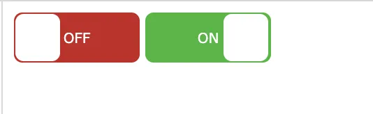
在我的项目中,我想在现有的切换代码中添加文本。所以我想要的是,当切换打开时,它应该显示文本“ON”,并在切换关闭时显示“OFF”文本。由于已经使用后端对其进行了处理,因此我无法更改为其他切换。我只想输入“ON”和“OFF”文本。谢谢。

这是我的代码

  .switch input {
  display: none;
}

.slider {
  position: absolute;
  cursor: pointer;
  top: 0;
  left: 0;
  right: 0;
  bottom: 0;
  background-color: #ca2222;
  -webkit-transition: .4s;
  transition: .4s;
}

.slider:before {
  position: absolute;
  content: "";
  height: 26px;
  width: 26px;
  left: 4px;
  bottom: 4px;
  background-color: white;
  -webkit-transition: .4s;
  transition: .4s;
}

input:checked+.slider {
  background-color: #2ab934;
}

input:focus+.slider {
  box-shadow: 0 0 1px #2196F3;
}

input:checked+.slider:before {
  -webkit-transform: translateX(26px);
  -ms-transform: translateX(26px);
  transform: translateX(26px);
}


/* Rounded sliders */

.slider.round {
  border-radius: 34px;
}

.slider.round:before {
  border-radius: 50%;
<label class="switch"><input type="checkbox" id="togBtn"><div class="slider round"></span></div></label>


以下是一个带有示例的代码,可用于切换开关。 http://www.aspdotnetkhan.com/toggle-switch-68.aspx - Firoz Khan
8个回答

131

你可以像这样做:

.switch {
  position: relative;
  display: inline-block;
  width: 90px;
  height: 34px;
}

.switch input {display:none;}

.slider {
  position: absolute;
  cursor: pointer;
  top: 0;
  left: 0;
  right: 0;
  bottom: 0;
  background-color: #ca2222;
  -webkit-transition: .4s;
  transition: .4s;
}

.slider:before {
  position: absolute;
  content: "";
  height: 26px;
  width: 26px;
  left: 4px;
  bottom: 4px;
  background-color: white;
  -webkit-transition: .4s;
  transition: .4s;
}

input:checked + .slider {
  background-color: #2ab934;
}

input:focus + .slider {
  box-shadow: 0 0 1px #2196F3;
}

input:checked + .slider:before {
  -webkit-transform: translateX(55px);
  -ms-transform: translateX(55px);
  transform: translateX(55px);
}

/*------ ADDED CSS ---------*/
.on
{
  display: none;
}

.on, .off
{
  color: white;
  position: absolute;
  transform: translate(-50%,-50%);
  top: 50%;
  left: 50%;
  font-size: 10px;
  font-family: Verdana, sans-serif;
}

input:checked+ .slider .on
{display: block;}

input:checked + .slider .off
{display: none;}

/*--------- END --------*/

/* Rounded sliders */
.slider.round {
  border-radius: 34px;
}

.slider.round:before {
  border-radius: 50%;}
<label class="switch">
 <input type="checkbox" id="togBtn">
 <div class="slider round">
  <!--ADDED HTML -->
  <span class="on">ON</span>
  <span class="off">OFF</span>
  <!--END-->
 </div>
</label>

或者纯CSS:

.switch {
  position: relative;
  display: inline-block;
  width: 90px;
  height: 34px;
}

.switch input {display:none;}

.slider {
  position: absolute;
  cursor: pointer;
  top: 0;
  left: 0;
  right: 0;
  bottom: 0;
  background-color: #ca2222;
  -webkit-transition: .4s;
  transition: .4s;
   border-radius: 34px;
}

.slider:before {
  position: absolute;
  content: "";
  height: 26px;
  width: 26px;
  left: 4px;
  bottom: 4px;
  background-color: white;
  -webkit-transition: .4s;
  transition: .4s;
  border-radius: 50%;
}

input:checked + .slider {
  background-color: #2ab934;
}

input:focus + .slider {
  box-shadow: 0 0 1px #2196F3;
}

input:checked + .slider:before {
  -webkit-transform: translateX(26px);
  -ms-transform: translateX(26px);
  transform: translateX(55px);
}

/*------ ADDED CSS ---------*/
.slider:after
{
 content:'OFF';
 color: white;
 display: block;
 position: absolute;
 transform: translate(-50%,-50%);
 top: 50%;
 left: 50%;
 font-size: 10px;
 font-family: Verdana, sans-serif;
}

input:checked + .slider:after
{  
  content:'ON';
}

/*--------- END --------*/
<label class="switch">
<input type="checkbox" id="togBtn">
<div class="slider round"></div>
</label>


1
我如何在表单加载后根据条件编程设置已选值?我已经使用了您答案的纯CSS版本,但对Web开发不熟悉。 - Rakibul Haq
1
已经得到了答案,使用一个变量并在输入标签内使用内联 PHP echo..无论如何还是谢谢。 - Rakibul Haq
如何使第一个选项符合ADA标准? - Metropolis
1
最好使用 em 来进行尺寸调整,这样更容易实现响应式设计:http://jsfiddle.net/d0g4tbcj/ - Zach Saucier
3
document.getElementById('togBtn').checked 是获取其值的正确方式。之前尝试使用 val(),但没有起作用。可能会对某些人有帮助。 - Mohsin

20

.switch {
  position: relative;
  display: inline-block;
  width: 90px;
  height: 34px;
}

.switch input {display:none;}

.slider {
  position: absolute;
  cursor: pointer;
  top: 0;
  left: 0;
  right: 0;
  bottom: 0;
  background-color: #ca2222;
  -webkit-transition: .4s;
  transition: .4s;
}

.slider:before {
  position: absolute;
  content: "";
  height: 26px;
  width: 26px;
  left: 4px;
  bottom: 4px;
  background-color: white;
  -webkit-transition: .4s;
  transition: .4s;
}

input:checked + .slider {
  background-color: #2ab934;
}

input:focus + .slider {
  box-shadow: 0 0 1px #2196F3;
}

input:checked + .slider:before {
  -webkit-transform: translateX(55px);
  -ms-transform: translateX(55px);
  transform: translateX(55px);
}

/*------ ADDED CSS ---------*/
.on
{
  display: none;
}

.on, .off
{
  color: white;
  position: absolute;
  transform: translate(-50%,-50%);
  top: 50%;
  left: 50%;
  font-size: 10px;
  font-family: Verdana, sans-serif;
}

input:checked+ .slider .on
{display: block;}

input:checked + .slider .off
{display: none;}

/*--------- END --------*/

/* Rounded sliders */
.slider.round {
  border-radius: 34px;
}

.slider.round:before {
  border-radius: 50%;}
<label class="switch"><input type="checkbox" id="togBtn"><div class="slider round"><!--ADDED HTML --><span class="on">Confirmed</span><span class="off">NA</span><!--END--></div></label>


1
欢迎来到 Stack Overflow。您能否添加一段简短的说明,解释您在代码中做了哪些更改以及为什么这样做可以解决问题? - JJJ
请在您的代码中添加注释 - 解释为什么这是对作者问题的答案。 - marverix

5

看这个例子

.switch {
        width: 50px;
        height: 17px;
        position: relative;
        display: inline-block;
    }

        .switch input {
            display: none;
        }

        .switch .slider {
            position: absolute;
            top: 0;
            bottom: 0;
            right: 0;
            left: 0;
            cursor: pointer;
            background-color: #e7ecf1;
            border-radius: 30px !important;
            border: 0;
            padding: 0;
            display: block;
            margin: 12px 10px;
            min-height: 11px;
        }

            .switch .slider:before {
                position: absolute;
                background-color: #aaa;
                height: 15px;
                width: 15px;
                content: "";
                left: 0px;
                bottom: -2px;
                border-radius: 50%;
                transition: ease-in-out .5s;
            }

            .switch .slider:after {
                content: "";
                color: white;
                display: block;
                position: absolute;
                transform: translate(-50%,-50%);
                top: 50%;
                left: 70%;
                transition: all .5s;
                font-size: 10px;
                font-family: Verdana,sans-serif;
            }

        .switch input:checked + .slider:after {
            transition: all .5s;
            left: 30%;
            content: "";
        }

        .switch input:checked + .slider {
            background-color: #d3d6d9;
        }

            .switch input:checked + .slider:before {
                transform: translateX(15px);
                background-color: #26a2ac;
            }
<label class="switch">
                                        <input type="checkbox" />
                                        <div class="slider"></div>
                                    </label>


5

可以通过修改边框半径来添加方形版本的切换按钮

.switch {
  position: relative;
  display: inline-block;
  width: 90px;
  height: 36px;
}

.switch input {display:none;}

.slider {
  position: absolute;
  cursor: pointer;
  top: 0;
  left: 0;
  right: 0;
  bottom: 0;
  background-color: #ca2222;
  -webkit-transition: .4s;
  transition: .4s;
  border-radius: 6px;
}

.slider:before {
  position: absolute;
  content: "";
  height: 34px;
  width: 32px;
  top: 1px;
  left: 1px;
  right: 1px;
  bottom: 1px;
  background-color: white;
  transition: 0.4s;
  border-radius: 6px;
}

input:checked + .slider {
  background-color: #2ab934;
}

input:focus + .slider {
  box-shadow: 0 0 1px #2196F3;
}

input:checked + .slider:before {
  -webkit-transform: translateX(26px);
  -ms-transform: translateX(26px);
  transform: translateX(55px);
}

.slider:after {
  content:'OFF';
  color: white;
  display: block;
  position: absolute;
  transform: translate(-50%,-50%);
  top: 50%;
  left: 50%;
  font-size: 10px;
  font-family: Verdana, sans-serif;
}
input:checked + .slider:after {
  content:'ON';
}
<label class="switch">
  <input type="checkbox" id="togBtn">
  <div class="slider"></div>
</label>

enter image description here


5
    .switch
    {
            width: 50px;
            height: 30px;
            position: relative;
            display:inline-block;
    }

    .switch input
    {
            display: none;
    }

    .slider
    {
            position: absolute;
            top: 0;
            bottom: 0;
            right: 0;
            left: 0;
            cursor: pointer;
            background-color: gray;
            border-radius: 30px;

    }
    .slider:before
    {

        position: absolute;
        background-color: #fff;
        height: 20px;
        width: 20px;
        content: "";
        left: 5px;
        bottom: 5px;
        border-radius: 50%;
        transition: ease-in-out .5s;
    }

    .slider:after
    {
        content: "Off";

        color: white;
        display: block;
        position: absolute;
        transform: translate(-50%,-50%);
        top: 50%;
        left: 70%;
        transition: all .5s;
        font-size: 10px;
        font-family: Verdana,sans-serif;
    }

    input:checked + .slider:after
    {
        transition: all .5s;
        left: 30%;
        content: "On"

    }
    input:checked + .slider
    {
        background-color: blue;

    }

    input:checked + .slider:before
    {
        transform: translateX(20px);
    }


    **The HTML CODE**

    <label class="switch">

                <input type="checkbox"/>

                 <div class="slider">

                </div>
        </label>


If You want to add long text like activate or Deactivate

just make few changes 

.switch
{
        width:90px
}
.slider:after
{
     left: 60%; //as you want in percenatge
}
input:checked + .slider:after
{
       left:40%; //exactly opposite of .slider:after 
}

and last

input:checked + .slider:before
{
    transform: translateX(60px); //as per your choice but 60px is perfect
}

根据您的选择提供内容,其中您已经写了“开”和“关”


2

极简主义的纯CSS实现

你只需要一个带有背景的复选框作为滑块,再加上你的内容,ON/OFF即可。这个结果同时能够支持键盘操作和屏幕阅读器使用。

input {
  -webkit-appearance: none;
  appearance: none;
  width: 64px;
  padding-left: 33px;
  margin: 0;
  border-radius: 16px;
  background: radial-gradient(circle 12px, white 100%, transparent calc(100% + 1px)) #ccc -16px;
  transition: 0.3s ease-in-out;
}

input::before {
  content: "OFF";
  font: bold 12px/32px Verdana;
  color: white;
  text-shadow: 0 1px black;
}

:checked {
  padding-left: 8px;
  background-color: dodgerBlue;
  background-position: 16px;
}

:checked::before {
  content: "ON";
}
<input type="checkbox">


1

这里我用CSS制作了一个切换按钮:

.switch {
  position: relative;
  display: inline-block;
  width: 100%;
  height: 34px;
}

.switch input {display:none;}

.slider {
  position: absolute;
  cursor: pointer;
  top: 0;
  left: 0;
  right: 0;
  bottom: 0;
  background-color: #ca2222;
  -webkit-transition: .4s;
  transition: .4s;
}

.slider:before {
  position: absolute;
  content: "";
  height: 26px;
  width: 26px;
  left: 4px;
  bottom: 4px;
  background-color: white;
  -webkit-transition: .4s;
  transition: .4s;
}

input:checked + .slider {
  background-color: #2ab934;
}

input:focus + .slider {
  box-shadow: 0 0 1px #2196F3;
}

input:checked + .slider:before {
  -webkit-transform: translateX(165px);
  -ms-transform: translateX(165px);
  transform: translateX(200px);
}

/*------ ADDED CSS ---------*/
.on
{
  display: none;
}

.on, .off
{
  color: white;
  position: absolute;
  transform: translate(-50%,-50%);
  top: 50%;
  left: 50%;
  font-size: 10px;
  font-family: Verdana, sans-serif;
}

input:checked+ .slider .on
{display: block;}

input:checked + .slider .off
{display: none;}

/*--------- END --------*/

/* Rounded sliders */
.slider.round {
  border-radius: 34px;
}

.slider.round:before {
  border-radius: 50%;}

这是一个带有文本的切换按钮的HTML代码:

<input type="checkbox" id="togBtn">
<div class="slider round">
    <!--ADDED HTML -->
    <span class="on">BOOKED</span>
    <span class="off">AVAILABLE</span>
    <!--END-->
</div>

-3

试试这个

.switch {
  position: relative;
  display: inline-block;
  width: 60px;
  height: 34px;
}

.switch input {display:none;}

.slider {
  position: absolute;
  cursor: pointer;
  top: 0;
  left: 0;
  right: 0;
  bottom: 0;
  background-color: #ccc;
  -webkit-transition: .4s;
  transition: .4s;
}

.slider:before {
  position: absolute;
  content: "";
  height: 26px;
  width: 26px;
  left: 4px;
  bottom: 4px;
  background-color: white;
  -webkit-transition: .4s;
  transition: .4s;
}

input:checked + .slider {
  background-color: #2196F3;
}

input:focus + .slider {
  box-shadow: 0 0 1px #2196F3;
}

input:checked + .slider:before {
  -webkit-transform: translateX(26px);
  -ms-transform: translateX(26px);
  transform: translateX(26px);
}

/* Rounded sliders */
.slider.round {
  border-radius: 34px;
}

.slider.round:before {
  border-radius: 50%;
}
<!doctype html>
<html>
<head>
<meta charset="utf-8">
<title>Untitled Document</title>
</head>

<body>

<h2>Toggle Switch</h2>

<label class="switch">
  <input type="checkbox">
  <div class="slider"></div>
</label>

<label class="switch">
  <input type="checkbox" checked>
  <div class="slider"></div>
</label><br><br>

<label class="switch">
  <input type="checkbox">
  <div class="slider round"></div>
</label>

<label class="switch">
  <input type="checkbox" checked>
  <div class="slider round"></div>
</label>

</body>
</html>


只是想在按钮主控上添加“ON”和“OFF”文本 :) - KennethLazos
@KennethLazos正在询问有关文本而不仅仅是切换的内容。 - MJK

网页内容由stack overflow 提供, 点击上面的
可以查看英文原文,
原文链接