使用下面的代码,我只能为元素的底部边缘生成一个线性渐变border-image。如何修改代码以使其也适用于顶部?
div {
    /* gradient shining border */
    border-style: solid;
    border-width: 3px;
    -webkit-border-image: -webkit-linear-gradient(
        left,
        rgba(0,0,0,1) 1%,
        rgba(0,255,255,1) 50%,
        rgba(0,0,0,1) 100%
    ) 0 0 100% 0/0 0 3px 0 stretch;
    -moz-border-image: -moz-linear-gradient(
        left,
        rgba(0,0,0,1) 1%,
        rgba(0,255,255,1) 50%,
        rgba(0,0,0,1) 100%
    ) 0 0 100% 0/0 0 3px 0 stretch;
    -o-border-image: -o-linear-gradient(
        left,
        rgba(0,0,0,1) 1%,
        rgba(0,255,255,1) 50%,
        rgba(0,0,0,1) 100%
    ) 0 0 100% 0/0 0 3px 0 stretch;
    border-image: linear-gradient(
        to left,
        rgba(0,0,0,1) 1%,
        rgba(0,255,255,1) 50%,
        rgba(0,0,0,1) 100%
    ) 0 0 100% 0/0 0 3px 0 stretch;
}
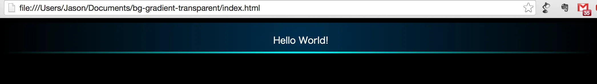
当前输出: