R - ggplot2等高线图

3
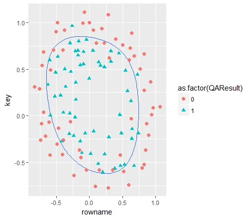
我正在尝试在R中复制Andrew Ng在Coursera上的机器学习课程中的代码(因为该课程使用Octave)。
基本上,我必须绘制一个多项式正则化逻辑回归的非线性决策边界(当p = 0.5时)。
我可以很容易地用base库复制出这个图形:
contour(u, v, z, levels = 0)
points(x = data$Test1, y = data$Test2)

where:

u <- v <- seq(-1, 1.5, length.out = 100)

而z是一个100x100的矩阵,其中包含了网格上每个点的z值。数据的维度为118x3。

我无法在ggplot2中完成它。有人知道如何在ggplot2中复制相同的效果吗?我尝试过:

z = as.vector(t(z))
ggplot(data, aes(x = Test1, y = Test2) + geom_contour(aes(x = u, y = 
v, z = z))

但是我收到了错误消息:美学必须是长度为1或与数据(118)相同:颜色,x,y,形状。谢谢。
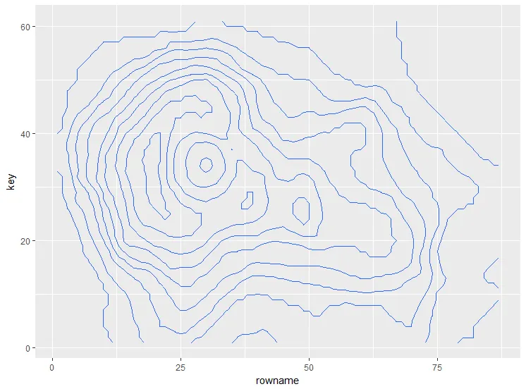
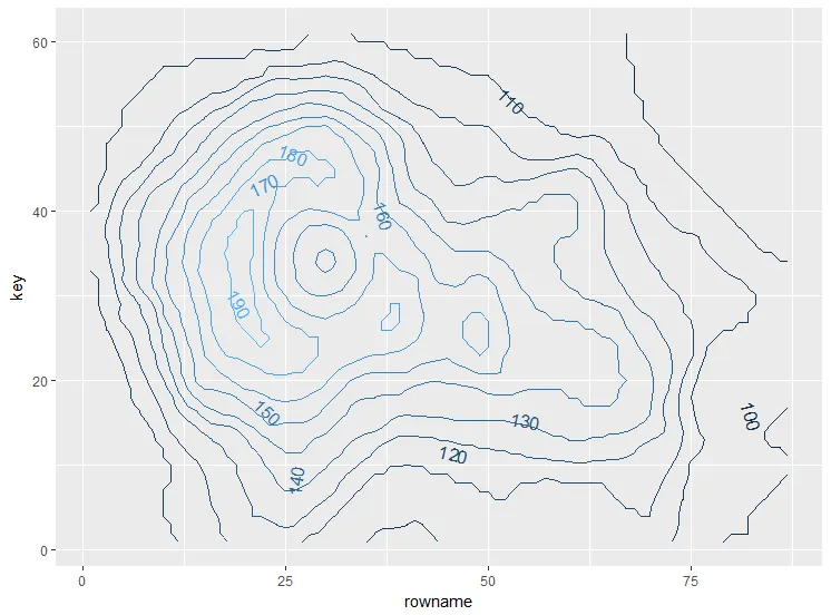
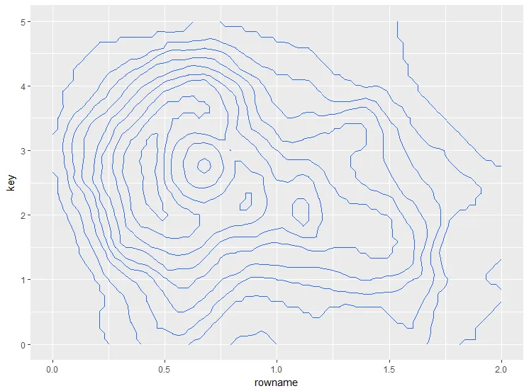
编辑(添加由误用代码创建的图):

enter image description here


1
这个新的软件包看起来可以帮助解决这个问题:https://github.com/clauswilke/isoband - Dave Gruenewald
2个回答

11

你需要做的是将坐标转换为长格式。这里有一个使用火山数据集的例子:

data(volcano)

在基础 R 中:

contour(volcano)

这里输入图像描述

使用 ggplot2:

library(tidyverse)
as.data.frame(volcano) %>% #convert the matrix to data frame
  rownames_to_column() %>% #get row coordinates
  gather(key, value, -rowname) %>% #convert to long format
  mutate(key = as.numeric(gsub("V", "", key)), #convert the column names to numbers
         rowname = as.numeric(rowname)) %>%
  ggplot() +
  geom_contour(aes(x = rowname, y = key, z = value))

enter image description here

如果您想像在基础R绘图中一样直接标记它,您可以使用directlabels库:

首先将颜色/填充映射到变量:

as.data.frame(volcano) %>%
  rownames_to_column() %>%
  gather(key, value, -rowname) %>%
  mutate(key = as.numeric(gsub("V", "", key)),
         rowname = as.numeric(rowname)) %>%
  ggplot() +
  geom_contour(aes(x = rowname,
                   y = key,
                   z = value,
                   colour = ..level..)) -> some_plot

然后

library(directlabels)

direct.label(some_plot, list("far.from.others.borders", "calc.boxes", "enlarge.box", 
                     box.color = NA, fill = "transparent", "draw.rects"))

在此输入图像描述

若要在特定坐标添加标记,只需添加另一个具有适当数据的图层:

之前的绘图

as.data.frame(volcano) %>% 
  rownames_to_column() %>% 
  gather(key, value, -rowname) %>% 
  mutate(key = as.numeric(gsub("V", "", key)), 
         rowname = as.numeric(rowname)) %>%
  ggplot() +
  geom_contour(aes(x = rowname, y = key, z = value)) -> plot_cont

例如,可以通过添加具有点的图层来实现:

plot_cont +
  geom_point(data = data.frame(x = c(35, 47, 61),
                               y = c(22, 37, 15)),
             aes(x = x, y = y), color = "red")

您可以通过以下方式添加任何类型的图层:geom_linegeom_text等。

enter image description here

编辑2:更改轴的比例有几个选项,其中之一是为矩阵分配适当的rownamescolnames

我将为x轴分配从0到2的序列,并为y轴分配从0到5的序列:

rownames(volcano) <- seq(from = 0,
                         to = 2,
                         length.out = nrow(volcano)) #or some vector like u
colnames(volcano) <- seq(from = 0,
                         to = 5,
                         length.out = ncol(volcano)) #or soem vector like v

as.data.frame(volcano) %>% 
  rownames_to_column() %>% 
  gather(key, value, -rowname) %>% 
  mutate(key = as.numeric(key), 
         rowname = as.numeric(rowname)) %>%
  ggplot() +
  geom_contour(aes(x = rowname, y = key, z = value))

输入图片说明


嗨,你的解决方案有效,它绘制了预期的轮廓。只是有一个问题:x和y轴的刻度不是从-1到1.5(u和v),而是一直延伸到100。 - Melvin86
@Melvin86 对删除的评论和针对 xy 轴比例的评论进行了编辑。 - missuse
谢谢你的帮助,这个方法完美地解决了我的问题。我在问题中附上了代码的示意图供参考。再见! - Melvin86

3

ggplot2最有效地处理长格式的数据。这里有一个使用虚假数据的示例:

library(tidyverse)  

u <- v <- seq(-1, 1.5, length.out = 100)

# Generate fake data
z = outer(u, v, function(a, b) sin(2*a^3)*cos(5*b^2))
rownames(z) = u
colnames(z) = v

# Convert data to long format and plot
as.data.frame(z) %>% 
  rownames_to_column(var="row") %>% 
  gather(col, value, -row) %>% 
  mutate(row=as.numeric(row), 
         col=as.numeric(col)) %>% 
ggplot(aes(col, row, z=value)) +
  geom_contour(bins=20) +
  theme_classic()

enter image description here


嗨eipi10,谢谢你的回答,我已经用missuse的代码创建了图表。虽然我还没有测试过,但我认为你的代码对我的情况也可以工作,因为这些代码非常相似。 - Melvin86

网页内容由stack overflow 提供, 点击上面的
可以查看英文原文,
原文链接