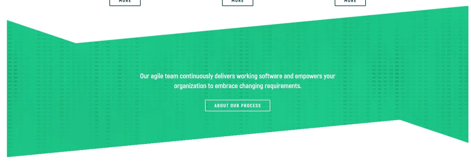
这是我用HTML/CSS需要实现的效果,文本应始终位于绿色容器内,无论屏幕大小如何。
为了实现这个视图,我使用了
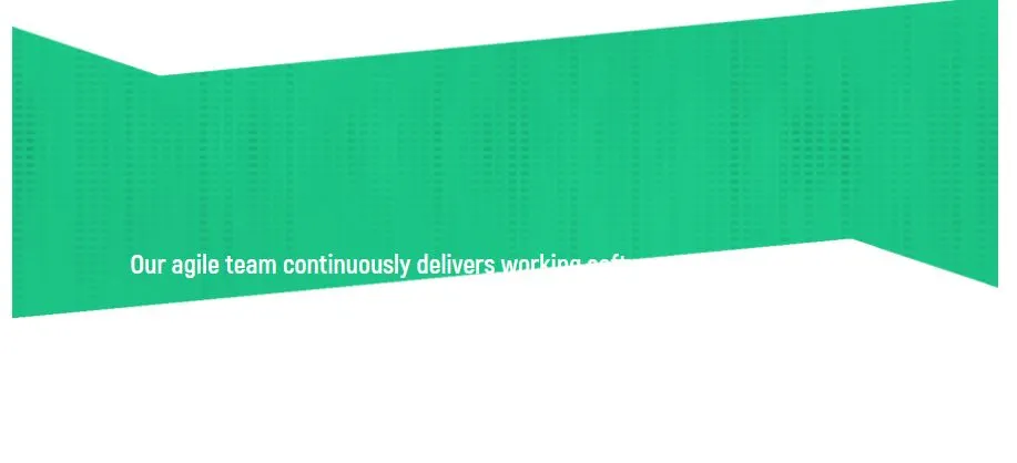
当我调整窗口大小时,文本会超出范围:
这是我的HTML:
<section id="aboutprocess">
        <div class="container">
            <div class="row">
                <div class="col-md-8 col-md-offset-2">
                    <p class="text-center">Our agile team continuously delivers working software and empowers your organization to embrace changing requirements.
                    </p>
                    <button type="button" class="btn btn-link center-block white" role="link" type="submit" name="op" value="Link 2">about our process</button>
                </div>
                <!--end col-md-8 col-md-offset-2-->
            </div>
            <!--end row -->
        </div>
        <!--end container-->
    </section>
    <!--end aboutprocess-->
为了实现这个视图,我使用了
background-size: contain + flexbox:#aboutprocess {
background: url("../img/tech_bg.png") no-repeat left top;
width: 100%;
height: 588px;
background-size: contain;
display: -webkit-box;
display: -ms-flexbox;
display: flex;
-webkit-box-align: center;
-ms-flex-align: center;
align-items: center;
}
#aboutprocess p {
color: #ffffff;
}
当我调整窗口大小时,文本会超出范围:
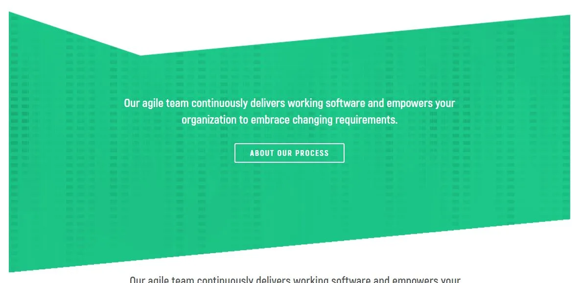
background-size cover 时,绿色背景图片不再显示原始形状:
如何让这个绿色背景保持其形状,使文本在此背景上垂直和水平对齐。
这里是链接到演示页面。
感谢您的帮助。