CSS - 将图片转换成房子的形状

7

我有以下HTML代码:

<figure class="pimage">
  <a href="http://nathandasilva.co.uk/butlinps/property-item/schofield-road-loughborough-le11-4qj/">
    <img class="attachment-homeland_property_medium wp-post-image" width="330" height="230" alt="7-020130322113404" src="http://nathandasilva.co.uk/butlinps/wp-content/uploads/2014/11/7-020130322113404-330x230.jpg"></img>
  </a>
</figure>

从我所能看到的CSS中,如下所示:
.page-id-11 .pimage {
  padding: 17px !important;
  background-color: #FFF;
}

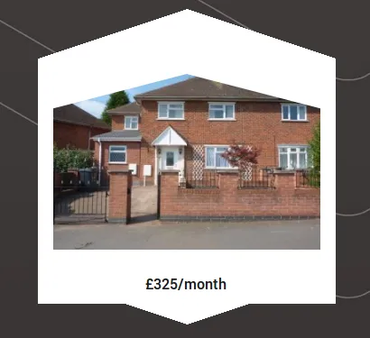
我想要做的是将图片(不失真)转换成一个基本房屋的形状,就像下面的图片一样: enter image description here

相关问题:https://dev59.com/uIbca4cB1Zd3GeqPQQAd - web-tiki
没关系,我已经得到了尺寸,我会在几分钟内更新我的答案。 - Weafs.py
没关系!喜欢做这种事情。 - Weafs.py
太好了@chipChocolate.py - 我可能只是稍微将其向上移动,并在下面放置更多内容!:D - nsilva
@chipChocolate.py - 非常感谢你! - nsilva
显示剩余6条评论
2个回答

12

最佳选项是使用 svg

定义一个内嵌的svg clipPath为了获得最大的浏览器支持),并将其应用于您的图像。

<svg width="200" height="200" viewBox="0 0 200 200">
  <defs>
    <clipPath id="shape">
      <path d="M100,0 L200,60 L200,200 L0,200 L0,60z" />
    </clipPath>
  </defs>
  <a xlink:href="#">
    <image clip-path="url(#shape)" xlink:href="http://www.lorempixel.com/200/200" x="0" y="0" height="200px" width="200px" />
  </a>
</svg>

一个真实的房子模型:

<svg width="0" height="0">
  <defs>
    <clipPath id="shape">
      <path d="M0.5,0 L0.74,0.145 L0.74,0.085 L0.80.085 L0.8,0.179 L1,0.3 L0.90,0.3 L0.90,1 L0.1,1 L0.1,0.3 L0,0.3z" />
    </clipPath>
  </defs>
</svg>

<svg width="300" height="300" viewBox="0 0 1 1">
  <a xlink:href="#">
    <image clip-path="url(#shape)" xlink:href="http://placehold.it/300/300" x="0" y="0" height="1px" width="1px" />
  </a>
</svg>

在不同图片尺寸上应用相同的clipPath

您也可以将相同的clipPath应用于不同的图片尺寸。

以下是在300×300、200×200、100×100、50×50、25×25、12.5×12.5和5×5图片尺寸上的示例。

<svg width="0" height="0">
  <defs>
    <clipPath id="shape">
      <path d="M0.5,0 L0.74,0.145 L0.74,0.085 L0.80.085 L0.8,0.179 L1,0.3 L0.90,0.3 L0.90,1 L0.1,1 L0.1,0.3 L0,0.3z" />
    </clipPath>
  </defs>
</svg>

<svg width="300" height="300" viewBox="0 0 1 1">
  <a xlink:href="#">
    <image clip-path="url(#shape)" xlink:href="http://placehold.it/300/300" x="0" y="0" height="1px" width="1px" />
  </a>
</svg>

<svg width="200" height="200" viewBox="0 0 1 1">
  <a xlink:href="#">
    <image clip-path="url(#shape)" xlink:href="http://placehold.it/200/200" x="0" y="0" height="1px" width="1px" />
  </a>
</svg>

<svg width="100" height="100" viewBox="0 0 1 1">
  <a xlink:href="#">
    <image clip-path="url(#shape)" xlink:href="http://placehold.it/100/100" x="0" y="0" height="1px" width="1px" />
  </a>
</svg>

<svg width="50" height="50" viewBox="0 0 1 1">
  <a xlink:href="#">
    <image clip-path="url(#shape)" xlink:href="http://placehold.it/50/50" x="0" y="0" height="1px" width="1px" />
  </a>
</svg>

<svg width="25" height="25" viewBox="0 0 1 1">
  <a xlink:href="#">
    <image clip-path="url(#shape)" xlink:href="http://placehold.it/25/25" x="0" y="0" height="1px" width="1px" />
  </a>
</svg>

<svg width="12.5" height="12.5" viewBox="0 0 1 1">
  <a xlink:href="#">
    <image clip-path="url(#shape)" xlink:href="http://placehold.it/12.5/12.5" x="0" y="0" height="1px" width="1px" />
  </a>
</svg>

<svg width="5" height="5" viewBox="0 0 1 1">
  <a xlink:href="#">
    <image clip-path="url(#shape)" xlink:href="http://placehold.it/5/5" x="0" y="0" height="1px" width="1px" />
  </a>
</svg>


要将图片适应于您的网站上的容器,如下图所示:

enter image description here

请将您的svg代码更改为以下内容:

(注意: 添加了负边距(margin-top: -17px)是因为您在.pimage上有padding: 17px) (坐标是通过一些简单的数学计算得出的)

<svg width="296" viewBox="0 0 1.286956522 1" height="230" style="margin-top: -17px;">
  <defs style="">
    <clipPath id="shape">
      <path d="M0.6434782609,0 L1.286956522,0.166666666667 L1.286956522,1 L0,1 L0,0.166666666667z"></path>
    </clipPath>
  </defs>
  <a xlink:href="#">
    <image y="-0.1" x="0" clip-path="url(#shape)" xlink:href="http://nathandasilva.co.uk/butlinps/wp-content/uploads/2014/11/7-020130322113404-330x230.jpg" height="1px" width="1.286956522px"></image>
  </a>
</svg>


5
你可以始终使用伪元素,例如:

pseudo elements

div{
    position:relative;
    height: 230px;  /* image height */
    width: 330px;   /* image width */
}

div:before{
    content: '';
    position:absolute;
    top:0;
    left:0;
    width: 0;
    height: 0;
    border-style: solid;
    border-width: 100px 175px 0 0;         /* 175px = image width/2 */
    border-color: #ffffff transparent transparent transparent;
}

div:after{
    content: '';
    position:absolute;
    top:0;
    right:0;
    width: 0;
    height: 0;
    border-style: solid;
    border-width: 0 175px 100px 0;
    border-color: transparent #ffffff transparent transparent;
}
<div>
    <img src="http://nathandasilva.co.uk/butlinps/wp-content/uploads/2014/11/7-020130322113404-330x230.jpg" />
</div>

JSFiddle


如果你把img标签放在锚点a标签里面,看看会发生什么。三角形将无法被点击。 - Weafs.py
@chipChocolate.py 嗯,如果不改变标记,我怀疑这是不可能的(对于纯CSS解决方案)。然而,如果OP愿意改变它的标记,那么这里有一个可点击的示例(我编辑了从csshexagon.com给出的代码)。 - Vucko
你能否不使用jQuery来查找最近的锚点并使用该方法使其可点击? - nsilva
@nsilva,在我的两个示例中,我都没有使用JQuery。你可以使用它并使三角形部分可点击。 - Vucko

网页内容由stack overflow 提供, 点击上面的
可以查看英文原文,
原文链接