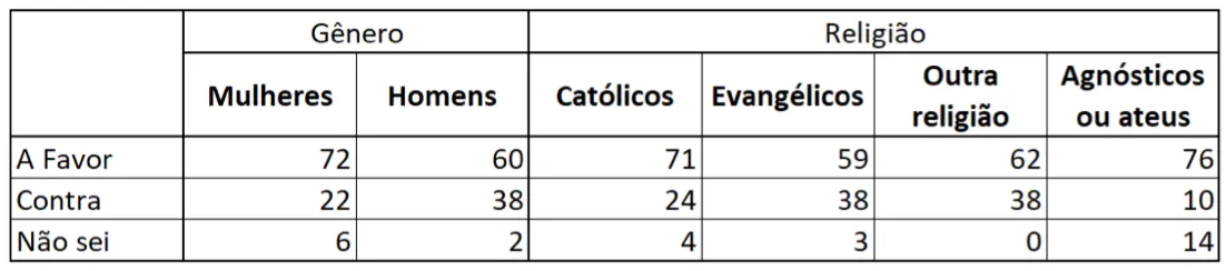
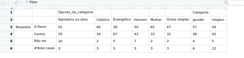
我一直在阅读有关使用expss软件包制作带标签的表格的两个标题,请参见此处和此处,但在线代码对我无效。我的想法是创建一个非常类似于此图像的表格:
数据框如下:
df <- data.frame(Categoria = c("gender", "gender" , "gender", "gender", "gender", "gender",
                                 "religion", "religion", "religion", "religion", "religion",
                                 "religion", "religion", "religion", "religion", "religion",
                                 "religion", "religion"),
                 Opcoes_da_categoria = c("Mulher", "Homem", "Mulher", "Homem", "Mulher",
                                           "Homem", "Outra religião", "Católico", "Agnóstico ou ateu",
                                           "Evangélico", "Outra religião", "Católico",
                                           "Agnóstico ou ateu", "Evangélico", "Outra religião",
                                           "Católico", "Agnóstico ou ateu", "Evangélico"),
                 Resposta = c("A Favor", "A Favor", "Contra",  "Contra",  "Não sei", "Não sei",
                              "A Favor", "A Favor", "A Favor", "A Favor", "Contra", "Contra",
                              "Contra", "Contra", "Não sei", "Não sei", "Não sei", "Não sei"),
                 value_perc = c(65, 50, 33, 43, 2, 7, 67, 64, 56, 28, 31, 34, 35, 66, 2, 2, 10, 5))
我创建两个表头的代码如下,但由于以下问题,它无法正常工作:
- 表格应该有两个标题
- 列名不应该出现在表格中
- 值不应该有小数位
library(expss)
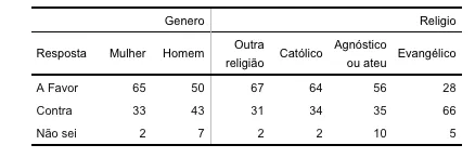
my_table <- df %>%
tab_cells(Resposta) %>%
tab_weight(value_perc) %>%
tab_cols(Opcoes_da_categoria, Categoria) %>%
tab_stat_cpct(total_label = NULL) %>%
tab_pivot()
library(gridExtra)
png("my_table.png", height = 50*nrow(my_table), width = 200*ncol(my_table))
grid.table(my_table)
dev.off()
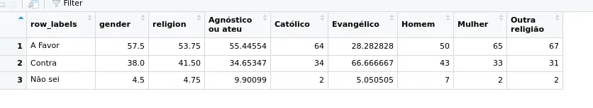
expss,但可以使用knitr::kable()和kableExtra完成此操作。我不知道您想要的确切样式,但这是另一个选项:vignette here。 - Andrew