希望有人能够帮助我解决一个ggplot脚本的问题。我想创建一个折线图,并在右边栏中为每条线添加标签。由于该脚本将多次使用,因此需要相对灵活地处理不同的数据。目前已经基本满足我的要求,但是我遇到了一个未能解决的问题。
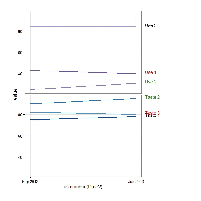
这个脚本可以绘制分面图或非分面图的折线图。我遇到的问题是,在右边的标签区域中,如果随着时间的推移没有显著变化,则应将其颜色编码为黑色;如果有积极的变化,则为绿色;如果有消极的变化,则为红色。 当我只有一个分面时,我已经有了一个可行的脚本来实现这一点,但是一旦在图表中有多个分面,标签的颜色编码会出现以下错误。
Error: Incompatible lengths for set aesthetics:
以下是带有多个方面数据的脚本。问题似乎在于我在geom_text行中指定颜色的方式。如果我删除脚本中geom_text行中的color调用,则可以在正确的位置打印属性,但没有颜色。我真的很困惑。这是我在这里的第一篇帖子,如果我在帖子中做错了什么,请告诉我。
   require(ggplot2)
require(grid)
require(zoo)
require(reshape)
require(reshape2)
require(directlabels)

time.data<-structure(list(Attribute = structure(c(1L, 1L, 2L, 2L, 3L, 3L,
                                                  4L, 4L, 5L, 5L, 6L, 6L), .Label = c("Taste 1", "Taste 2", "Taste 3",
                                                                                      "Use 1", "Use 2", "Use 3"), class = "factor"), Attribute.Category = structure(c(2L,
                                                                                                                                                                      2L, 2L, 2L, 2L, 2L, 1L, 1L, 1L, 1L, 1L, 1L), .Label = c("Nutritional/Usage",
                                                                                                                                                                                                                              "Taste/Quality"), class = "factor"), Attribute.Order = c(1L,
                                                                                                                                                                                                                                                                                       1L, 2L, 2L, 3L, 3L, 4L, 4L, 5L, 5L, 6L, 6L), Category.Order = c(1L,
                                                                                                                                                                                                                                                                                                                                                       1L, 1L, 1L, 1L, 1L, 2L, 2L, 2L, 2L, 2L, 2L), Color = structure(c(1L,
                                                                                                                                                                                                                                                                                                                                                                                                                        1L, 2L, 2L, 3L, 3L, 4L, 4L, 5L, 5L, 6L, 6L), .Label = c("#084594",
                                                                                                                                                                                                                                                                                                                                                                                                                                                                                "#2171B5", "#4292C6", "#6A51A3", "#807DBA", "#9E9AC8"), class = "factor"),
                          value = c(75L, 78L, 90L, 95L, 82L, 80L, 43L, 40L, 25L, 31L,
                                    84L, 84L), Date2 = structure(c(2L, 1L, 2L, 1L, 2L, 1L, 2L,
                                                                   1L, 2L, 1L, 2L, 1L), .Label = c("1/1/2013", "9/1/2012"), class = "factor")), .Names = c("Attribute",
                                                                                                                                                           "Attribute.Category", "Attribute.Order", "Category.Order", "Color",
                                                                                                                                                           "value", "Date2"), class = "data.frame", row.names = c(NA, -12L
                                                                                                                                                           ))

label.data<-structure(list(7:12, Attribute = structure(1:6, .Label = c("Taste 1",
                                                                       "Taste 2", "Taste 3", "Use 1", "Use 2", "Use 3"), class = "factor"),
                           Attribute.Category = structure(c(2L, 2L, 2L, 1L, 1L, 1L), .Label = c("Nutritional/Usage",
                                                                                                "Taste/Quality"), class = "factor"), Attribute.Order = 1:6,
                           Category.Order = c(1L, 1L, 1L, 2L, 2L, 2L), Color = structure(1:6, .Label = c("#084594",
                                                                                                         "#2171B5", "#4292C6", "#6A51A3", "#807DBA", "#9E9AC8"), class = "factor"),
                           Significance = structure(c(2L, 3L, 1L, 1L, 3L, 2L), .Label = c("neg",
                                                                                          "neu", "pos"), class = "factor"), variable = structure(c(1L,
                                                                                                                                                   1L, 1L, 1L, 1L, 1L), .Label = "1/1/2013", class = "factor"),
                           value = c(78L, 95L, 80L, 40L, 31L, 84L), Date2 = structure(c(1L,
                                                                                        1L, 1L, 1L, 1L, 1L), .Label = "2013-01-01", class = "factor"),
                           label.color = structure(c(1L, 2L, 3L, 3L, 2L, 1L), .Label = c("black",
                                                                                         "forestgreen", "red"), class = "factor")), .Names = c("",
                                                                                                                                               "Attribute", "Attribute.Category", "Attribute.Order", "Category.Order",
                                                                                                                                               "Color", "Significance", "variable", "value", "Date2", "label.color"
                                                                                         ), class = "data.frame", row.names = c(NA, -6L))

color.palette<-as.character(unique(time.data$Color))

time.data$Date2<-as.Date(time.data$Date2,format="%m/%d/%Y")

plot<-ggplot()+
  geom_line(data=time.data,aes(as.numeric(time.data$Date2),time.data$value,group=time.data$Attribute,color=time.data$Color),size=1)+
  geom_text(data=label.data,aes(x=Inf, y=label.data$value, label=paste("  ",label.data$Attribute)),
            color=label.data$label.color,
            size=4,vjust=0, hjust=0,na.rm=T)+
  facet_grid(Attribute.Category~.,space="free")+
  theme_bw()+
  scale_x_continuous(breaks=as.numeric(unique(time.data$Date2)),labels=format(unique(time.data$Date2),format = "%b %Y"))+
  theme(strip.background=element_blank(),
        strip.text.y=element_blank(),
        legend.text=element_blank(),
        legend.title=element_blank(),
        plot.margin=unit(c(1,5,1,1),"cm"),
        legend.position="none")+
  scale_colour_manual(values=color.palette)

gt3 <- ggplot_gtable(ggplot_build(plot))
gt3$layout$clip[gt3$layout$name == "panel"] <- "off"
grid.draw(gt3)
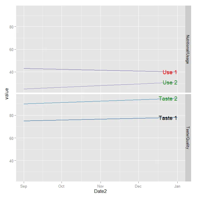
plot.start和plot.end提供值,因为它们目前未定义。 - SlowLearnertime.data和label.data),因此一种方法是创建2个类似的数据框,仅使用3-4个日期作为x轴,3个Attribute而不是10个(像High,Low,Med这样的短文本!),2个Attribute.Category。此外,对于此示例,您真的需要Significance,variable和其他列吗?如果不需要,请删除所有这些内容。删除major.line.color,ymin和其他声明-与问题无关。最后,省略theme()部分:这只是您稍后可以添加的外观调整。祝你好运! - SlowLearner