使用Counter()函数并绘制文本中最常见的单词

6

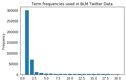
我编写了一个函数,用于输出和绘制文本中出现最频繁的单词。请参见下面的代码和输出。

tf = Counter()
for i  in list(tweet['text']):
    temp=XXX 
for tag, count in tf.most_common(20):
        print("{}: {}".format(tag, count))   
        
y = [count for tag, count in tf.most_common(20)]
x = range(1, len(y)+1)

plt.bar(x, y)
plt.title("Term frequencies used inTwitter Data")
plt.ylabel("Frequency")
plt.savefig('us-iran-term-distn.png')

输出结果是带有以下图表的最常见单词:
blacklivesmatter: 127336
blm: 58619
black: 25973
people: 17960
.
.
lives: 11684
police: 10762
matter: 9902
white: 9766
georgefloyd: 9023
protest: 8734

enter image description here

请问如何在 x 轴上添加出现频率最高的单词?

非常感谢!


1
它运行得很好。非常感谢。如果我们添加 plt.xticks(rotation=90),它会使标签可读。请在您方便时回答问题,以便我可以接受它。谢谢。 - bravopapa
1个回答

11

您可以直接使用标签列表作为x值。Matplotlib将这些文本显示为轴的刻度标签。如果需要更好地区分较低的值,您可以选择使用plt.yscale('log')

以下代码首先生成一个遵循Zipf分布的随机单词列表。

from collections import Counter
import numpy as np
from matplotlib import pyplot as plt

words = ['Red', 'Orange', 'Yellow', 'Green', 'Blue', 'Purple', 'Brown', 'Magenta', 'Tan', 'Cyan', 'Olive', 'Maroon', 'Navy', 'Aquamarine', 'Turquoise', 'Silver', 'Lime', 'Teal', 'Indigo', 'Violet', 'Pink', 'Black', 'White', 'Gray']
indices = np.random.zipf(1.6, size=100000).astype(np.int) % len(words)
tweets = np.array(words)[indices]

tf = Counter(tweets)

y = [count for tag, count in tf.most_common(20)]
x = [tag for tag, count in tf.most_common(20)]

plt.bar(x, y, color='crimson')
plt.title("Term frequencies in Twitter Data")
plt.ylabel("Frequency (log scale)")
plt.yscale('log') # optionally set a log scale for the y-axis
plt.xticks(rotation=90)
for i, (tag, count) in enumerate(tf.most_common(20)):
    plt.text(i, count, f' {count} ', rotation=90,
             ha='center', va='top' if i < 10 else 'bottom', color='white' if i < 10 else 'black')
plt.xlim(-0.6, len(x)-0.4) # optionally set tighter x lims
plt.tight_layout() # change the whitespace such that all labels fit nicely
plt.show()

生成的图表


网页内容由stack overflow 提供, 点击上面的
可以查看英文原文,
原文链接