想在纯CSS中复制YouTube的自动播放切换按钮

3
直到最近,YouTube使用了一个名为“paper-toggle-button”的标签。我的脚本使用了它,但由于YouTube已将其删除,我不得不使用普通的无聊复选框。 
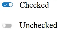
我不仅想要答案,我还想学习它是如何工作的。这个高级CSS对我来说很困扰。 我一直在尝试通过各种教程来复制它,这些教程以各种方式展示如何制作滑动切换按钮。但我对外观不满意。我希望它看起来尽可能接近YouTube的切换按钮。至少有一件事我已经学会了。下面的代码不需要任何图片,这很好。

picture of the toggle button

这需要我没有的CSS高级知识。
这是一个例子,看起来很丑。因为例如必须手动将标签放在正确的位置。请参见.labelterm。当我无法使用此教程代码添加复选标记时,我放弃了。
<!DOCTYPE HTML>
<html>
<head>
    <meta charset="utf-8" name="viewport" content="width=device-width, initial-scale=1">
    <title>Awesome checkbox</title>
    <style type="text/css">
        .mylabel {
            position: relative;
            display: block;
            width: 60px;
            height: 30px;
            margin-bottom: 15px;
        }
        .mylabel input {
            display: none;
        }
        .slidinggroove {
            position: absolute;
            top: 0;
            right: 0;
            bottom: 0;
            left: 0;
            background: #ababab;
            /*background: rgba(0, 0, 0, 0.1);*/
            border-radius: 20px;
            transition: all 0.3s ease;
        }
        .slidinggroove:after {
            position: absolute;
            content: "";
            width: 28px;
            height: 28px;
            border-radius: 50%;
            background: #fff;
            /*background: rgba(255, 255, 255, 0.2);*/
            top: 1px;
            left: 1px;
            transition: all 0.3s ease;
        }
        input:checked + .slidinggroove {
            background: #5fcf80;
        }
        input:checked + .slidinggroove:after {
            transform: translateX(30px);
        }
        .labelterm {
            margin-left: 65px;
            font-size: 16px;
            color: #222;
            font-family: "Roboto", sans-serif;
            position: relative;
            top: 5px;
        }
    </style>
</head>

<body>
    <div class="mylabel">
        <input type="checkbox" id="coding">
        <div class="slidinggroove"></div>
        <label class="mylabel" for="coding" name="skills"><p class="labelterm">Test</p></label>
    </div>
</body>
</html>
2个回答

1

以下是我如何解决这个问题以达到图片所示的效果:

.slidinggroove::before{
  position: absolute;
  left: 7px;
  top: 50%;
  transform: translateY(-7px);
  width: 20px;
  height: 20px;
  font-family: "Font Awesome 5 Free";
  font-weight: 900;
  content: "\f00c";
  display: block;
  color: #fff;
}

你需要导入一个图标字体库,我建议使用FontAwesome,以下是一个工作示例:

.mylabel {
  position: relative;
  display: block;
  width: 60px;
  height: 30px;
  margin-bottom: 15px;
}

.mylabel input {
  display: none;
}

.slidinggroove {
  position: absolute;
  top: 0;
  right: 0;
  bottom: 0;
  left: 0;
  background: #ababab;
  /*background: rgba(0, 0, 0, 0.1);*/
  border-radius: 20px;
  transition: all 0.3s ease;
}

.slidinggroove:after {
  position: absolute;
  content: "";
  width: 28px;
  height: 28px;
  border-radius: 50%;
  background: #fff;
  /*background: rgba(255, 255, 255, 0.2);*/
  top: 1px;
  left: 1px;
  transition: all 0.3s ease;
}

.slidinggroove:before {
  position: absolute;
  left: 7px;
  top: 50%;
  transform: translateY(-7px);
  width: 20px;
  height: 20px;
  font-family: "Font Awesome 5 Free";
  font-weight: 900;
  content: "\f00c";
  display: block;
  color: #fff;
}

input:checked+.slidinggroove {
  background: #5fcf80;
}

input:checked+.slidinggroove:after {
  transform: translateX(30px);
}

.labelterm {
  margin-left: 65px;
  font-size: 16px;
  color: #222;
  font-family: "Roboto", sans-serif;
  position: relative;
  top: 5px;
}
<html>

<head>
  <meta charset="utf-8" name="viewport" content="width=device-width, initial-scale=1">
  <title>Awesome checkbox</title>
</head>

<body>
  <div class="mylabel">
    <input type="checkbox" id="coding">
    <div class="slidinggroove"></div>
    <label class="mylabel" for="coding" name="skills"><p class="labelterm">Test</p></label>
  </div>
</body>

</html>

它的工作原理如下:您创建一个伪元素,其内容为FontAwesome图标的Unicode。然后,您可以完全控制其悬停状态(字体大小、颜色等)。

0

感谢您学习的热情。让我们将问题分解并逐个解决,然后将它们合并在一起以得到完整的解决方案。显然,我们需要几个东西:

  1. 一个椭圆形背景,用于切换移动。我们称其为“坑”。
  2. 可以向左或向右移动的圆圈。我们称其为“旋钮”。
  3. 控件需要具有自己的状态,用于选中和取消选中。我们可以使用本地复选框。
  4. 控件的颜色会随着状态而改变。
  5. 动画

我们首先从基础开始。要使用HTML绘制切换开关:

<div class="toggle">
    <input class="toggle__input" type="checkbox"> <span class="toggle__pit"> <span class="toggle__knob"></span>
    </span>
</div>

toggle 作为整个开关的容器。里面有一个原生复选框元素 toggle__pit 和一个 toggle__knob。没有 CSS 样式,它们只是白色正方形。让我们根据示例图样式化它。

.toggle__pit {
  /* set the size */
  width: 36px;
  height: 16px;
  /* set the color */
  background-color: #bababa;
  border: 1px solid #bababa;
  /* set the oval shape, value = height /2 */
  border-radius: 8px;
  /* border width is part of the element size */
  box-sizing: border-box;
  /* display span as a inline block element */
  /* span is a inline element which cant assign width and height*/
  display: inline-block;
}

.toggle__knob {
  /* set the size */
  width: 14px;
  height: 14px;
  /* make it circle */
  border-radius: 50%;
  background-color: white;
  display: inline-block;
}

.toggle .toggle__input {
  /* keep the checkbox hidden */
  display: none;
}
<div class="toggle">
  <input class="toggle__input" type="checkbox"> <span class="toggle__pit">
                <span class="toggle__knob"></span>
  </span>

</div>

现在切换按钮看起来像示例图像,但处于未选中状态。我们需要使其具有交互性,以响应用户操作。由于复选框是隐藏的,用户无法与其交互。我们可以使用<label>与输入关联。通过这种方式,即使输入被隐藏,我们也可以切换它。我们需要稍微修改一下HTML,让输入被标签包裹。

.toggle__pit {
  /* set the size */
  width: 36px;
  height: 16px;
  /* set the color */
  background-color: #bababa;
  border: 1px solid #bababa;
  /* set the oval shape, value = height /2 */
  border-radius: 8px;
  /* border width is part of the element size */
  box-sizing: border-box;
  /* display span as a inline block element */
  /* span is a inline element which cant assign width and height*/
  display: inline-block;
}

.toggle .toggle__pit::after {
  /* if the checkbox is checked, move knob to right */
  content: 'L';
  font-family: Helvetica, Arial, Sans-Serif;
  color: white;
  font-size: 12px;
  display: inline-block;
  transform: translateX(4px) translateY(-3px) scaleX(-1) rotate(-40deg);
  transform-origin: 50% 50%;
}

.toggle__knob {
  /* set the size */
  width: 14px;
  height: 14px;
  /* make it circle */
  border-radius: 50%;
  background-color: white;
  display: inline-block;
  /* for position it to left or right */
  position: absolute;
}

.toggle__label {
  /* act as a reference point for knob positioning */
  position: relative;
  line-height: 16px;
}

.toggle .toggle__input {
  /* keep the checkbox hidden */
  display: none;
}

.toggle .toggle__input:checked+.toggle__pit {
  /* if the checkbox is checked, change pit color */
  background-color: #167ac6;
  border: 1px solid #167ac6;
}

.toggle .toggle__input:checked+.toggle__pit .toggle__knob {
  /* if the checkbox is checked, move knob to right */
  left: 21px;
}
<div class="toggle">
  <label class="toggle__label"> <input class="toggle__input" type="checkbox"> <span class="toggle__pit">
                <span class="toggle__knob"></span>
        </span>
        </label>
</div>

最后,为了平滑状态转换,请添加一些 transitiontoogle__knobtoggle__pit

.toggle__pit {
  /* set the size */
  width: 36px;
  height: 16px;
  /* set the color */
  background-color: #bababa;
  border: 1px solid #bababa;
  /* set the oval shape, value = height /2 */
  border-radius: 8px;
  /* border width is part of the element size */
  box-sizing: border-box;
  /* display span as a inline block element */
  /* span is a inline element which cant assign width and height*/
  display: inline-block;
  transition: background-color 0.5s linear, border 0.5s linear;
}

.toggle .toggle__pit::after {
  /* use L to mock a tick*/
  content: 'L';
  font-family: Helvetica, Arial, Sans-Serif;
  color: white;
  font-size: 12px;
  /* pseudo-element is inline by defauly, which you can't apply transform*/
  display: inline-block;
  /* flip L horizontally and rotate it */
  transform: translateX(4px) translateY(-3px) scaleX(-1) rotate(-40deg);
  transform-origin: 50% 50%;
}

.toggle__knob {
  /* set the size */
  width: 14px;
  height: 14px;
  /* make it circle */
  border-radius: 50%;
  background-color: white;
  display: inline-block;
  /* for position it to left or right */
  position: absolute;
  left: 1px;
  /* enable animation */
  transition: all 0.5s linear;
}

.toggle__label {
  /* act as a reference point for knob positioning */
  position: relative;
  line-height: 16px;
}

.toggle .toggle__input {
  /* keep the checkbox hidden */
  display: none;
}

.toggle .toggle__input:checked+.toggle__pit {
  /* if the checkbox is checked, change pit color */
  background-color: #167ac6;
  border: 1px solid #167ac6;
}

.toggle .toggle__input:checked+.toggle__pit .toggle__knob {
  /* if the checkbox is checked, move knob to right */
  left: 21px;
}
<div class="toggle">
  <label class="toggle__label"> <input class="toggle__input" type="checkbox"> <span class="toggle__pit">
                <span class="toggle__knob"></span>
        </span>
        </label>
</div>


网页内容由stack overflow 提供, 点击上面的
可以查看英文原文,
原文链接