我用 Twitter Bootstrap 3 制作了一个在 modal 中嵌入的表格。奇怪的是,在 Firefox 和 jsFiddle 上可以正常运行,但在 Google Chrome 上不行。
这里是jsFiddle:
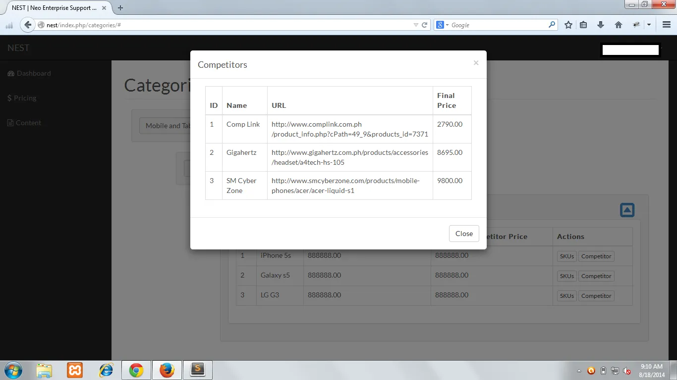
http://jsfiddle.net/dsf496jw/3/ 以下为一些屏幕截图。
Chrome: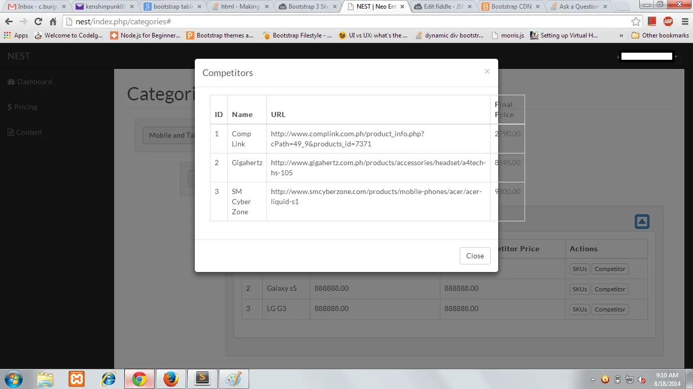 Firefox:
<button class="btn btn-xs btn-default" data-toggle="modal" data-target="#competitor_modal">
Competitor
</button>
<div class="modal fade" id="competitor_modal" tabindex="-1" role="dialog" aria-labelledby="myModalLabel" aria-hidden="true">
<div class="modal-dialog">
<div class="modal-content">
<div class="modal-header">
<button type="button" class="close" data-dismiss="modal">
<span aria-hidden="true">×</span>
<span class="sr-only">Close</span>
</button>
<h4 class="modal-title" id="myModalLabel">Competitors</h4>
</div>
<div class="modal-body">
<div class="container-fluid">
<div class="row">
<div class="col-lg-12">
<div class="table-responsive">
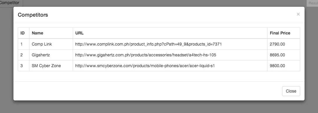
<table class="table table-bordered">
<thead>
<tr>
<th>ID</th>
<th>Name</th>
<th>URL</th>
<th>Final Price</th>
</tr>
</thead>
<tbody>
<tr>
<td>1</td>
<td>Comp Link</td>
<td>http://www.complink.com.ph/product_info.php?cPath=49_9&products_id=7371</td>
<td>2790.00</td>
</tr>
<tr>
<td>2</td>
<td>Gigahertz</td>
<td>http://www.gigahertz.com.ph/products/accessories/headset/a4tech-hs-105</td>
<td>8695.00</td>
</tr>
<tr>
<td>3</td>
<td>SM Cyber Zone</td>
<td>http://www.smcyberzone.com/products/mobile-phones/acer/acer-liquid-s1</td>
<td>9800.00</td>
</tr>
</tbody>
</table>
</div>
</div>
</div>
</div>
</div>
<div class="modal-footer">
<button type="button" class="btn btn-default" data-dismiss="modal">Close</button>
</div>
</div>
</div>
</div>
这里是jsFiddle:
http://jsfiddle.net/dsf496jw/3/ 以下为一些屏幕截图。
Chrome:
Firefox:
<td style="width:20%">这样向<td>标签添加内联宽度来调整列宽(四列之间的总宽度应为 100%)。 - Dan