如我在问题中所写,我想要在XML中更改Spinner的下拉箭头的颜色(默认箭头,不是自定义箭头或其他东西),但问题是我找不到任何可以从XML中引用它的内容。
这是否可能?如果可以,如何更改颜色?
如我在问题中所写,我想要在XML中更改Spinner的下拉箭头的颜色(默认箭头,不是自定义箭头或其他东西),但问题是我找不到任何可以从XML中引用它的内容。
这是否可能?如果可以,如何更改颜色?
有三种方法可以实现这一点。
1. 通过代码:
在您的xml中,确保您的下拉列表拥有一个id。假设我们有一个id为"spinner"的下拉列表。
在您的代码中,在onCreate()中添加以下内容:
Spinner spinner = (Spinner) findViewById(R.id.spinner);
spinner.getBackground().setColorFilter(getResources().getColor(R.color.red), PorterDuff.Mode.SRC_ATOP);
其中红色是在values文件夹中的colors.xml中定义的颜色。
2. 通过xml:
适用于API 21+:
<Spinner
    android:layout_width="wrap_content"
    android:layout_height="wrap_content"
    android:backgroundTint="@color/red" />
或者如果您使用支持库,您可以使用:
<android.support.v7.widget.AppCompatSpinner
    android:layout_width="wrap_content"
    android:layout_height="wrap_content"
    app:backgroundTint="@color/red" />
3. 通过可绘制对象:
您可以使用此在线工具:http://android-holo-colors.com
该工具将为您生成所需颜色的自定义可绘制对象,并确保选择下拉菜单,然后下载资源。
colors.xml文件。还是说我需要创建它?另外,我想指出,在我的问题中,当我说“通过XML”时,我是指是否有一些选项,例如android:colorDropDownArrow或类似的选项,可以直接在XML中设置箭头的值。谢谢! - Francisco Romero我很惊讶没有人指出来,但是您可以通过继承 Widget.AppCompat.Spinner 并更改 backgroundTint 来实现。
<style name="Spinner" parent="Widget.AppCompat.Spinner">
        <item name="backgroundTint">@color/spinnerTint</item>
</style>
并将其应用于Spinner
<Spinner
    style="@style/Spinner"
    android:layout_width="wrap_content"
    android:layout_height="wrap_content"
    android:spinnerMode="dropdown" />
android:backgroundTint 是什么?这是 AppCompat 版本(注意这里没有 android 前缀,样式继承了一个派生自 AppCompat 的样式)。 - mewaandroid:background 时,您不再使用 Android 的背景可绘制对象,而是定义了一个新的颜色可绘制对象,这就是为什么您看不到箭头的原因。 - mewa使用backgroundTint属性
<Spinner
        android:layout_width="wrap_content"
        android:layout_height="wrap_content"
        android:backgroundTint="@color/white"
        />
如果 min_SDK 小于 21(Lollipop),则应该使用 AppCompatSpinner。
<android.support.v7.widget.AppCompatSpinner
        android:layout_width="wrap_content"
        android:layout_height="wrap_content"
        app:backgroundTint="@color/white"
        />
如果(API 21+){
您可以直接在您的 Spinner 中使用 android:backgroundTint="@color/color":
<Spinner
   android:id="@+id/spinner"
   android:layout_width="match_parent"
   android:layout_height="match_parent"
   android:backgroundTint="@color/color" />
如果不符合条件,那么执行以下操作:
创建自己的样式:
<style name="spinner_style" parent="Widget.AppCompat.Spinner">
        <item name="backgroundTint">@color/color</item>
</style>
<Spinner
   android:id="@+id/spinner"
   android:layout_width="match_parent"
   android:layout_height="match_parent"
   style="@style/spinner_style"/>
}
注意:您可以在所有API中使用style方法。
<Spinner
            android:id="@+id/spinner"
            android:layout_width="match_parent"
            android:layout_height="wrap_content"
            android:backgroundTint="#00000" />
仅适用于API级别高于21的版本
试一下这个:
spinner_age.getBackground().setColorFilter(ContextCompat.getColor(this,
                R.color.spinner_icon), PorterDuff.Mode.SRC_ATOP);
https://icons8.com/icons/set/drop-down
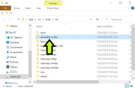
第二步。使用Paint在向下箭头旁边添加一个带有黑色边框的白色框,并保存为.PNG文件。
第三步。 将 .PNG 图像复制并粘贴到应用程序的可绘制文件夹中。
         <TextView
            android:id="@+id/spinnersearchtext"
            android:layout_width="80dp"
            android:layout_height="40dp"
            android:layout_marginEnd="5dp"
            android:gravity="center|end"
            android:text="Search:"
            android:textColor="#FFFFFF"
            android:textSize="20dp"
            android:textStyle="bold"
            android:visibility="visible"
            app:layout_constraintEnd_toStartOf="@+id/spinner1"
            app:layout_constraintHorizontal_bias="1"
            app:layout_constraintStart_toStartOf="parent"
            app:layout_constraintTop_toTopOf="@+id/spinner1" />


         <Spinner
            android:id="@+id/spinner1"
            android:layout_width="100dp"
            android:layout_height="40dp"
            android:layout_marginLeft="50dp"
            android:background="@drawable/dropdownarrow"
            app:layout_constraintBottom_toBottomOf="parent"
            app:layout_constraintHorizontal_bias="0.5"
            app:layout_constraintLeft_toLeftOf="parent"
            app:layout_constraintRight_toRightOf="parent"
            app:layout_constraintTop_toTopOf="parent" />
最终结果: