如何在代码中实现响应式布局?
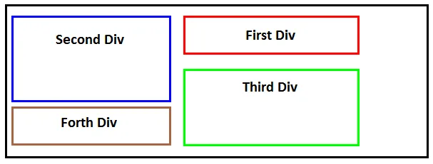
我有四个高度不同的
。在较小的屏幕上,布局符合预期。
对于较大的屏幕,我想将第二个(蓝色)和第四个(棕色)
向左浮动,将第一个(红色)和第三个(绿色)
向右浮动,如图所示。
以下是我的代码:
CSS
.wrapper {
    border: 2px solid;
    padding: 10px;
    min-height: 300px;
}
.first-div {
    border: 2px solid red;
    height: 80px;
    margin-bottom: 10px;
}
.second-div {
    border: 2px solid blue;
    height: 200px;
    margin-bottom: 10px;
}
.third-div {
    border: 2px solid green;
    height: 180px;
    margin-bottom: 10px;
}
.forth-div {
    border: 2px solid brown;
    height: 100px;
}
@media (min-width: 892px) {
.first-div {
    float: right;
    width: 500px;
    }
.second-div {
    float: left;
    width: 280px;
}
.third-div {
    clear: both;
    float: right;
    width: 500px;
}
.forth-div {
    clear: both;
    float: left;
    width: 280px;
}
}
h4 {
    text-align: center;
}
.clear-both {
    clear: both;
}
HTML
<div class="wrapper">

<div class="first-div"><h4>First Div</h4></div>

<div class="second-div"><h4>Second Div</h4></div>

<div class="third-div"><h4>Third Div</h4></div>

<div class="forth-div"><h4>Forth Div</h4></div>

<div class="clear-both"></div>

</div>