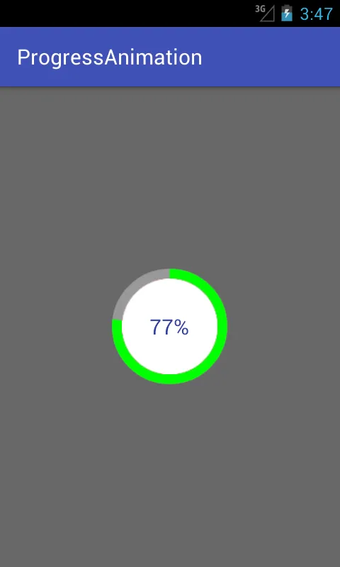
我想创建一个圆形确定进度条,这种进度条在中心显示进度。有没有默认的方法来创建这个进度条,还是我必须创建自己的自定义进度条?
安卓圆形确定进度条
46
- AndroidDev
2
1很可能是这个问题的重复:https://dev59.com/_m435IYBdhLWcg3wtSYV - AlexBottoni
4@AlexBottoni,不是关于不确定进度条的。非常不同。 - User
4个回答
65
我在我的博客demonuts.com上,详细介绍了有关Android 环形进度条的示例。您也可以在那里找到完整的源代码和说明。
以下是我如何使用纯代码而不使用任何库创建带有圆形内部百分比的环形进度条。
首先创建一个名为circular.xml的可绘制文件。
<?xml version="1.0" encoding="utf-8"?>

<layer-list xmlns:android="http://schemas.android.com/apk/res/android">
    <item android:id="@android:id/secondaryProgress">
        <shape
            android:innerRadiusRatio="6"
            android:shape="ring"
            android:thicknessRatio="20.0"
            android:useLevel="true">


            <gradient
                android:centerColor="#999999"
                android:endColor="#999999"
                android:startColor="#999999"
                android:type="sweep" />
        </shape>
    </item>

    <item android:id="@android:id/progress">
        <rotate
            android:fromDegrees="270"
            android:pivotX="50%"
            android:pivotY="50%"
            android:toDegrees="270">

            <shape
                android:innerRadiusRatio="6"
                android:shape="ring"
                android:thicknessRatio="20.0"
                android:useLevel="true">


                <rotate
                    android:fromDegrees="0"
                    android:pivotX="50%"
                    android:pivotY="50%"
                    android:toDegrees="360" />

                <gradient
                    android:centerColor="#00FF00"
                    android:endColor="#00FF00"
                    android:startColor="#00FF00"
                    android:type="sweep" />

            </shape>
        </rotate>
    </item>
</layer-list>
现在,在您的activity_main.xml中添加以下内容:
  <?xml version="1.0" encoding="utf-8"?>
<RelativeLayout xmlns:android="http://schemas.android.com/apk/res/android"
    xmlns:tools="http://schemas.android.com/tools"
    android:layout_width="match_parent"
    android:layout_height="match_parent"
    android:background="@color/dialog"
    tools:context="com.example.parsaniahardik.progressanimation.MainActivity">

    <ProgressBar

        android:id="@+id/circularProgressbar"
        style="?android:attr/progressBarStyleHorizontal"
        android:layout_width="250dp"
        android:layout_height="250dp"
        android:indeterminate="false"
        android:max="100"
        android:progress="50"
        android:layout_centerInParent="true"
        android:progressDrawable="@drawable/circular"
        android:secondaryProgress="100"
        />

    <ImageView
        android:layout_width="90dp"
        android:layout_height="90dp"
        android:background="@drawable/whitecircle"
        android:layout_centerInParent="true"/>

    <TextView
        android:id="@+id/tv"
        android:layout_width="250dp"
        android:layout_height="250dp"
        android:gravity="center"
        android:text="25%"
        android:layout_centerInParent="true"
        android:textColor="@color/colorPrimaryDark"
        android:textSize="20sp" />

</RelativeLayout>
在activity_main.xml中,我使用了一个带有白色背景的圆形图像,以显示百分比周围的白色背景。下面是该图像:
您可以更改此图像的颜色,以设置自定义百分比文本周围的颜色。
现在最后将以下代码添加到MainActivity.java中:
import android.content.res.Resources;
import android.graphics.drawable.Drawable;
import android.os.Handler;
import android.support.v7.app.AppCompatActivity;
import android.os.Bundle;
import android.view.animation.DecelerateInterpolator;
import android.widget.ProgressBar;
import android.widget.TextView;

public class MainActivity extends AppCompatActivity {

    int pStatus = 0;
    private Handler handler = new Handler();
    TextView tv;
    @Override
    protected void onCreate(Bundle savedInstanceState) {
        super.onCreate(savedInstanceState);
        setContentView(R.layout.activity_main);

        Resources res = getResources();
        Drawable drawable = res.getDrawable(R.drawable.circular);
        final ProgressBar mProgress = (ProgressBar) findViewById(R.id.circularProgressbar);
        mProgress.setProgress(0);   // Main Progress
        mProgress.setSecondaryProgress(100); // Secondary Progress
        mProgress.setMax(100); // Maximum Progress
        mProgress.setProgressDrawable(drawable);

      /*  ObjectAnimator animation = ObjectAnimator.ofInt(mProgress, "progress", 0, 100);
        animation.setDuration(50000);
        animation.setInterpolator(new DecelerateInterpolator());
        animation.start();*/

        tv = (TextView) findViewById(R.id.tv);
        new Thread(new Runnable() {

            @Override
            public void run() {
                // TODO Auto-generated method stub
                while (pStatus < 100) {
                    pStatus += 1;

                    handler.post(new Runnable() {

                        @Override
                        public void run() {
                            // TODO Auto-generated method stub
                            mProgress.setProgress(pStatus);
                            tv.setText(pStatus + "%");

                        }
                    });
                    try {
                        // Sleep for 200 milliseconds.
                        // Just to display the progress slowly
                        Thread.sleep(8); //thread will take approx 1.5 seconds to finish
                    } catch (InterruptedException e) {
                        e.printStackTrace();
                    }
                }
            }
        }).start();
    }
}
如果你想制作水平进度条,请遵循此链接,它具有许多有价值的示例和源代码:
http://www.skholingua.com/android-basic/user-interface/form-widgets/progressbar
- Parsania Hardik
4
2为什么进度条外面有这么多额外的空间?我该如何减少它? - Prabs
3将
android:innerRadiusRatio="6" 修改为 android:innerRadiusRatio="2.5"。 - Prabs1将
android:innerRadiusRatio="6" 更改为 android:innerRadiusRatio="2.35",现在完美无缺,几乎没有多余的空间。 - viveksuggu顶级,非常棒的解决方案! - Manuela
45
首先将progress_circle.xml添加到您的res/drawable目录中,如下所示:
<?xml version="1.0" encoding="utf-8"?>
<layer-list xmlns:android="http://schemas.android.com/apk/res/android" >

<item android:drawable="@drawable/progress_circular_background"/>
<item>
    <shape
        android:innerRadiusRatio="3.4"
        android:shape="ring"
        android:thicknessRatio="6.0" >
        <gradient
            android:endColor="#ffffffff"
            android:startColor="#ffffff"
            android:type="sweep"
            android:useLevel="true" />
    </shape>
</item>
<item>
    <rotate
        android:drawable="@drawable/progress_particle"
        android:fromDegrees="0"
        android:pivotX="50%"
        android:pivotY="50%"
        android:toDegrees="360" />
</item>

</layer-list>
我在谷歌图片搜索中使用了“progress_particle.png”和“progress_circular_background.png”(带引号),因为这些是安卓默认的可绘制对象,但它们已经丢失了。你可能想要自定义它们,但它们可以让你开始。
然后在你的XML布局中:
<ProgressBar
    android:id="@+id/timer_progress"
    style="?android:attr/progressBarStyleHorizontal"
    android:layout_width="200dp"
    android:layout_height="200dp"
    android:indeterminate="false"
    android:max="60"
    android:progressDrawable="@drawable/progress_circle" />
我的最大值是60,因为我将其用于秒计时器,但你可能有不同的需求。
关键在于,即使它是一个圆形进度条,你仍需要使用style="?android:attr/progressBarStyleHorizontal"。
- user901309
7
7进度圆形(progress_circle.xml)是一种可绘制(drawable)类型。您提供的文件不完整,需要一个上层对象来作为其组成部分。 - RyanCheu
3戒指形状(不是进度符号)是否可以从-90度(12点钟方向)开始填充? - stepic
1我有一个小问题。有drawable-ldpi、drawable-hdpi等文件夹。我应该使用哪个文件夹来存放这个xml文件? - Bagusflyer
4请将@bagusflyer提到的内容放进名为 "drawable" 的文件夹中,这些 xml 文件是独立于 dpi 的资源。 - kaupov
4
style="?android:attr/progressBarStyleHorizontal" 不是必需的,而 android:indeterminateOnly="false" 则是必需的。 - Eugen Pechanec显示剩余2条评论
9
针对您问题中的“确定性”部分,现在material design库支持确定性圆形进度条。
<com.google.android.material.progressindicator.CircularProgressIndicator
    android:layout_width="wrap_content"
    android:layout_height="wrap_content" />
更多信息请参见此处。
其他答案可能会帮助您如何在中心插入进度标签。
- Mahozad
4
有人知道如何实现它吗?文档没有帮助。我就是无法让它工作... - who-aditya-nawandar
@whoadityanawandar 我自己没有使用过这些,但如果你的意思是在代码中使进度条确定,文档建议这样做:
`int progress = getLoadingProgress()indicator.setProgressCompat(progress, true)` - Mahozad
谢谢,虽然这看起来还不完整,我的意思是你如何为它设置计时器等等... - who-aditya-nawandar
谢谢,我在想为什么我们需要自定义一个非常常见的元素,比如进度条。 - Thân Hoàng
8
一个确定性圆形进度指示器的示例。
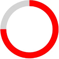
<com.google.android.material.progressindicator.CircularProgressIndicator
  android:layout_width="wrap_content"
  android:layout_height="wrap_content"
  android:progress="75"
  app:indicatorColor="#FF0000"
  app:indicatorSize="100dp"
  app:trackColor="#D3D3D3"
  app:trackThickness="10dp" />
References
- Tatsuya Fujisaki
2
1这个回答真是救了我的一天!非常感谢!! - Taslim Oseni
1这个答案救了我的一天!非常感谢!! - undefined
网页内容由stack overflow 提供, 点击上面的可以查看英文原文,
原文链接
原文链接