我正在学习Jetpack Compose,并且想要构建类似于以下这样的东西:
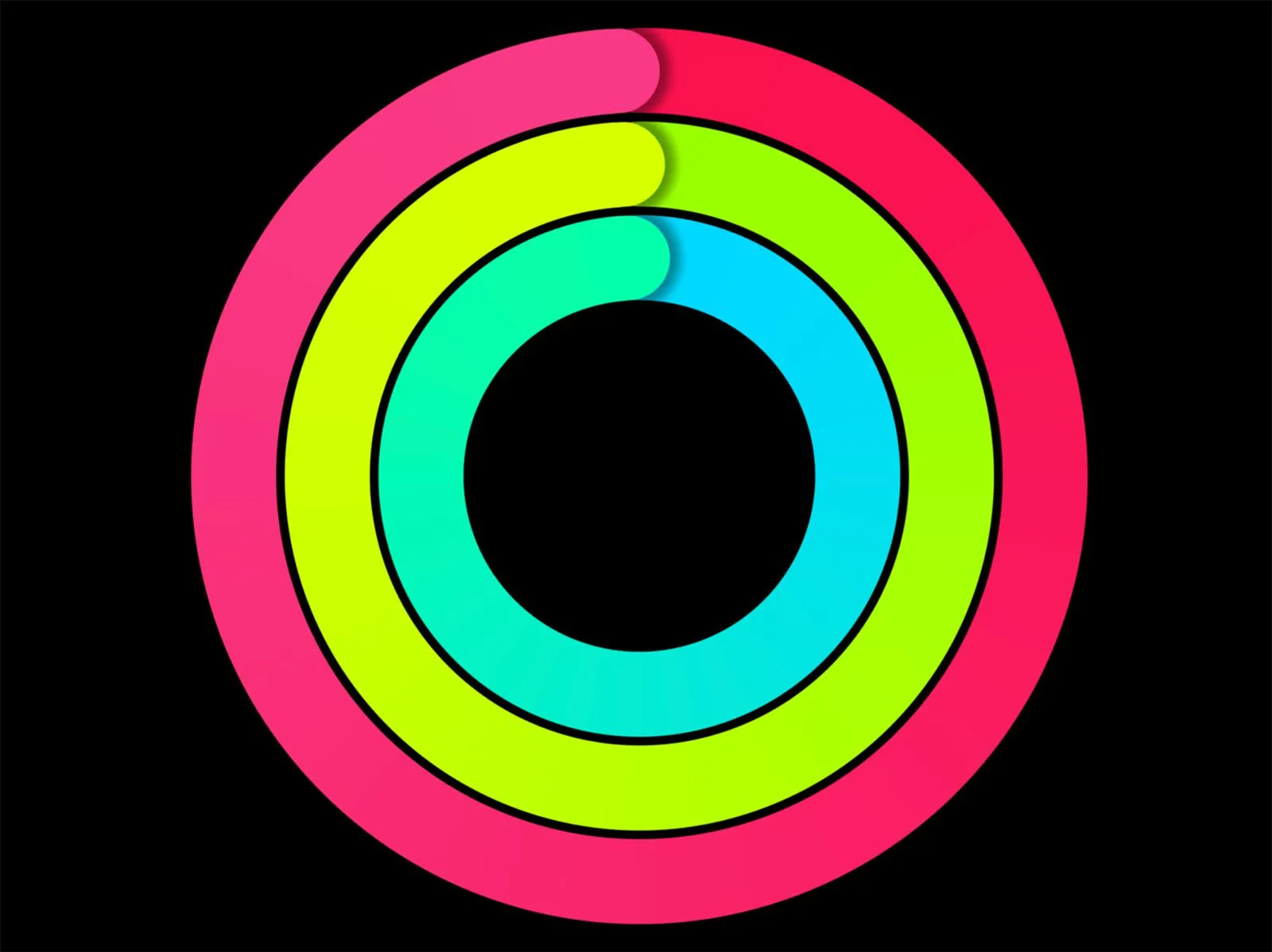
我尝试过使用Box布局通过堆叠,但需要硬编码圆形大小。 我希望环的大小是不确定的。如何使用Compose实现此目标?
我正在学习Jetpack Compose,并且想要构建类似于以下这样的东西:
我尝试过使用Box布局通过堆叠,但需要硬编码圆形大小。 我希望环的大小是不确定的。如何使用Compose实现此目标?
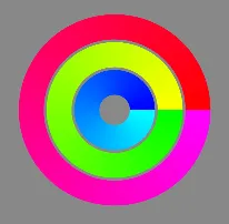
Canvas 来实现。我曾经这样做过,可以为你提供一个起点来实现你想要的东西...@Composable
fun DrawGradientCircles() {
Canvas(
modifier = Modifier
.size(300.dp)
.background(Color.Gray)
) {
drawCircle(
brush = Brush.sweepGradient(listOf(Color.Magenta, Color.Red)),
radius = 300f,
style = Stroke(90f)
)
drawCircle(
brush = Brush.sweepGradient(listOf(Color.Green, Color.Yellow)),
radius = 200f,
style = Stroke(90f)
)
drawCircle(
brush = Brush.sweepGradient(listOf(Color.Cyan, Color.Blue)),
radius = 100f,
style = Stroke(90f)
)
}
}
编辑:我在这里发布了更新版本:
https://gist.github.com/nglauber/e947dacf50155fb72408e83f6595e430
我使用CircularProgressIndicator成功完成了它。
@Composable
fun ringView(){

var sz by remember { mutableStateOf(Size.Zero)}

    Box(
        Modifier
            .aspectRatio(1f)
            .fillMaxSize()
            .background(Color.Blue)
            .onGloballyPositioned { coordinates ->
                sz = coordinates.size.toSize()
            }
            , contentAlignment = Alignment.Center){

        Box(Modifier.aspectRatio(1f), contentAlignment = Alignment.Center){
            Text(text = pxToDp(sz.height.toInt()).toString())
            CircularProgressIndicator(progress = 0.9F, Modifier.size(pxToDp(sz.width.toInt()).dp), strokeWidth = (pxToDp(sz.width.toInt())/15).dp,color = Color.Green)
            CircularProgressIndicator(progress = 0.9F, Modifier.size((pxToDp(sz.width.toInt())-(2*(pxToDp(sz.width.toInt())/15))).dp), strokeWidth = (pxToDp(sz.width.toInt())/15).dp, color = Color.Black )
            CircularProgressIndicator(progress = 0.9F, Modifier.size((pxToDp(sz.width.toInt())-(4*(pxToDp(sz.width.toInt())/15))).dp), strokeWidth = (pxToDp(sz.width.toInt())/15).dp, color = Color.Gray )
            CircularProgressIndicator(progress = 0.9F, Modifier.size((pxToDp(sz.width.toInt())-(6*(pxToDp(sz.width.toInt())/15))).dp), strokeWidth = (pxToDp(sz.width.toInt())/15).dp, color = Color.Cyan )
            CircularProgressIndicator(progress = 0.9F, Modifier.size((pxToDp(sz.width.toInt())-(8*(pxToDp(sz.width.toInt())/15))).dp), strokeWidth = (pxToDp(sz.width.toInt())/15).dp, color = Color.Magenta )

        }

    }

}

fun pxToDp(px: Int): Int {
return (px / Resources.getSystem().displayMetrics.density).toInt()
}
Canvas中有一个DrawScope,它具有size属性。如果你需要相对尺寸,请在Canvas内部使用size。 - Gabriele Mariotti