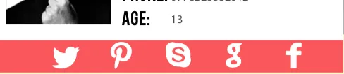
在边框上叠加图标

3
我想创建一些覆盖边框的图标,效果如下: enter image description here 然而,当我尝试这样做时,结果是这样的: enter image description here 
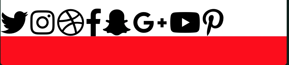
有没有办法可以解决这个问题?不用担心图标颜色,我将其改为黑色以使其可见。是否可以使用HTML和CSS实现此目的。
以下是我的工作: https://codepen.io/anon/pen/YLdPjM

body {
  margin: 0;
  padding: 0;
  font-family: 'Oswald', sans-serif;
}
 .red {
  color: red;
}

.underline {
  text-decoration: underline;
}
.nav ul {
  list-style: none;
  background-color: #0F211E;
  text-align: center;
  padding: 0;
  margin: 0;

}
.nav li {
  font-size: 1.2em;
  line-height: 40px;
  height: 40px;
  border-bottom: 1px solid #888;
}
 
.nav a {
  text-decoration: none;
  color: #fff;
  display: block;
  transition: .3s background-color;
  text-transform: uppercase;
}
 .hero-image {
  background-image: url("1.jpg");
  height: 50%;
  background-position: center;
  background-repeat: no-repeat;
  background-size: cover;
  position: relative;
  
}


@media screen and (min-width: 600px) {
  .nav li {
    width: 120px;
    border-bottom: none;
    height: 50px;
    line-height: 50px;
    font-size: 1.4em;
  }
 
  /* Option 1 - Display Inline */
  .nav li {
    display: inline-block;
    margin-right: -4px;
  }
 
  /* Options 2 - Float
  .nav li {
    float: left;
  }
  .nav ul {
    overflow: auto;
    width: 600px;
    margin: 0 auto;
  }
  .nav {
    background-color: #444;
  }
  */
}


section.hero {
  height: 75%;
  position: relative;
}

.hero-content {
  position: absolute;
  top: 50%;
  transform: translateY(5%);
  width: 100%;
}


.bgimg {
  /* The image used */
    background-image: url("bg.jpg");

    /* Set a specific height */
    height: 100%;

    /* Position and center the image to scale nicely on all screens */
    background-position: center;
    background-repeat: no-repeat;
    background-size: cover;
    position: relative;
}
.back .caption:before{
  border-top: 1px solid #fff;
  border-bottom: 1px solid #fff;
  transform: scale(0,1);
}

.back .caption:after{
  border-right: 1px solid #fff;
  border-left: 1px solid #fff;
  transform: scale(1,0);
}

.card.flipped .back .caption:before,
.card.flipped .back .caption:after {
  opacity: .9;
  transform: scale(1);  
}

.back dl{
  font-family:'Lato', Arial, sans-serif;
  font-weight:300;
  bottom:40px;
  left:40px;
  position: absolute;
  opacity: 0;
  transition: opacity .35s, transform .35s;
  transition-delay: .85s;
  transform: translate3d(-40px,0,0);
}

.card.flipped .back dl {
  opacity: 1;
  transform: translate3d(0,0,0);
}

dl dt{
  float: left;
  width: 60px;
  overflow: hidden;
  clear: left;
  text-align: right;
  font-weight:700;
}

dl dd{
  margin-left: 80px;
  text-align:left;
}

dl dd:before,
dl dd:after{
  display: table;
  content: " ";
}

dl dd:after{
  clear: both;
}

.front:hover p {
  opacity: 1;
  transform: translate3d(0,0,0);
}

figure a{
  z-index: 1000;
  text-indent: 200%;
  white-space: nowrap;
  font-size: 0;
  opacity: 0;
  position: absolute;
  top: 0;
  left: 0;
  width: 100%;
  height: 100%;
}

@media (min-width: 450px) {
  .container{
    left: 50%;
    margin-left:-225px;
  }
}


body {
  background-color: #0F211E;

}

.recipe-card {
    border-top: 15px solid lightblue; 
    border-bottom: 50px solid red;
  background: #fff;
  margin: 0 auto;
  width: 90%;
  max-width: 496px;
  border-top-left-radius: 5px;
  border-top-right-radius: 5px;
  border-bottom-left-radius: 5px;
  border-bottom-right-radius: 5px;
}


.card-top {
  padding: 30px 15px;
  display: flex;
}

.card-top .right {
  padding-left: 20px;
}
<html>
<head>
 
<title>Portfolio</title>

<link rel="stylesheet" href="https://use.fontawesome.com/releases/v5.0.13/css/all.css" integrity="sha384-DNOHZ68U8hZfKXOrtjWvjxusGo9WQnrNx2sqG0tfsghAvtVlRW3tvkXWZh58N9jp" crossorigin="anonymous">
<link href="https://fonts.googleapis.com/css?family=Oswald" rel="stylesheet">

<link rel="stylesheet" href="style.css">
</style>
 
</head>

<body class="news" >


 <header>

  <div class="nav">
   <ul>
    <li class="two"><a href="#"> <span>About</span></a></li>
    <li class="three"><a class="active" href="#">Projects</a></li>
    <li class="four"><a href="#">Skills</a></li>
   </ul>
  </div>
 </header>
 

 <section class="hero">
  <div class="bgimg">
  </div> 


  <div class="hero-content">
   <div class="recipe-card">

    <aside>
     <div class="card-top">
      <div class="left">
       <img src="myAvatar.png" class="myavatar">
      </div>
      <div class="right">
       <h1>Hamza Wahbi</h1>
       <hr class="hrunder">
       <h5 style="color:#8B8B8B " >Web Developer</h5>
       <h1>Age: <font color="#8B8B8B">13</font></h1>
       <h1>Email: <font color="#8B8B8B">fxgfnxngfx@gmail.com</font></h1>
       <h1>Phone: <font color="#8B8B8B">0093836372</font></h1>
      </div>

     </div>

    </aside>
     <i class="fab fa-twitter fa-3x" style="color: black;"></i>
     <i class="fab fa-instagram fa-3x" style="color: black;"></i>
     <i class="fab fa-dribbble fa-3x" style="color: black;"></i>
     <i class="fab fa-facebook-f fa-3x" style="color: black;"></i>
     <i class="fab fa-snapchat-ghost fa-3x" style="color: black;"></i>
     <i class="fab fa-google-plus-g  fa-3x" style="color: black;"></i>
                    <i class="fab fa-youtube fa-3x" style="color: black;"></i>
                    <i class="fab fa-pinterest-p fa-3x" style="color: black;"></i>
   </div>

  </div><!-- .hero-content -->

 </section>
 
</div>


</html>


1
将图标用带有背景的容器包装起来。 - Temani Afif
4个回答

3
为什么要使用边框?只需将图标放在一个 div 中,并将该 div 的背景颜色设置为红色即可。请参见以下代码片段。

body {
  margin: 0;
  padding: 0;
  font-family: 'Oswald', sans-serif;
}

.red {
  color: red;
}

.icon-bar {
  display: -webkit-box;
  display: -ms-flexbox;
  display: flex;
  -webkit-box-pack: space-evenly;
  -ms-flex-pack: space-evenly;
  justify-content: space-evenly;
  background-color: #FC5558;
  padding: 5px;
}

.icon-bar i {
  color: #fff;
}

.underline {
  text-decoration: underline;
}

.nav ul {
  list-style: none;
  background-color: #0F211E;
  text-align: center;
  padding: 0;
  margin: 0;
}

.nav li {
  font-size: 1.2em;
  line-height: 40px;
  height: 40px;
  border-bottom: 1px solid #888;
}

.nav a {
  text-decoration: none;
  color: #fff;
  display: block;
  transition: .3s background-color;
  text-transform: uppercase;
}

.hero-image {
  background-image: url("1.jpg");
  height: 50%;
  background-position: center;
  background-repeat: no-repeat;
  background-size: cover;
  position: relative;
}

@media screen and (min-width: 600px) {
  .nav li {
    width: 120px;
    border-bottom: none;
    height: 50px;
    line-height: 50px;
    font-size: 1.4em;
  }
  /* Option 1 - Display Inline */
  .nav li {
    display: inline-block;
    margin-right: -4px;
  }
  /* Options 2 - Float
  .nav li {
    float: left;
  }
  .nav ul {
    overflow: auto;
    width: 600px;
    margin: 0 auto;
  }
  .nav {
    background-color: #444;
  }
  */
}

section.hero {
  height: 75%;
  position: relative;
}

.hero-content {
  position: absolute;
  top: 50%;
  transform: translateY(5%);
  width: 100%;
}

.bgimg {
  /* The image used */
  background-image: url("bg.jpg");
  /* Set a specific height */
  height: 100%;
  /* Position and center the image to scale nicely on all screens */
  background-position: center;
  background-repeat: no-repeat;
  background-size: cover;
  position: relative;
}

.back .caption:before {
  border-top: 1px solid #fff;
  border-bottom: 1px solid #fff;
  transform: scale(0, 1);
}

.back .caption:after {
  border-right: 1px solid #fff;
  border-left: 1px solid #fff;
  transform: scale(1, 0);
}

.card.flipped .back .caption:before,
.card.flipped .back .caption:after {
  opacity: .9;
  transform: scale(1);
}

.back dl {
  font-family: 'Lato', Arial, sans-serif;
  font-weight: 300;
  bottom: 40px;
  left: 40px;
  position: absolute;
  opacity: 0;
  transition: opacity .35s, transform .35s;
  transition-delay: .85s;
  transform: translate3d(-40px, 0, 0);
}

.card.flipped .back dl {
  opacity: 1;
  transform: translate3d(0, 0, 0);
}

dl dt {
  float: left;
  width: 60px;
  overflow: hidden;
  clear: left;
  text-align: right;
  font-weight: 700;
}

dl dd {
  margin-left: 80px;
  text-align: left;
}

dl dd:before,
dl dd:after {
  display: table;
  content: " ";
}

dl dd:after {
  clear: both;
}

.front:hover p {
  opacity: 1;
  transform: translate3d(0, 0, 0);
}

figure a {
  z-index: 1000;
  text-indent: 200%;
  white-space: nowrap;
  font-size: 0;
  opacity: 0;
  position: absolute;
  top: 0;
  left: 0;
  width: 100%;
  height: 100%;
}

@media (min-width: 450px) {
  .container {
    left: 50%;
    margin-left: -225px;
  }
}

body {
  background-color: #0F211E;
}

.recipe-card {
  border-top: 15px solid lightblue;
  background: #fff;
  margin: 0 auto;
  width: 90%;
  max-width: 496px;
  border-top-left-radius: 5px;
  border-top-right-radius: 5px;
  border-bottom-left-radius: 5px;
  border-bottom-right-radius: 5px;
}

.card-top {
  padding: 30px 15px;
  display: flex;
}

.card-top .right {
  padding-left: 20px;
}
<html>

<head>

  <title>Portfolio</title>

  <link rel="stylesheet" href="https://use.fontawesome.com/releases/v5.0.13/css/all.css" integrity="sha384-DNOHZ68U8hZfKXOrtjWvjxusGo9WQnrNx2sqG0tfsghAvtVlRW3tvkXWZh58N9jp" crossorigin="anonymous">
  <link href="https://fonts.googleapis.com/css?family=Oswald" rel="stylesheet">

  <link rel="stylesheet" href="style.css">
  </style>

</head>

<body class="news">


  <header>

    <div class="nav">
      <ul>
        <li class="two">
          <a href="#"> <span>About</span></a>
        </li>
        <li class="three"><a class="active" href="#">Projects</a></li>
        <li class="four"><a href="#">Skills</a></li>
      </ul>
    </div>
  </header>


  <section class="hero">
    <div class="bgimg">
    </div>


    <div class="hero-content">
      <div class="recipe-card">

        <aside>
          <div class="card-top">
            <div class="left">
              <img src="myAvatar.png" class="myavatar">
            </div>
            <div class="right">
              <h1>Hamza Wahbi</h1>
              <hr class="hrunder">
              <h5 style="color:#8B8B8B ">Web Developer</h5>
              <h1>Age:
                <font color="#8B8B8B">13</font>
              </h1>
              <h1>Email:
                <font color="#8B8B8B">fxgfnxngfx@gmail.com</font>
              </h1>
              <h1>Phone:
                <font color="#8B8B8B">0093836372</font>
              </h1>
            </div>

          </div>

        </aside>
        <div class="icon-bar">
          <i class="fab fa-twitter fa-3x"></i>
          <i class="fab fa-instagram fa-3x"></i>
          <i class="fab fa-dribbble fa-3x"></i>
          <i class="fab fa-facebook-f fa-3x"></i>
          <i class="fab fa-snapchat-ghost fa-3x"></i>
          <i class="fab fa-google-plus-g  fa-3x"></i>
          <i class="fab fa-youtube fa-3x"></i>
          <i class="fab fa-pinterest-p fa-3x"></i>
        </div>
      </div>

    </div>
    <!-- .hero-content -->

  </section>

  </div>


</html>


2
您可以将所有图标包装在一个DIV中(在下面的代码段中使用了类名icon_row),对该DIV应用position: absolute,并对recipe-card DIV应用position: relative,以将其定义为图标DIV的位置锚定点(还可以使用诸如bottomleft等位置设置来微调位置):

body {
  margin: 0;
  padding: 0;
  font-family: 'Oswald', sans-serif;
}

.red {
  color: red;
}

.underline {
  text-decoration: underline;
}

.nav ul {
  list-style: none;
  background-color: #0F211E;
  text-align: center;
  padding: 0;
  margin: 0;
}

.nav li {
  font-size: 1.2em;
  line-height: 40px;
  height: 40px;
  border-bottom: 1px solid #888;
}

.nav a {
  text-decoration: none;
  color: #fff;
  display: block;
  transition: .3s background-color;
  text-transform: uppercase;
}

.hero-image {
  background-image: url("1.jpg");
  height: 50%;
  background-position: center;
  background-repeat: no-repeat;
  background-size: cover;
  position: relative;
}

@media screen and (min-width: 600px) {
  .nav li {
    width: 120px;
    border-bottom: none;
    height: 50px;
    line-height: 50px;
    font-size: 1.4em;
  }
  /* Option 1 - Display Inline */
  .nav li {
    display: inline-block;
    margin-right: -4px;
  }
  /* Options 2 - Float
  .nav li {
    float: left;
  }
  .nav ul {
    overflow: auto;
    width: 600px;
    margin: 0 auto;
  }
  .nav {
    background-color: #444;
  }
  */
}

section.hero {
  height: 75%;
  position: relative;
}

.hero-content {
  position: absolute;
  top: 50%;
  transform: translateY(5%);
  width: 100%;
}

.bgimg {
  /* The image used */
  background-image: url("bg.jpg");
  /* Set a specific height */
  height: 100%;
  /* Position and center the image to scale nicely on all screens */
  background-position: center;
  background-repeat: no-repeat;
  background-size: cover;
  position: relative;
}

.back .caption:before {
  border-top: 1px solid #fff;
  border-bottom: 1px solid #fff;
  transform: scale(0, 1);
}

.back .caption:after {
  border-right: 1px solid #fff;
  border-left: 1px solid #fff;
  transform: scale(1, 0);
}

.card.flipped .back .caption:before,
.card.flipped .back .caption:after {
  opacity: .9;
  transform: scale(1);
}

.back dl {
  font-family: 'Lato', Arial, sans-serif;
  font-weight: 300;
  bottom: 40px;
  left: 40px;
  position: absolute;
  opacity: 0;
  transition: opacity .35s, transform .35s;
  transition-delay: .85s;
  transform: translate3d(-40px, 0, 0);
}

.card.flipped .back dl {
  opacity: 1;
  transform: translate3d(0, 0, 0);
}

dl dt {
  float: left;
  width: 60px;
  overflow: hidden;
  clear: left;
  text-align: right;
  font-weight: 700;
}

dl dd {
  margin-left: 80px;
  text-align: left;
}

dl dd:before,
dl dd:after {
  display: table;
  content: " ";
}

dl dd:after {
  clear: both;
}

.front:hover p {
  opacity: 1;
  transform: translate3d(0, 0, 0);
}

figure a {
  z-index: 1000;
  text-indent: 200%;
  white-space: nowrap;
  font-size: 0;
  opacity: 0;
  position: absolute;
  top: 0;
  left: 0;
  width: 100%;
  height: 100%;
}

@media (min-width: 450px) {
  .container {
    left: 50%;
    margin-left: -225px;
  }
}

body {
  background-color: #0F211E;
}

.recipe-card {
  border-top: 15px solid lightblue;
  border-bottom: 50px solid red;
  background: #fff;
  margin: 0 auto;
  width: 90%;
  max-width: 496px;
  border-top-left-radius: 5px;
  border-top-right-radius: 5px;
  border-bottom-left-radius: 5px;
  border-bottom-right-radius: 5px;
  position: relative;
}

.card-top {
  padding: 30px 15px;
  display: flex;
}

.card-top .right {
  padding-left: 20px;
}
.icon_row {
position: absolute;
left: 30px;
}
<html>

<head>

  <title>Portfolio</title>

  <link rel="stylesheet" href="https://use.fontawesome.com/releases/v5.0.13/css/all.css" integrity="sha384-DNOHZ68U8hZfKXOrtjWvjxusGo9WQnrNx2sqG0tfsghAvtVlRW3tvkXWZh58N9jp" crossorigin="anonymous">
  <link href="https://fonts.googleapis.com/css?family=Oswald" rel="stylesheet">

  <link rel="stylesheet" href="style.css">
  </style>

</head>

<body class="news">


  <header>

    <div class="nav">
      <ul>
        <li class="two">
          <a href="#"> <span>About</span></a>
        </li>
        <li class="three"><a class="active" href="#">Projects</a></li>
        <li class="four"><a href="#">Skills</a></li>
      </ul>
    </div>
  </header>


  <section class="hero">
    <div class="bgimg">
    </div>


    <div class="hero-content">
      <div class="recipe-card">

        <aside>
          <div class="card-top">
            <div class="left">
              <img src="myAvatar.png" class="myavatar">
            </div>
            <div class="right">
              <h1>Hamza Wahbi</h1>
              <hr class="hrunder">
              <h5 style="color:#8B8B8B ">Web Developer</h5>
              <h1>Age:
                <font color="#8B8B8B">13</font>
              </h1>
              <h1>Email:
                <font color="#8B8B8B">fxgfnxngfx@gmail.com</font>
              </h1>
              <h1>Phone:
                <font color="#8B8B8B">0093836372</font>
              </h1>
            </div>

          </div>

        </aside>
        <div class="icon_row">
        <i class="fab fa-twitter fa-3x" style="color: black;"></i>
        <i class="fab fa-instagram fa-3x" style="color: black;"></i>
        <i class="fab fa-dribbble fa-3x" style="color: black;"></i>
        <i class="fab fa-facebook-f fa-3x" style="color: black;"></i>
        <i class="fab fa-snapchat-ghost fa-3x" style="color: black;"></i>
        <i class="fab fa-google-plus-g  fa-3x" style="color: black;"></i>
        <i class="fab fa-youtube fa-3x" style="color: black;"></i>
        <i class="fab fa-pinterest-p fa-3x" style="color: black;"></i>
        </div>
      </div>

    </div>
    <!-- .hero-content -->

  </section>

  </div>


</html>


非常感谢您的回答,它非常有帮助! - Hamza

1
尝试将图标放在一个带有position:fixed和bottom:0的div中。

body {
  margin: 0;
  padding: 0;
  font-family: 'Oswald', sans-serif;
}
 .red {
  color: red;
}

.underline {
  text-decoration: underline;
}
.nav ul {
  list-style: none;
  background-color: #0F211E;
  text-align: center;
  padding: 0;
  margin: 0;

}
.nav li {
  font-size: 1.2em;
  line-height: 40px;
  height: 40px;
  border-bottom: 1px solid #888;
}
 
.nav a {
  text-decoration: none;
  color: #fff;
  display: block;
  transition: .3s background-color;
  text-transform: uppercase;
}
 .hero-image {
  background-image: url("1.jpg");
  height: 50%;
  background-position: center;
  background-repeat: no-repeat;
  background-size: cover;
  position: relative;
  
}


@media screen and (min-width: 600px) {
  .nav li {
    width: 120px;
    border-bottom: none;
    height: 50px;
    line-height: 50px;
    font-size: 1.4em;
  }
 
  /* Option 1 - Display Inline */
  .nav li {
    display: inline-block;
    margin-right: -4px;
  }
 
  /* Options 2 - Float
  .nav li {
    float: left;
  }
  .nav ul {
    overflow: auto;
    width: 600px;
    margin: 0 auto;
  }
  .nav {
    background-color: #444;
  }
  */
}


section.hero {
  height: 75%;
  position: relative;
}

.hero-content {
  position: absolute;
  top: 50%;
  transform: translateY(5%);
  width: 100%;
}


.bgimg {
  /* The image used */
    background-image: url("bg.jpg");

    /* Set a specific height */
    height: 100%;

    /* Position and center the image to scale nicely on all screens */
    background-position: center;
    background-repeat: no-repeat;
    background-size: cover;
    position: relative;
}
.back .caption:before{
  border-top: 1px solid #fff;
  border-bottom: 1px solid #fff;
  transform: scale(0,1);
}

.back .caption:after{
  border-right: 1px solid #fff;
  border-left: 1px solid #fff;
  transform: scale(1,0);
}

.card.flipped .back .caption:before,
.card.flipped .back .caption:after {
  opacity: .9;
  transform: scale(1);  
}

.back dl{
  font-family:'Lato', Arial, sans-serif;
  font-weight:300;
  bottom:40px;
  left:40px;
  position: absolute;
  opacity: 0;
  transition: opacity .35s, transform .35s;
  transition-delay: .85s;
  transform: translate3d(-40px,0,0);
}

.card.flipped .back dl {
  opacity: 1;
  transform: translate3d(0,0,0);
}

dl dt{
  float: left;
  width: 60px;
  overflow: hidden;
  clear: left;
  text-align: right;
  font-weight:700;
}

dl dd{
  margin-left: 80px;
  text-align:left;
}

dl dd:before,
dl dd:after{
  display: table;
  content: " ";
}

dl dd:after{
  clear: both;
}

.front:hover p {
  opacity: 1;
  transform: translate3d(0,0,0);
}

figure a{
  z-index: 1000;
  text-indent: 200%;
  white-space: nowrap;
  font-size: 0;
  opacity: 0;
  position: absolute;
  top: 0;
  left: 0;
  width: 100%;
  height: 100%;
}

@media (min-width: 450px) {
  .container{
    left: 50%;
    margin-left:-225px;
  }
}


body {
  background-color: #0F211E;

}

.recipe-card {
    border-top: 15px solid lightblue; 
    border-bottom: 50px solid red;
  background: #fff;
  margin: 0 auto;
  width: 90%;
  max-width: 496px;
  border-top-left-radius: 5px;
  border-top-right-radius: 5px;
  border-bottom-left-radius: 5px;
  border-bottom-right-radius: 5px;
}


.card-top {
  padding: 30px 15px;
  display: flex;
}

.card-top .right {
  padding-left: 20px;
}
<html>
<head>

<title>Portfolio</title>

<link rel="stylesheet" href="https://use.fontawesome.com/releases/v5.0.13/css/all.css" integrity="sha384-DNOHZ68U8hZfKXOrtjWvjxusGo9WQnrNx2sqG0tfsghAvtVlRW3tvkXWZh58N9jp" crossorigin="anonymous">
<link href="https://fonts.googleapis.com/css?family=Oswald" rel="stylesheet">

<link rel="stylesheet" href="style.css">
</style>

</head>

<body class="news" >


<header>

 <div class="nav">
  <ul>
   <li class="two"><a href="#"> <span>About</span></a></li>
   <li class="three"><a class="active" href="#">Projects</a></li>
   <li class="four"><a href="#">Skills</a></li>
  </ul>
 </div>
</header>


<section class="hero">
 <div class="bgimg">
 </div> 


 <div class="hero-content">
  <div class="recipe-card">

   <aside>
    <div class="card-top">
     <div class="left">
      <img src="myAvatar.png" class="myavatar">
     </div>
     <div class="right">
      <h1>Hamza Wahbi</h1>
      <hr class="hrunder">
      <h5 style="color:#8B8B8B " >Web Developer</h5>
      <h1>Age: <font color="#8B8B8B">13</font></h1>
      <h1>Email: <font color="#8B8B8B">fxgfnxngfx@gmail.com</font></h1>
      <h1>Phone: <font color="#8B8B8B">0093836372</font></h1>
     </div>

    </div>

   </aside>
    <div style="position: fixed; bottom:0;">
    <i class="fab fa-twitter fa-3x" style="color: black;"></i>
    <i class="fab fa-instagram fa-3x" style="color: black;"></i>
    <i class="fab fa-dribbble fa-3x" style="color: black;"></i>
    <i class="fab fa-facebook-f fa-3x" style="color: black;"></i>
    <i class="fab fa-snapchat-ghost fa-3x" style="color: black;"></i>
    <i class="fab fa-google-plus-g  fa-3x" style="color: black;"></i>
                <i class="fab fa-youtube fa-3x" style="color: black;"></i>
                <i class="fab fa-pinterest-p fa-3x" style="color: black;"></i>
  </div>
  </div>

 </div><!-- .hero-content -->

</section>

</div>


</html>


是的,我只是在等待 Stack Overflow 允许我接受你的答案 :) - Hamza
@Hamza,请不要四处奔波请求别人给你的问题点赞。如果这是一个特别好的问题,值得被点赞,他们会自己去做的。 - CBroe
@CBroe非常抱歉,我不会再这样做了:( - Hamza

1

body {
  margin: 0;
  padding: 0;
  font-family: 'Oswald', sans-serif;
  background-color: #0F211E;
}

.red {
  color: red;
}

.icon-div{
   background-color: red;
   justify-content: space-evenly;
   display: flex;
   padding: 4px;
}

.icon-div i{
  color: #fff;;
}

.underline {
  text-decoration: underline;
}

.nav ul {
  list-style: none;
  background-color: #0F211E;
  text-align: center;
  padding: 0;
  margin: 0;
}

.nav li {
  font-size: 1.2em;
  line-height: 40px;
  height: 40px;
  border-bottom: 1px solid #888;
}

.nav a {
  text-decoration: none;
  color: #fff;
  display: block;
  transition: .3s background-color;
  text-transform: uppercase;
}

.hero-image {
  
  height: 50%;
  background-position: center;
  background-repeat: no-repeat;
  background-size: cover;
  position: relative;
}

@media screen and (min-width: 600px) {
  .nav li {
    width: 120px;
    border-bottom: none;
    height: 50px;
    line-height: 50px;
    font-size: 1.4em;
  }
  /* Option 1 - Display Inline */
  .nav li {
    display: inline-block;
    margin-right: -4px;
  }
  /* Options 2 - Float
  .nav li {
    float: left;
  }
  .nav ul {
    overflow: auto;
    width: 600px;
    margin: 0 auto;
  }
  .nav {
    background-color: #444;
  }
  */
}

section.hero {
  height: 75%;
  position: relative;
}

.hero-content {
  position: absolute;
  top: 50%;
  transform: translateY(5%);
  width: 100%;
}

.bgimg {
  /* The image used */
  background-image: url("bg.jpg");
  /* Set a specific height */
  height: 100%;
  /* Position and center the image to scale nicely on all screens */
  background-position: center;
  background-repeat: no-repeat;
  background-size: cover;
  position: relative;
}

.back .caption:before {
  border-top: 1px solid #fff;
  border-bottom: 1px solid #fff;
  transform: scale(0, 1);
}

.back .caption:after {
  border-right: 1px solid #fff;
  border-left: 1px solid #fff;
  transform: scale(1, 0);
}

.card.flipped .back .caption:before,
.card.flipped .back .caption:after {
  opacity: .9;
  transform: scale(1);
}

.back dl {
  font-family: 'Lato', Arial, sans-serif;
  font-weight: 300;
  bottom: 40px;
  left: 40px;
  position: absolute;
  opacity: 0;
  transition: opacity .35s, transform .35s;
  transition-delay: .85s;
  transform: translate3d(-40px, 0, 0);
}

.card.flipped .back dl {
  opacity: 1;
  transform: translate3d(0, 0, 0);
}

dl dt {
  float: left;
  width: 60px;
  overflow: hidden;
  clear: left;
  text-align: right;
  font-weight: 700;
}

dl dd {
  margin-left: 80px;
  text-align: left;
}

dl dd:before,
dl dd:after {
  display: table;
  content: " ";
}

dl dd:after {
  clear: both;
}

.front:hover p {
  opacity: 1;
  transform: translate3d(0, 0, 0);
}

figure a {
  z-index: 1000;
  text-indent: 200%;
  white-space: nowrap;
  font-size: 0;
  opacity: 0;
  position: absolute;
  top: 0;
  left: 0;
  width: 100%;
  height: 100%;
}

@media (min-width: 450px) {
  .container {
    left: 50%;
    margin-left: -225px;
  }
}


.recipe-card {
  border-top: 15px solid lightblue;
  
  background: #fff;
  margin: 0 auto;
  width: 90%;
  max-width: 496px;
  border-top-left-radius: 5px;
  border-top-right-radius: 5px;
  border-bottom-left-radius: 5px;
  border-bottom-right-radius: 5px;
}

.card-top {
  padding: 30px 15px;
  display: flex;
}

.card-top .right {
  padding-left: 20px;
}
<html>

<head>

  <title>Portfolio</title>

  <link rel="stylesheet" href="https://use.fontawesome.com/releases/v5.0.13/css/all.css" integrity="sha384-DNOHZ68U8hZfKXOrtjWvjxusGo9WQnrNx2sqG0tfsghAvtVlRW3tvkXWZh58N9jp" crossorigin="anonymous">
  <link href="https://fonts.googleapis.com/css?family=Oswald" rel="stylesheet">

  <link rel="stylesheet" href="style.css">
  </style>

</head>

<body class="news">


  <header>

    <div class="nav">
      <ul>
        <li class="two">
          <a href="#"> <span>About</span></a>
        </li>
        <li class="three"><a class="active" href="#">Projects</a></li>
        <li class="four"><a href="#">Skills</a></li>
      </ul>
    </div>
  </header>


  <section class="hero">
    <div class="bgimg">
    </div>


    <div class="hero-content">
      <div class="recipe-card">

        <aside>
          <div class="card-top">
            <div class="left">
              <img src="myAvatar.png" class="myavatar">
            </div>
            <div class="right">
              <h1>Hamza Wahbi</h1>
              <hr class="hrunder">
              <h5 style="color:#8B8B8B ">Web Developer</h5>
              <h1>Age:
                <font color="#8B8B8B">13</font>
              </h1>
              <h1>Email:
                <font color="#8B8B8B">fxgfnxngfx@gmail.com</font>
              </h1>
              <h1>Phone:
                <font color="#8B8B8B">0093836372</font>
              </h1>
            </div>

          </div>

        </aside>
        
        <div class="icon-div">
        <i class="fab fa-twitter fa-3x" ></i>
        <i class="fab fa-instagram fa-3x" ></i>
        <i class="fab fa-dribbble fa-3x" ></i>
        <i class="fab fa-facebook-f fa-3x"></i>
        <i class="fab fa-snapchat-ghost fa-3x" ></i>
        <i class="fab fa-google-plus-g  fa-3x" ></i>
        <i class="fab fa-youtube fa-3x" ></i>
        <i class="fab fa-pinterest-p fa-3x" ></i>
        </div>
        
      </div>

    </div>
    <!-- .hero-content -->

  </section>

  </div>

</html>


网页内容由stack overflow 提供, 点击上面的
可以查看英文原文,
原文链接