我有五个列表,打算在两个独立的子图中绘制。在子图1中,我想要列表1、2、3和4;在子图2中,我想要列表4和5。这些是列表以及用于设置x标签的event_index。
为了生成这两个子图,我使用以下代码:
我得到的是这样的: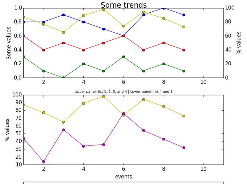 几个问题:
几个问题:
event_index=['event 1','event 2','event 3','event 4','event 5','event 6','event 7','event 8','event 9','event 10']
list1 = [0.7,0.8,0.8,0.9,0.8,0.7,0.6,0.9,1.0,0.9]
list2 = [0.2,0.3,0.1,0.0,0.2,0.1,0.3,0.1,0.2,0.1]
list3 = [0.4,0.6,0.4,0.5,0.4,0.5,0.6,0.4,0.5,0.4]
list4 = [78,87,77,65,89,98,74,94,85,73]
list5 = [16,44,14,55,34,36,76,54,43,32]
为了生成这两个子图,我使用以下代码:
fig = plt.figure() #Creates a new figure
ax1 = fig.add_subplot(211) #First subplot: list 1,2,3, and 4
ax2 = ax1.twinx() #Creates a twin y-axis for plotting the values of list 4
line1 = ax1.plot(list1,'bo-',label='list1') #Plotting list1
line2 = ax1.plot(list2,'go-',label='list2') #Plotting list2
line3 = ax1.plot(list3,'ro-',label='list3') #Plotting list3
line4 = ax2.plot(list4,'yo-',label='list4') #Plotting list4
ax1.set_ylim(0,1)
ax1.set_xlim(1, len(event_index)+1)
ax1.set_ylabel('Some values',fontsize=12)
ax2.set_ylabel('% values',fontsize=12)
ax2.set_ylim(0,100)
ax2.set_xlim(1, len(event_index)+1)
ax3 = fig.add_subplot(212) #Second subplot: list 4 and 5
ax3.set_xlim(1, len(event_index)+1)
ax3.set_ylabel('% values',fontsize=12)
#Plotting Footprint % and Critical Cells %
ax3.plot(list4,'yo-',label='list4')
line5 = ax3.plot(list5,'mo-',label='list5')
#Assigning labels
lines = line1+line2+line3+line4+line5
labels = [l.get_label() for l in lines]
ax3.legend(lines, labels, loc=(0,-0.4), ncol=5) #The legend location. All five series are in the same legend.
ax3.set_xlabel('events')
title_string=('Some trends')
subtitle_string=('Upper panel: list 1, 2, 3, and 4 | Lower panel: list 4 and 5')
plt.suptitle(title_string, y=0.99, fontsize=17)
plt.title(subtitle_string, fontsize=8)
fig.tight_layout()
plt.show()
我得到的是这样的:
几个问题:
- 副标题不在第一个子图上方,而是在第二个子图上方
- 我看不到/阅读图例,我希望它居中,但位于第二个子图的x标签下方
- 所有我的列表都有长度为10,但只绘制了9个值
- 可能我想要去掉第二个子图的y轴刻度
- 我希望图表标题“一些趋势”不与第一个子图“粘连”
fig.subplots_adjust(bottom=0.3)(你可能需要调整0.3的值)。 - tmdavisonxlim设置为(1,len(list)+1)来削减第一个点,因为Python从0开始索引,而不是1。 - tmdavison