我需要使用CSS混合两个元素的背景颜色。我已经尝试了 background-blend-mode: multiply,但它只适用于将两种颜色放在同一个元素中。
我需要实现类似于这样的效果 -
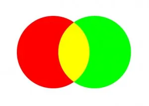
这里的圆圈只是一个示例,用于展示我需要的内容。正如我所提到的,我正在寻找两个不同元素的颜色混合。我已经为我需要混合的实际形状创建了一个 fiddle。 http://jsfiddle.net/fmgfsr4o/2/
我需要使用CSS混合两个元素的背景颜色。我已经尝试了 background-blend-mode: multiply,但它只适用于将两种颜色放在同一个元素中。
我需要实现类似于这样的效果 -
html {
height: 100%;
background:
    repeating-radial-gradient(
        circle,
        transparent,
        transparent 3.5em,
        tomato 1em,
        tomato 4.5em
    ),
    repeating-radial-gradient(
        circle,
        transparent,
        transparent 3.5em,
        dodgerblue 3.5em,
        dodgerblue 4.5em
    );

background-blend-mode: multiply;
background-size: 10em 10em;
background-position:
    0 0,
    5em 5em,
    10em 5em;
}
{{链接1:JSFiddle}}
div {
  /* adjust the width of the container to adjust circle's
     overlap size and shape */
  width: 80px;
  height: 50px;
  /* for debug purpose only */
  border: solid blue 1px;

  background:
    /* draw the red circle */
    radial-gradient(red 0%, red 70%, transparent 70%, transparent 100%) 0 0,
    /* draw the green circle */
    radial-gradient(green 0%, green 70%, transparent 70%, transparent 100%) 0 0;
    /* the red on the left, the green on the right */
  background-position: top left, top right;

  /* you can make then bigger or smaller */
  /* but you have to change width size above too */
  background-size: 50px 50px;
  /* You want both circles to appears once only */
  background-repeat: no-repeat;

  /* you can try with other values too */
  /* https://developer.mozilla.org/en-US/docs/Web/CSS/background-blend-mode */
  background-blend-mode: multiply;
}
HTML
<div></div>
我为您做了一个JSFiddle,用于尝试:http://jsfiddle.net/pomeh/07nLpwwj/
这是我在使用Firefox 31时得到的结果:

background-blend-mode属性目前仍处于候选推荐状态,因此在使用时要小心(感谢@Paulie_D指出)。background-blend-mode 只适用于一个元素。请更新您的问题并详细说明您需要什么:我的答案似乎符合您的问题,但您的问题与您实际需要的不符,因此您永远无法以这种方式找到有用的答案。 - pomeh:after和 :before,但它们被视为不同的元素,所以不能在它们之间使用混合模式。如果形状在图像中,并且你使用了background-image:url(firstShape), url(secondShape),那么可能会起作用,但这需要使用外部图像,而且可能不是你想要的:/ - pomeh
:after和:before)进行调整。 - pomeh