CSS边框颜色切换动画: "from"颜色不正确

3

我制作了一个CSS动画,其中一部分是更改

的边框颜色。

我使用fromto值。边框应该闪烁白色和蓝色,但我得到的是浅蓝色而不是白色。

我制作了一个最小化的代码片段来演示这个问题。你有什么想法我做错了什么吗?

.switch {
  width: 100px;
  height: 100px;
  border: 5px solid white;
  -webkit-animation: switch-animation 2s steps(2, start) infinite;
  animation: switch-animation 2s steps(2, start) infinite;
}

@keyframes switch-animation {
  from {
    border-color: white;
  }
  to {
    border-color: blue;
  }
}
@-webkit-keyframes switch-animation {
  from {
    border-color: white;
  }
  to {
    border-color: blue;
  }
}
<html>
  <head></head>
  <body>
    <div class="switch"></div>
  </body>
</html>


1
想象一下,你站在一个地方,想要离开2步。迈出第一步,你现在到达了你想去的50%。再迈一步,你现在到达了100%。
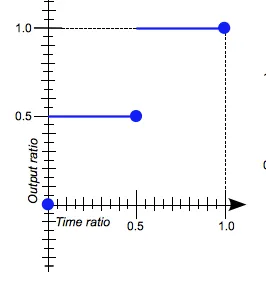
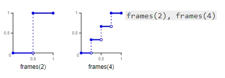
steps就像这样工作。当你使用steps(2, start)时,使用的两个步骤分别是50%和100%。使用steps(2, end)将完全相反。NicossB的解决方案是正确的。 - FranCarstens
2个回答

6
根据文档steps(2,start)将产生此时间输出:

enter image description here

因此,您将花费0时间在第一个状态上,一半的时间在50%(淡蓝色)和一半的时间在100%(蓝色)上。使用end而不是start,您将使用类似的逻辑,在最后一个状态上花费0时间。实际上,您要寻找的是frames函数,但它实际上处于草案阶段,并且使用frames(2)将完全符合您的要求:

enter image description here

一个简单的解决方法是更改关键帧的值,以强制每个颜色在动画的一半停留,而不使用steps

.switch {
  width: 100px;
  height: 100px;
  border: 5px solid white;
  animation: switch-animation 2s infinite linear;
}

@keyframes switch-animation {
  0%,50% {
    border-color: white;
  }
  50.1%,100% {
    border-color: blue;
  }
}
<div class="switch"></div>


2
很好的回答,附有解释。应该标记为答案。 - NicossB
很好的回答,感谢详细说明。 - lisa p.

3

这应该可以工作。

.switch {
  width: 100px;
  height: 100px;
  border: 5px solid white;
  -webkit-animation: switch-animation 2s steps(1, start) infinite;
  animation: switch-animation 2s steps(1, start) infinite;
}

@keyframes switch-animation {
  0%,100% {
    border-color: white;
  }
  50% {
    border-color: blue;
  }
}
@-webkit-keyframes switch-animation {
  0%,100%{
    border-color: white;
  }
  50% {
    border-color: blue;
  }
}
<html>
  <head></head>
  <body>
    <div class="switch"></div>
  </body>
</html>


网页内容由stack overflow 提供, 点击上面的
可以查看英文原文,
原文链接