创建一个极坐标直方图

8
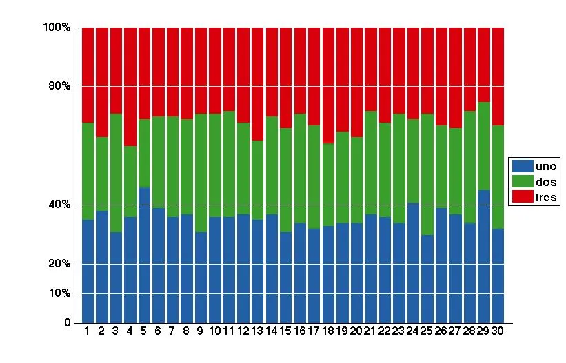
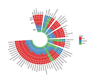
极坐标直方图可以非常有用地绘制具有多个条目的堆积条形图。下面的图像提供了一个示例,显示了图形目标。使用ggplot2在R中可以相对容易地实现这一点。类似于matlab中的“rose”函数似乎不允许这样的结果。
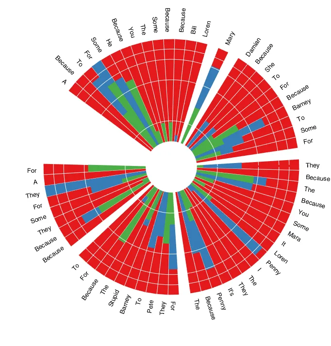
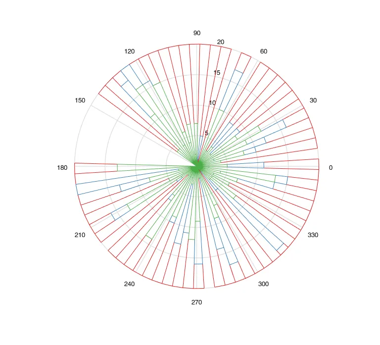
enter image description here

作为起点,这是我所拥有的内容:
  • 脚本
% inputs
l = [1 1.4 2 5 1 5 10;
      10 5 1 5 2 1.4 1;
      5 6 3 1 3 2 4];
alpha = [10 20 50 30 25 60 50]; % in degrees
label = 1:length(alpha);

% setings
offset = 1;
alpha_gap = 2;

polarHist(l,alpha,label)
  • 函数 polarHist

function polarHist(data,alpha,theta_label,offset,alpha_gap,ticks)

if nargin  360-alpha_gap*length(alpha)
    error('Covers more than 360°')
end

% code
theta_right = 90 - alpha_gap + cumsum(-alpha) - alpha_gap*[0:length(alpha)-1];
theta_left = theta_right + alpha;

col = get(gca,'colororder');

for j = 1:size(data,1)
    hold all
    if j == 1
        rho_in = kron(offset*ones(1,length(alpha)),[1 1]);
    else
        rho_in = rho_ext;
    end
    rho_ext = rho_in + kron(data(j,:),[1 1]);
    for k = 1:size(data,2)
        h = makewedge(rho_in(k),rho_ext(k),theta_left(k),theta_right(k),col(j,:));
        if j == size(data,1) && ~isempty(theta_label)
            theta = theta_right(k) + (theta_left(k) - theta_right(k))/2;
            rho = rho_ext(k)+1;
            [x,y] = pol2cart(theta/180*pi,rho);
            lab = text(x,y,num2str(theta_label(k),'%0.f'),'HorizontalAlignment','center','VerticalAlignment','bottom');
            set(lab, 'rotation', theta-90)
        end
    end
end
axis equal
theta = linspace(pi/2,min(theta_right)/180*pi);
%ticks = [0 5 10 15 20];
rho_ticks = offset + ticks;
ax = polar([ones(length(ticks(2:end)),1)*theta]',[rho_ticks(2:end)'*ones(1,length(theta))]');
set(ax,'color','w','linewidth',1.5)
axis off
for i=1:length(ticks)
    [x,y] = pol2cart((90)/180*pi,rho_ticks(i));
    text(x,y,num2str(ticks(i)),'HorizontalAlignment','right');
end
  • 函数 makewedge
function hOut = makewedge(rho1, rho2, theta1, theta2, color)
%MAKEWEDGE Plot a wedge.
% MAKEWEDGE(rho1, rho2, theta1, theta2, color) plots a polar
% wedge bounded by the given inputs. The angles are in degrees.
%
% h = MAKEWEDGE(...) returns the patch handle.

ang = linspace(theta1/180*pi, theta2/180*pi);
[arc1.x, arc1.y] = pol2cart(ang, rho1);
[arc2.x, arc2.y] = pol2cart(ang, rho2);
x = [arc1.x arc2.x(end:-1:1)];
y = [arc1.y arc2.y(end:-1:1)];
newplot;
h = patch(x, y, color);
if ~ishold
    axis equal tight;
end
if nargout > 0
     hOut = h;
end

结果仍然远远落后于ggplot2的输出,但我认为这是一个开始。我正在努力添加图例(l的行)...

2
为什么不能使用多个“rose”图来完成这个任务? - Suever
@Suever 随意提出答案。 - s__C
你试过了吗? - Suever
8
请提供样例数据,以便其他人可以进行尝试并建议适合您的解决方案。 - kkuilla
如果 nargin < 360-alpha_gap*length(alpha),那么这个表达式可能行不通! - bhamadicharef
2个回答

8
您可以通过使用hist获取每个元素的累积箱子,然后将其归一化为百分比,并使用补丁将其作为极地堆叠条形图绘制,以简化您的问题。
例如,假设您的数据由30个元素组成,每个元素有1000个样本,每个样本可以是1、2或3。
data=randi(3,1000,30); %create random data

[data_bins,~]=hist(data',3); %Get the accumulated bins

data_bins=data_bins/1000; %Normalize values to percentages

您可以绘制普通堆叠条形图来可视化数据。
function stackedbar(ymatrix1)

% Create figure
figure1 = figure('Color',[1 1 1]);

% Create axes
axes1 = axes('Parent',figure1,...
    'YTickLabel',{'0','10%','20%','40%','80%','100%'},...
    'YTick',[0 10 20 40 80 100],...
    'XTick',[1:length(ymatrix1)],...
    'FontWeight','bold',...
    'FontSize',16);

xlim(axes1,[0 length(ymatrix1)+1]);
ylim(axes1,[0 100]);

hold(axes1,'all');

% Create multiple lines using matrix input to bar
bar1 = bar(ymatrix1,'EdgeColor',[1 1 1],'BarLayout','stacked',...
    'Parent',axes1);
set(bar1(1),...
    'FaceColor',[0.137254908680916 0.372549027204514 0.647058844566345],...
    'EdgeColor',[0.137254908680916 0.372549027204514 0.647058844566345],...
    'DisplayName','uno');
set(bar1(2),...
    'FaceColor',[0.223529413342476 0.619607865810394 0.168627455830574],...
    'EdgeColor',[0.223529413342476 0.619607865810394 0.168627455830574],...
    'DisplayName','dos');
set(bar1(3),'FaceColor',[0.850980401039124 0 0.0431372560560703],...
    'EdgeColor',[0.850980401039124 0 0.0431372560560703],...
    'DisplayName','tres');

% Create legend
legend1 = legend(axes1,'show');
set(legend1,...
    'Position',[0.902123631386861 0.416961133287318 0.0826277372262772 0.16808336774016]);


plot([0,length(ymatrix1)],[10,10],'w')
plot([0,length(ymatrix1)],[20,20],'w')
plot([0,length(ymatrix1)],[40,40],'w')
plot([0,length(ymatrix1)],[80,80],'w')

您可以使用 pol2cart 来使用极坐标的相同值,通过在一个 patch 中绘制所有相同颜色的条形图,您可以在这些 patches 上调用 legend

输入图像描述

function polarstackedbar(data,offset)

% Data is the normalized values and offset is the size of the white circle at the center

yticks=[10,20,40,80,100];

% Create figure
figure1 = figure('Color',[1 1 1]);

% Create axes
axes1 = axes('Parent',figure1,'ZColor',[1 1 1],'YColor',[1 1 1],...
    'XColor',[1 1 1],...
    'PlotBoxAspectRatio',[434 342.3 2.282],...
    'FontWeight','bold',...
    'FontSize',16,...
    'DataAspectRatio',[1 1 1]);

temp=[data(:,1)+data(:,2)+data(:,3)+offset,data(:,1)+data(:,2)+data(:,3)+offset,zeros(length(data),1)]';
temp=temp(:);
temp=[0;temp];

temp2=[data(:,1)+data(:,2)+offset,data(:,1)+data(:,2)+offset,zeros(length(data),1)]';
temp2=temp2(:);
temp2=[0;temp2];

temp3=[data(:,1)+offset,data(:,1)+offset,zeros(length(data),1)]';
temp3=temp3(:);
temp3=[0;temp3];

th=(1:length(data))*3*pi/(2*length(data));
themp=[th;th;th];
themp=themp(:);
themp=[0;0;themp];
themp(end)=[];

% Create patch
[XData1,YData1]=pol2cart(themp,temp);
p1=patch('Parent',axes1,'YData',YData1,...
    'XData',XData1,...
    'FaceColor',[0.850980401039124 0 0.0431372560560703],...
    'EdgeColor',[0.850980401039124 0 0.0431372560560703],...
    'DisplayName','tres');

% Create patch
[XData2,YData2]=pol2cart(themp,temp2);
p2=patch('Parent',axes1,'YData',YData2,...
    'XData',XData2,...
    'FaceColor',[0.223529413342476 0.619607865810394 0.168627455830574],...
    'EdgeColor',[0.223529413342476 0.619607865810394 0.168627455830574],...
    'DisplayName','dos');

% Create patch
[XData3,YData3]=pol2cart(themp,temp3);
p3=patch('Parent',axes1,'YData',YData3,...
    'XData',XData3,...
    'FaceColor',[0.137254908680916 0.372549027204514 0.647058844566345],...
    'EdgeColor',[0.137254908680916 0.372549027204514 0.647058844566345],...
    'DisplayName','uno');

% Create patch
[XData4,YData4]=pol2cart(themp,offset*ones(3*length(data)+1,1));
patch('Parent',axes1,'YData',YData4,...
    'XData',XData4,...
    'LineStyle','none',...
    'FaceColor',[1 1 1]);

% Create legend
legend([p3,p2,p1]);
hold
% Create labels
for i=1:length(data)
    [x,y]=pol2cart((i-0.5)*3*pi/(2*length(data)),offset+5+100);
    h=text(x,y,num2str(i),'HorizontalAlignment','center');
    set(h,'rotation',rad2deg((i-0.5)*3*pi/(2*length(data)))-90+90*sign(cos((i-0.5)*3*pi/(2*length(data)))));

    [x,y]=pol2cart((i)*3*pi/(2*length(data)),offset+15+100);
    plot([0,x],[0,y],'w');
end

thetas=0:0.01:2*pi;

for tick=yticks
    [X,Y]=pol2cart(thetas,tick+offset*ones(1,629));
    plot(X,Y,'w')
    text(X(472)+15,Y(472),strcat(int2str(tick),'%'),'FontWeight','bold','FontSize',16,'HorizontalAlignment','center');
end

enter image description here


6
这似乎是一个有趣的问题,所以我试着去解决它。代码可能需要一些微调(如底部所述),但你可以得到一个大致的想法,如何绘制类似的图表。正如你所看到的,我间接地使用 Suever 关于 rose 绘图的建议。

我不确定何时能找到时间完善这个项目,所以如果有人想帮助改进它,请告诉我,我会开一个 Github 存储库。

function q38054152
%% Define resolution:
W = 5;  % the step size in degrees, larger value = smaller resolution
P = 20; % the "radius" of the external disc (corresponds to the 100%)
%% Generate some data:
M = (1:W:360).';
T = deg2rad(M);
N = numel(M);
S = cell(N,1); for x=1:N,S{x}=feval(@(x)x(1),strsplit(evalc('why')));end
% add some empty regions
M([randi(N,1,5) 30:36]) = NaN;
S(isnan(M)) = cell(1,sum(isnan(M)));
%% Ensure R >= B >= G:
% Generate histogram inputs:
cR = P*ones(N,1); % baseline is fully red
cB = randi(P+1,N,1)-1;
cG = randi(P+1,N,1)-1;
% Replicate:
R = deg2rad(repelem(M, min( cR       ,[],2)));
B = deg2rad(repelem(M, min([cR,cB]   ,[],2)));
G = deg2rad(repelem(M, min([cR,cB,cG],[],2)));
clear cR cB cG
%% Plot:
figure();
hR(1) = rose(R,T); hR(1).Color = [227 025 027]./255; hold on;
hR(2) = rose(B,T); hR(2).Color = [054 125 183]./255;
hR(3) = rose(G,T); hR(3).Color = [076 174 073]./255;
%% Fun with plot:
figure('Color',[1 1 1]); 
% Convert lines to polygons:
patch('XData', hR(1).XData,'YData', hR(1).YData, 'FaceColor', hR(1).Color, 'EdgeColor', 'w');
axis square; axis off; box off; hold on;
patch('XData', hR(2).XData,'YData', hR(2).YData, 'FaceColor', hR(2).Color, 'EdgeColor', 'none');
patch('XData', hR(3).XData,'YData', hR(3).YData, 'FaceColor', hR(3).Color, 'EdgeColor', 'none');
% Remove center (method 1: mask with patch)
xC = cosd(1:360); yC = sind(1:360);
patch('XData', 0.2*P*xC,'YData', 0.2*P*yC, 'FaceColor', [1 1 1], 'EdgeColor', 'none');
% Remove center (method 2: relocate RGB patches using cart2pol and adjusting the inner R)
 % Todo
% Draw "grid":
F = 0.2+0.8*(100-[10 20 40 80])/100;
for ind = 1:numel(F)
  line(xC*F(ind)*P,yC*F(ind)*P,'Color',[1 1 1],'LineWidth',0.1);
end
% Add annotations:
for ind = 1:numel(M)
  if isnan(M(ind))
    continue
  end
  text(xC(M(ind))*P*1.05,yC(M(ind))*P*1.05,S{ind},'Rotation', mod(M(ind)+90,180)-90,...
    'HorizontalAlignment',iftr(M(ind) < 90 || M(ind) > 270,'left','right'));
end

function out = iftr(cond,in1,in2)
%IFTR is a ternary operator implementation
% note: unlike "&&" and "||" this function does not have lazy evaluation capabilities, 
% thus both inputs need to be known before this function executes.
if cond
    out = in1;
else
    out = in2;
end

结果如下: 需要的近似值

中间我们也得到了这个: 一些中间结果

已知的错误/问题:

  1. 从线对象中提取的patch对象有时会在不应该有的地方创建边缘,导致图形中出现一些奇怪的形状(随机生成数据时大多数时间都会发生这种情况,运行它,你就会知道我的意思)。
  2. 像网格线一样缩放R/G/B的值,以考虑占据20%半径的白色圆心。
  3. 需要注释白色环的网格(即“20%”,“40%”等)。应该找到一种智能的方式来放置它们,使其尽可能少地干扰数据。
  4. 一些代码被复制而不是放置在一个函数中。
  5. 图例丢失了。

2
不仅MATLAB会为你做饭,它还会给你带来花朵。干得好! - Andras Deak -- Слава Україні
不错的答案,然而 rose 的最大缺点是“楔形”顶部边界仅在中心处(不是弧线)与 rho 轴垂直。 - s__C
@s__C 你必须承认,在你发布的图片中,很难发现这个细节 :) 我可以想到几种方法来“修复”它:**1)**通过将每个条目复制成奇数次数(因此1个“bar”变成3或5或7个副本)来增加网格的分辨率,然后确保您填充标签列表中除了中间项之外的所有项目都是 NaN(因此如果1个bar变成3个,则第1个和第3个的标签将为NaN,而第2个将是原始标签)。 2) 找到“弧”段的 XDataYData并添加中间点以获得“圆形”效果。 - Dev-iL
@Dev-iL 的确,这已经在我提供的 makewedge 函数的代码中存在了... - s__C

网页内容由stack overflow 提供, 点击上面的
可以查看英文原文,
原文链接