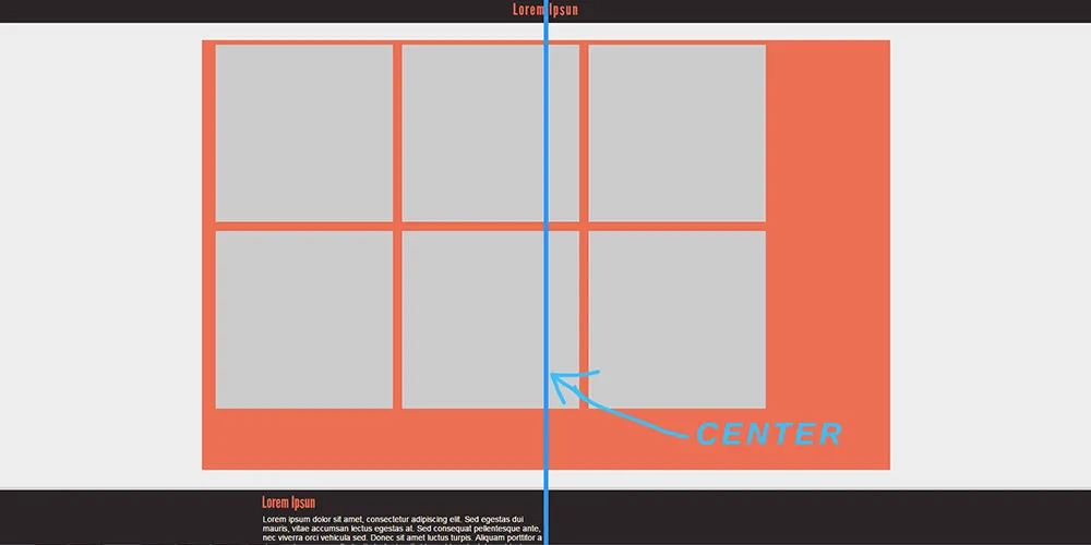
我正在尝试使用HTML和CSS创建图像库,但在让图库显示在页面中央方面遇到了一些问题。目前,图片(图片中的灰色框)离左侧太远了。我希望整个图库都能居中于页面上。
任何关于此的帮助都将不胜感激!
截图
#content {
  overflow: auto;
  margin-top: 30px;
  margin-bottom: 30px;
  background-color: #6b88f2;
}

.gallery {
  min-height: calc(100vh - 200px);
  margin: 0 auto;
  max-width: 1200px;
  padding: 0 1rem;
  background-color: #ec6e52;
}

.cell {
  margin: 0.5rem;
}

.cell img {
  display: block;
}

.responsive-image {
  max-width: 100%;
}

@media screen and (min-width: 600px) {
  .grid {
    display: flex;
    flex-wrap: wrap;
    flex-direction: row;
  }
  .cell {
    width: calc(50% - 5rem);
  }
}

@media screen and (min-width: 1000px) {
  .cell {
    width: calc(33.3333% - 5rem);
  }
}<div id="content">
<div class="gallery">
<div class="grid">
<div class="cell">
<img src="bilder/test.png" alt="OS" class="responsive-image">
</div>
<!--End cell -->
<div class="cell">
<img src="bilder/test.png" alt="OS" class="responsive-image">
</div>
<!--End cell -->
<div class="cell">
<img src="bilder/test.png" alt="OS" class="responsive-image">
</div>
<!--End cell -->
<div class="cell">
<img src="bilder/test.png" alt="OS" class="responsive-image">
</div>
<!--End cell -->
<div class="cell">
<img src="bilder/test.png" alt="OS" class="responsive-image">
</div>
<!--End cell -->
<div class="cell">
<img src="bilder/test.png" alt="OS" class="responsive-image">
</div>
<!--End cell -->
</div>
<!--End grid -->
</div>
<!--End gallery -->
</div>
<!--End content -->
.cell上添加display: inline-block,并在.grid上添加text-align: center;。 - VTr