我该如何创建类似于 FloatingActionButton 的东西?
27个回答
298
我认为RawMaterialButton更加适合。
RawMaterialButton(
  onPressed: () {},
  elevation: 2.0,
  fillColor: Colors.white,
  child: Icon(
    Icons.pause,
    size: 35.0,
  ),
  padding: EdgeInsets.all(15.0),
  shape: CircleBorder(),
)
- UpaJah
7
252
更新(使用新的ElevatedButton)
ElevatedButton(更少的自定义)ElevatedButton( onPressed: () {}, child: Icon(Icons.menu, color: Colors.white), style: ElevatedButton.styleFrom( shape: CircleBorder(), padding: EdgeInsets.all(20), backgroundColor: Colors.blue, // <-- Button color foregroundColor: Colors.red, // <-- Splash color ), )ElevatedButton(具有更多的自定义选项)
ElevatedButton(
  onPressed: () {},
  child: Icon(Icons.menu),
  style: ButtonStyle(
    shape: MaterialStateProperty.all(CircleBorder()),
    padding: MaterialStateProperty.all(EdgeInsets.all(20)),
    backgroundColor: MaterialStateProperty.all(Colors.blue), // <-- Button color
    overlayColor: MaterialStateProperty.resolveWith<Color?>((states) {
      if (states.contains(MaterialState.pressed)) return Colors.red; // <-- Splash color
    }),
  ),
)
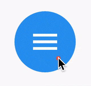
使用 InkWell
ClipOval(
  child: Material(
    color: Colors.blue, // Button color
    child: InkWell(
      splashColor: Colors.red, // Splash color
      onTap: () {},
      child: SizedBox(width: 56, height: 56, child: Icon(Icons.menu)),
    ),
  ),
)
输出(最后两个相同):
- CopsOnRoad
2
这是更好的解决方案,因为它涉及使用更为常见的ElevatedButton,并进行轻微的自定义,从而获得来自Material按钮的所有设计行为。 - Shahar Hajdu
使用FloatingActionButton怎么样? - MBH
83
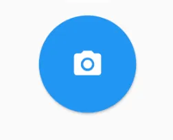
您只需要使用形状:CircleBorder()
MaterialButton(
  onPressed: () {},
  color: Colors.blue,
  textColor: Colors.white,
  child: Icon(
    Icons.camera_alt,
    size: 24,
  ),
  padding: EdgeInsets.all(16),
  shape: CircleBorder(),
)
- RodolfoSilva
1
2如果您使用填充,请确保设置minWidth。 - VipiN Negi
31
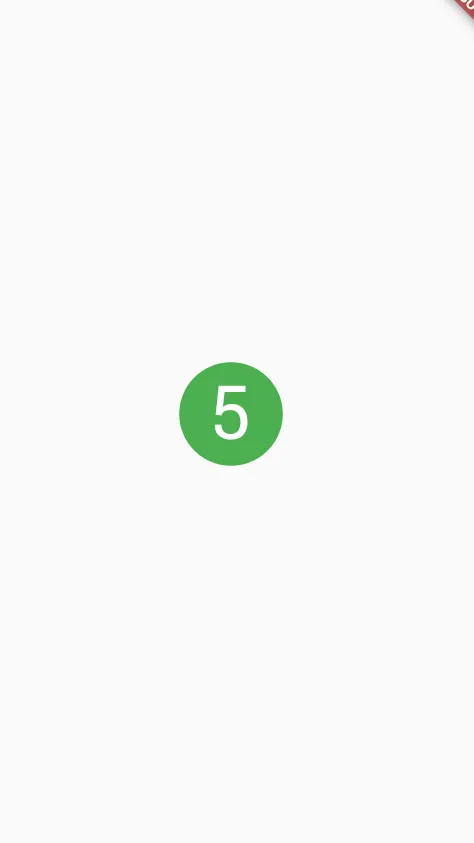
您可以使用 InkWell 来实现:
一个响应触摸的 Material 矩形区域。
下面的示例演示了如何使用 InkWell。注意:您不需要 StatefulWidget 来实现这个功能。我使用它来改变计数的状态。
示例:
import 'package:flutter/material.dart';
class SettingPage extends StatefulWidget {
@override
_SettingPageState createState() => new _SettingPageState();
}
class _SettingPageState extends State<SettingPage> {
int _count = 0;
@override
Widget build(BuildContext context) {
return new Scaffold(
body: new Center(
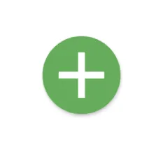
child: new InkWell(// this is the one you are looking for..........
onTap: () => setState(() => _count++),
child: new Container(
//width: 50.0,
//height: 50.0,
padding: const EdgeInsets.all(20.0),//I used some padding without fixed width and height
decoration: new BoxDecoration(
shape: BoxShape.circle,// You can use like this way or like the below line
//borderRadius: new BorderRadius.circular(30.0),
color: Colors.green,
),
child: new Text(_count.toString(), style: new TextStyle(color: Colors.white, fontSize: 50.0)),// You can add a Icon instead of text also, like below.
//child: new Icon(Icons.arrow_forward, size: 50.0, color: Colors.black38)),
),//............
),
),
);
}
}
如果你想获得 splashColor 和 highlightColor 的效果,需要使用一个材质类型为圆形的 Material 包装 InkWell 组件。然后从 Container 组件中移除 decoration。
结果:
- Blasanka
2
Blassanka,谢谢你的信息。我最终使用了FloatingActionButton。但是你的解决方案将在未来的其他场景中派上用场。 - Edmand Looi
2这段代码不再创建“圆形”按钮。 - Loolooii
29
如果您需要背景图片,可以使用带有IconButton的CircleAvatar。设置backgroundImage属性。
CircleAvatar(
  backgroundImage: NetworkImage(userAvatarUrl),
)
带有按钮的示例:
        CircleAvatar(
          backgroundColor: Colors.blue,
          radius: 20,
          child: IconButton(
            padding: EdgeInsets.zero,
            icon: Icon(Icons.add),
            color: Colors.white,
            onPressed: () {},
          ),
        ),

- live-love
1
这个方法可以用,但并不是一个理想的解决方案。Flutter文档中指出
CircleAvatar应该用来表示用户的头像,而不是一个通用的按钮。 - undefined18
您可以轻松地执行以下操作:
FlatButton(
      onPressed: () {

       },
      child: new Icon(
        Icons.arrow_forward,
        color: Colors.white,
        size: 20.0,
      ),
      shape: new CircleBorder(),
      color: Colors.black12,
    )
 。
。- Doan Bui
1
1FYI,FlatButton已被弃用。 - diadamalol
11
RaisedButton已被弃用,现在可以使用ElevatedButton创建。
ElevatedButton(
      onPressed: () {},
      child: Icon(Icons.add, color: Colors.white),
      style: ElevatedButton.styleFrom(
        shape: CircleBorder(),
        padding: EdgeInsets.all(20),
        primary: Colors.blue,
        onPrimary: Colors.black,
      ),
    )
- shirsh shukla
9
RawMaterialButton(
  onPressed: () {},
  constraints: BoxConstraints(),
  elevation: 2.0,
  fillColor: Colors.white,
  child: Icon(
    Icons.pause,
    size: 35.0,
  ),
  padding: EdgeInsets.all(15.0),
  shape: CircleBorder(),
)
请注意
约束:BoxConstraints(),它可以防止左侧填充。祝愉快fluttering!- john
8
使用ElevatedButton:
          ElevatedButton(
            onPressed: () {},
            child: Icon(
              Icons.add,
              color: Colors.white,
              size: 60.0,
            ),
            style: ElevatedButton.styleFrom(
                shape: CircleBorder(), primary: Colors.green),
          )
- Peter's Grandpa
8
实际上有一个示例,可以创建一个类似于FloatingActionButton的圆形IconButton。
Ink(
    decoration: const ShapeDecoration(
        color: Colors.lightBlue,
        shape: CircleBorder(),
    ),
    child: IconButton(
        icon: Icon(Icons.home),
        onPressed: () {},
    ),
)
要使用此代码示例创建本地项目,请执行以下操作:
flutter create --sample=material.IconButton.2 mysample
- Taiyr Begeyev
网页内容由stack overflow 提供, 点击上面的可以查看英文原文,
原文链接
原文链接
materialTapTargetSize: MaterialTapTargetSize.shrinkWrap。 - kashlomaterialTapTargetSize: MaterialTapTargetSize.shrinkWrap、padding: EdgeInsets.all(8)和constraints: BoxConstraints(minWidth: 0)结合在一起。 - Pedro RomãoRawMaterialButton列为过时。我不知道为什么它没有被标记为@Deprecated- 可能是因为它仍然在内部使用(例如由FloatingActionButton)。 - Elte Hupkes