WPF禁用按钮的背景

47

Button处于禁用状态时,我尝试改变它的样式:

    <Style TargetType="Button" x:Key="MyButton2">
        <Setter Property="Background" Value="MediumAquamarine" />
        <Setter Property="Foreground" Value="MediumBlue" />
        
        <Style.Triggers>
            <Trigger Property="IsEnabled" Value="false">
                <Setter Property="Background" Value="Green"/>
                <Setter Property="Foreground" Value="DeepPink"/>
            </Trigger>
        </Style.Triggers>

    </Style>

以及我的按钮:

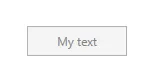
<Button Style="{StaticResource MyButton2}" Content="My text" Width="100" Height="30" IsEnabled="False" />    

但是由于某种原因,这种样式没有应用到按钮上:

输入图像描述

我该如何将这种样式应用到我的按钮上?而且我能否只使用样式而不覆盖按钮模板来实现?


请同时添加按钮的模板。 - Emond
3
我的按钮使用默认模板。我没有覆盖它。 - Junior222
看起来你一开始就没有将“IsEnabled”设置为“false”。 - Daniel Ward
3
按钮的XAML代码显示在问题的末尾。正如您所看到的,IsEnabled属性被设置为false。 - Junior222
你正在创建什么操作系统/应用程序类型?那个按钮看起来不像是默认的WPF按钮。 - Emond
我的操作系统是Windows 8.1企业版。 - Junior222
6个回答

35

我是否可以只用样式而不覆盖按钮模板来实现它?

我认为不行,因为Windows的控件有一个默认的样式控件模板,而且在每个版本的Windows中它们都是不同的。此外,样式只是一堆设置,通常样式不会改变/添加控件的行为,这是由控件模板负责的。

注意:样式是一组设置器,例如:设置背景、大小等。 控件模板则是这些设置将显示的形式。

在这种情况下,建议您更改控件模板,从而可以在系统的任何版本中获得相同的行为和视图。

在这种情况下,请尝试使用以下样式

<Window.Resources>
    <Style TargetType="Button" x:Key="MyButton2">
        <Setter Property="OverridesDefaultStyle" Value="True" />
        <Setter Property="Background" Value="MediumAquamarine" />
        <Setter Property="Foreground" Value="MediumBlue" />

        <Setter Property="Template">
            <Setter.Value>
                <ControlTemplate TargetType="{x:Type Button}">
                    <Grid Background="{TemplateBinding Background}">
                        <ContentPresenter x:Name="MyContentPresenter" 
                                          Content="{TemplateBinding Content}"
                                          HorizontalAlignment="Center" 
                                          VerticalAlignment="Center" />
                    </Grid>
                </ControlTemplate>
            </Setter.Value>
        </Setter>

        <Style.Triggers>
            <Trigger Property="IsEnabled" Value="False">
                <Setter Property="Background" Value="Green"/>
                <Setter Property="Foreground" Value="DeepPink"/>
            </Trigger>
        </Style.Triggers>
    </Style>
</Window.Resources>

<Grid x:Name="LayoutRoot">
    <Button Content="Button" 
            IsEnabled="False"
            HorizontalAlignment="Left" 
            VerticalAlignment="Top" 
            Width="75" 
            Style="{StaticResource MyButton2}"
            Click="Button_Click"/>
</Grid>

16

奇怪的是当我运行它时它“工作”,但只是部分地工作,这可能与按钮的模板有关。这是一个完整的按钮模板。

<Style x:Key="FocusVisual">
    <Setter Property="Control.Template">
        <Setter.Value>
            <ControlTemplate>
                <Rectangle Margin="2" SnapsToDevicePixels="true" Stroke="{DynamicResource {x:Static SystemColors.ControlTextBrushKey}}" StrokeThickness="1" StrokeDashArray="1 2"/>
            </ControlTemplate>
        </Setter.Value>
    </Setter>
</Style>
<SolidColorBrush x:Key="Button.Static.Background" Color="#FFDDDDDD"/>
<SolidColorBrush x:Key="Button.Static.Border" Color="#FF707070"/>
<SolidColorBrush x:Key="Button.MouseOver.Background" Color="#FFBEE6FD"/>
<SolidColorBrush x:Key="Button.MouseOver.Border" Color="#FF3C7FB1"/>
<SolidColorBrush x:Key="Button.Pressed.Background" Color="#FFC4E5F6"/>
<SolidColorBrush x:Key="Button.Pressed.Border" Color="#FF2C628B"/>
<SolidColorBrush x:Key="Button.Disabled.Background" Color="#FFF4F4F4"/>
<SolidColorBrush x:Key="Button.Disabled.Border" Color="#FFADB2B5"/>
<SolidColorBrush x:Key="Button.Disabled.Foreground" Color="#FF838383"/>
<Style x:Key="ButtonStyle1" TargetType="{x:Type Button}">
    <Setter Property="FocusVisualStyle" Value="{StaticResource FocusVisual}"/>
    <Setter Property="Background" Value="{StaticResource Button.Static.Background}"/>
    <Setter Property="BorderBrush" Value="{StaticResource Button.Static.Border}"/>
    <Setter Property="Foreground" Value="{DynamicResource {x:Static SystemColors.ControlTextBrushKey}}"/>
    <Setter Property="BorderThickness" Value="1"/>
    <Setter Property="HorizontalContentAlignment" Value="Center"/>
    <Setter Property="VerticalContentAlignment" Value="Center"/>
    <Setter Property="Padding" Value="1"/>
    <Setter Property="Template">
        <Setter.Value>
            <ControlTemplate TargetType="{x:Type Button}">
                <Border x:Name="border" BorderBrush="{TemplateBinding BorderBrush}" BorderThickness="{TemplateBinding BorderThickness}" Background="{TemplateBinding Background}" SnapsToDevicePixels="true">
                    <ContentPresenter x:Name="contentPresenter" Focusable="False" HorizontalAlignment="{TemplateBinding HorizontalContentAlignment}" Margin="{TemplateBinding Padding}" RecognizesAccessKey="True" SnapsToDevicePixels="{TemplateBinding SnapsToDevicePixels}" VerticalAlignment="{TemplateBinding VerticalContentAlignment}"/>
                </Border>
                <ControlTemplate.Triggers>
                    <Trigger Property="IsDefaulted" Value="true">
                        <Setter Property="BorderBrush" TargetName="border" Value="{DynamicResource {x:Static SystemColors.HighlightBrushKey}}"/>
                    </Trigger>
                    <Trigger Property="IsMouseOver" Value="true">
                        <Setter Property="Background" TargetName="border" Value="{StaticResource Button.MouseOver.Background}"/>
                        <Setter Property="BorderBrush" TargetName="border" Value="{StaticResource Button.MouseOver.Border}"/>
                    </Trigger>
                    <Trigger Property="IsPressed" Value="true">
                        <Setter Property="Background" TargetName="border" Value="{StaticResource Button.Pressed.Background}"/>
                        <Setter Property="BorderBrush" TargetName="border" Value="{StaticResource Button.Pressed.Border}"/>
                    </Trigger>
                    <Trigger Property="IsEnabled" Value="false">
                        <Setter Property="Background" TargetName="border" Value="{StaticResource Button.Disabled.Background}"/>
                        <Setter Property="BorderBrush" TargetName="border" Value="{StaticResource Button.Disabled.Border}"/>
                        <Setter Property="TextElement.Foreground" TargetName="contentPresenter" Value="{StaticResource Button.Disabled.Foreground}"/>
                    </Trigger>
                </ControlTemplate.Triggers>
            </ControlTemplate>
        </Setter.Value>
    </Setter>
</Style>

正如您所看到的,按钮的控件模板中有很多事情要处理。例如,在ctl被禁用时使用了以下SolidColorBrushes。

<SolidColorBrush x:Key="Button.Disabled.Background" Color="#FFF4F4F4"/>
<SolidColorBrush x:Key="Button.Disabled.Border" Color="#FFADB2B5"/>
<SolidColorBrush x:Key="Button.Disabled.Foreground" Color="#FF838383"/>
你可以在用户控件或应用程序范围内更改它们,也可以按照Daniel Ward的建议重写控件模板。

您可以通过在UI编辑器中右键单击任何控件并选择“编辑模板” -> “创建副本”来删除任何控件的默认模板...通过混合、代码或反汇编 :)

希望这有所帮助!

祝好

Stian


这应该被标记为答案,因为它不会移除按钮的样式(例如悬停、按下等)。 - lionheart
3
不错的文章。对于禁用触发器<Trigger Property="IsEnabled" Value="false">,我的建议是只使用这个setter:<Setter Property="Opacity" Value="0.5" /> 这样你就不需要设置3种颜色,特别是按钮中嵌套的内容会改变其视图。通过减少不透明度,图像和嵌套文本看起来像被禁用了。 - Beauty
最有帮助的答案 +1 - Jonas

10

可能晚了一点,但WPF提供了一个内置属性:

IsHitTestVisible="False"

使用上述属性可以禁用控件的所有鼠标移动事件,从而禁用控件而不改变其实际外观和感觉。


1
这个回答与问题无关,实际上是相反的,与该人想要的正好相反。 - Welcor
此外,这并不妨碍您通过键盘和TAB键浏览按钮。如果您依赖此解决方案,则可能会导致意外行为。 - AtosNicoS
它对我起了作用,谢谢。 - RAMM-HDR

6

我的解决方案比较简单,但不允许使用Transparent的背景颜色来禁用按钮,并且您也无法更改BorderBrush

我是这样做的:使用 TextBlock 作为按钮的内容,并在禁用时更改此 TextBlock 的背景颜色。

我的按钮代码如下:

<Button>
    <TextBlock Text="Click me!" Style="{StaticResource MyButtonContentStyle}" />
</Button>

我的建议是:MyButtonContentStyle的写法如下:
<Style x:Key="MyButtonContentStyle" TargetType="TextBlock">
    <Style.Triggers>
        <Trigger Property="IsEnabled" Value="False">
            <Setter Property="Background" Value="White" />
        </Trigger>
    </Style.Triggers>
</Style>

它对我们来说非常好用。

3

看起来唯一的方法是从按钮中删除chrome主题。 请注意,这将删除悬停/点击动画以及Windows 7上的按钮渐变(如果您正在为此构建),

不幸的是,Microsoft决定禁用按钮应该从chrome主题的代码后端的私有属性中获得背景颜色的硬编码值, 这意味着您无法通过XAML更改它。 那个链接描述了这个问题:

Button的控件模板使用ButtonChrome,它有一个名为ButtonOverlay的私有属性,当ButtonIsEnabled设置为False时,将Background设置为new SolidColorBrush(Color.FromRgb(0xf4, 0xf4, 0xf4))(或RGB 244,244,244),这是您看到的灰色。 您无法更改它。

你可以创建一个新的控件模板来替换按钮上的Themes:ButtonChrome元素,使用Border元素代替,并且可以更改Background。在设计视图中可能看不到效果,但在运行时会生效。例如,对于您的情况,它可能看起来像这样:
<!-- Default button focus visual -->
<Style x:Key="ButtonFocusVisual">
    <Setter Property="Control.Template">
        <Setter.Value>
            <ControlTemplate>
                <Rectangle Margin="2" SnapsToDevicePixels="true" Stroke="{DynamicResource {x:Static SystemColors.ControlTextBrushKey}}" StrokeThickness="1" StrokeDashArray="1 2"/>
            </ControlTemplate>
        </Setter.Value>
    </Setter>
</Style>
<Style x:Key="ButtonStyle1" TargetType="{x:Type Button}">
    <Setter Property="FocusVisualStyle" Value="{StaticResource ButtonFocusVisual}"/>
    <Setter Property="Background" Value="MediumAquamarine"/>
    <Setter Property="Foreground" Value="MediumBlue"/>
    <Setter Property="BorderBrush" Value="Blue"/>
    <Setter Property="BorderThickness" Value="1"/>
    <Setter Property="HorizontalContentAlignment" Value="Center"/>
    <Setter Property="VerticalContentAlignment" Value="Center"/>
    <Setter Property="Padding" Value="1"/>
    <Setter Property="Template">
        <Setter.Value>
            <ControlTemplate TargetType="{x:Type Button}">
                <Grid>
                    <Border x:Name="Border" Background="{TemplateBinding Background}" BorderBrush="{TemplateBinding BorderBrush}" BorderThickness="{TemplateBinding BorderThickness}" Padding="{TemplateBinding Padding}">
                        <ContentPresenter HorizontalAlignment="{TemplateBinding HorizontalContentAlignment}" Margin="{TemplateBinding Padding}" RecognizesAccessKey="True" SnapsToDevicePixels="{TemplateBinding SnapsToDevicePixels}" VerticalAlignment="{TemplateBinding VerticalContentAlignment}"/>
                    </Border>
                </Grid>
                <ControlTemplate.Triggers>
                    <Trigger Property="IsEnabled" Value="false">
                        <Setter Property="Foreground" Value="DeepPink"/>
                        <Setter Property="Background" Value="Green"/>
                    </Trigger>
                </ControlTemplate.Triggers>
            </ControlTemplate>
        </Setter.Value>
    </Setter>
</Style>

3

添加 BasedOn 工具栏按钮样式。这个解决方案对我有用:

BasedOn="{​StaticResource {​x:Static ToolBar.ButtonStyleKey}​}​"


网页内容由stack overflow 提供, 点击上面的
可以查看英文原文,
原文链接