使用stat_summary_hex展示最频繁的值,并使用离散颜色比例尺。

4

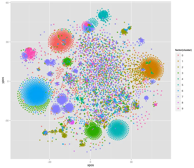
我有一个包含1万行和3列数据的数据框:xpos、ypos和cluster(cluster是0到9之间的数字),链接在这里:http://pastebin.com/NyQw29tb

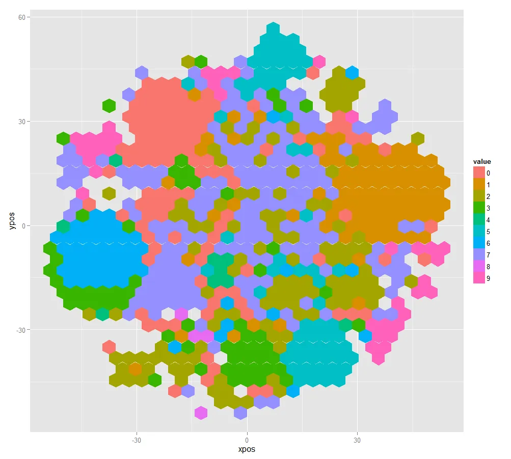
我想展示一个六边形图,每个六边形的颜色根据该六边形内出现最频繁的cluster而定。

目前为止,我已经做了:

 library(ggplot2)
 library(hexbin)
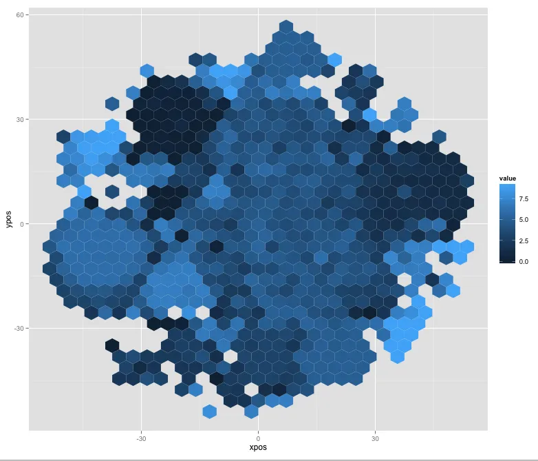
 ggplot(clusters, aes(x=xpos, y=ypos, z=cluster)) + stat_summary_hex(fun.x=mode)

我认为它给了我想要的东西(即用0到9的颜色填充每个六边形),但是颜色比例尺看起来是连续的,我不知道如何使其使用离散的比例尺。

output

为了更好地理解,这是数据的基本显示方式,但我希望通过使用六边形来使其更加平滑:

 qplot(data=clusters, xpos, ypos, color=factor(cluster))

output2

2个回答

4
我不知道你的stat_summary_hex(fun.x=mode)是在做什么,但我相信它并不是你想象中的那样(mode给出了一个对象的存储模式,而不是统计模式,fun.xstat_summary_hex的任何形式参数都不匹配)。试试这个。它会将每个箱中的观测值制表,并提取最大计数的标签。
ggplot(clusters, aes(x=xpos, y=ypos, z=cluster)) + stat_summary_hex(fun = function(x) {
    tab <- table(x)
    names(tab)[which.max(tab)]
})

Hexbinned clusters


感谢您对我的检查,您的答案正是我想要的,非常感谢。 - nicolaskruchten

1
我相信这里有两个问题。首先,mode不是你想要的函数(请检查帮助文档——它是获取或设置对象的类型或存储模式)。其次,对于 stat_summary_hex,参数应该是 fun= 而不是 fun.x=
这里有一个很好的讨论关于模式函数 在这里。推荐使用的函数是:
Mode <- function(x) {
  ux <- unique(x)
  ux[which.max(tabulate(match(x, ux)))]
}

最后,您要确保六边形的填充以离散值的形式进行处理。您可以修改fun函数,使其返回值为字符(如下面的代码所示)。

这里是一个可复现的示例:

library(ggplot2)
library(hexbin)
Mode <- function(x) {
  ux <- unique(x)
  ux[which.max(tabulate(match(x, ux)))]
}
clusters=data.frame(xpos=rnorm(1000),ypos=rnorm(1000),cluster=rep(1:9,length.out=100))
ggplot(clusters, aes(x=xpos, y=ypos, z=cluster)) +
  stat_summary_hex(fun=function(x){as.character(Mode(x))})

我希望这可以帮助到您。


网页内容由stack overflow 提供, 点击上面的
可以查看英文原文,
原文链接