我的目标是创建像我在下面的图片中突出显示的虚线。这只能使用CSS吗?
我的网页使用Bootstrap进行响应式设计,如果窗口的宽度发生变化,则虚线必须处于正确的位置。
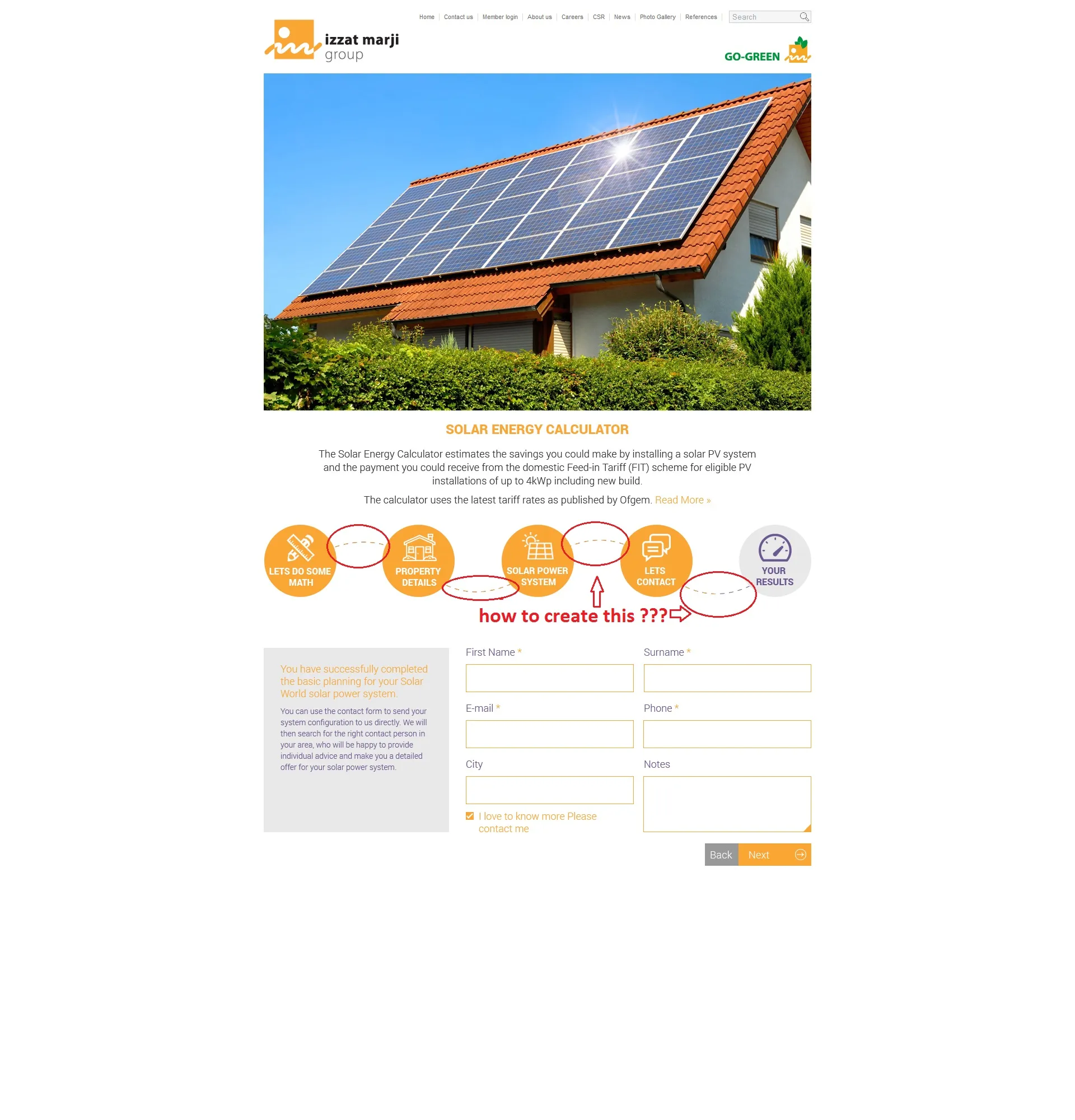
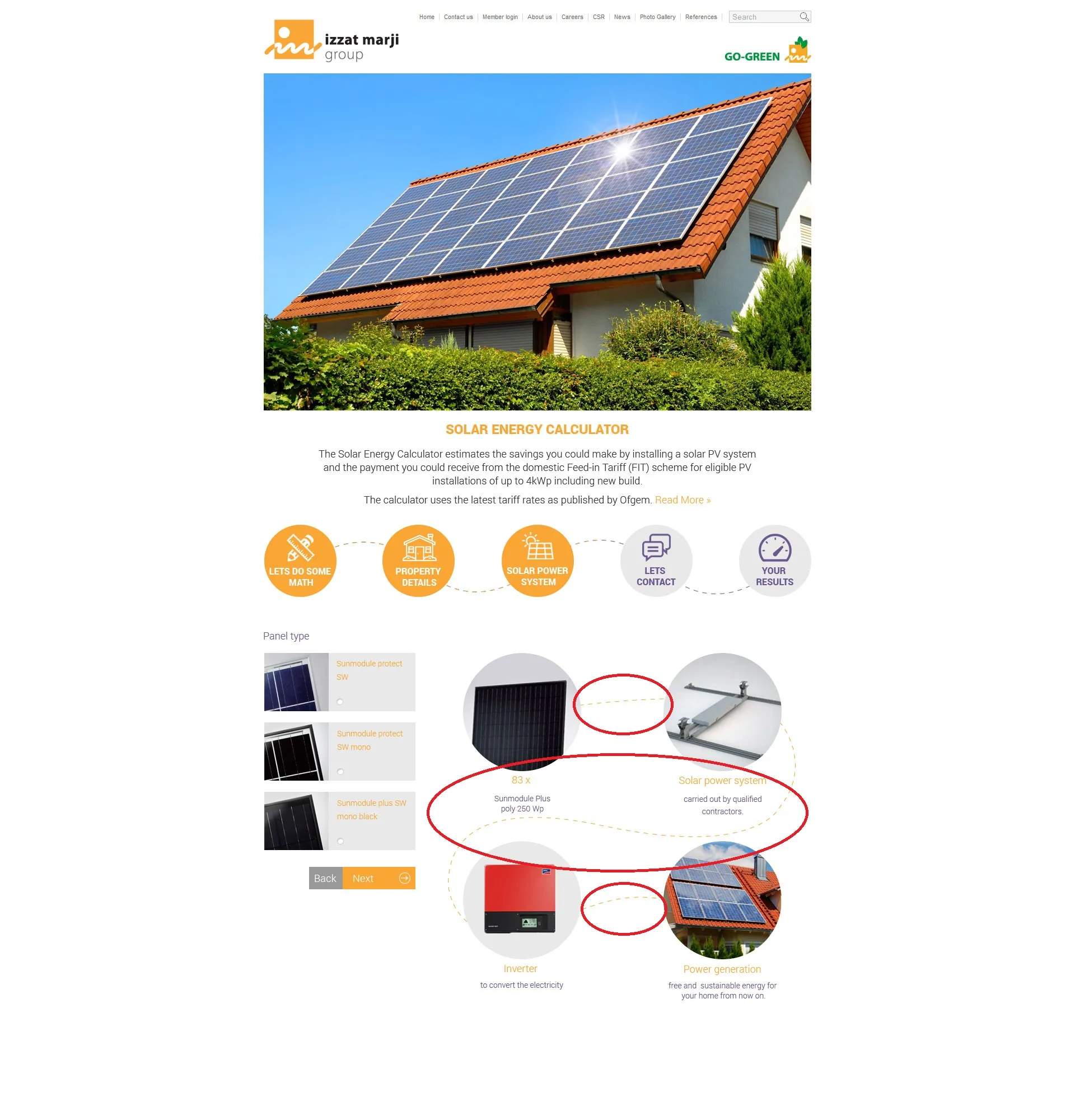
我的目标是创建像我在下面的图片中突出显示的虚线。这只能使用CSS吗?
我的网页使用Bootstrap进行响应式设计,如果窗口的宽度发生变化,则虚线必须处于正确的位置。
The bad news is that you can't bend the dashed border. Its always be solid if you use border-radius in CSS. But as i think this example will steer you to the right solution.
    #wrapper {
        width: 680px;
        display:table;
        margin: auto;
    }
    #wrapper > div {
        display: inline-block;
    }
    .circle {
        position:relative;
        padding: 20px;
        width: 120px;
        height: 120px;
        border-radius: 50%;
        background-color: #eee;
        border: solid 1px #ddd;
        z-index: 999;
    }
    .line-top {
        width: 120px;
        height:60px;
        z-index: -1;
        background: transparent;
        border: none;
        border-top: dashed 2px orange;
        padding: 40px 40px;
        border-radius: 50%;
        margin: 20px -50px 0;
    }
    .line-bottom {
        width: 120px;
        height:60px;
        z-index: -1;
        background: transparent;
        border: none;
        border-bottom: dashed 2px orange;
        padding: 40px 40px;
        border-radius: 0 0 50% 50%;
        margin: 0 -65px;
} <div id="wrapper">
<div class="circle"></div>
<div class="line-top"></div>
<div class="circle"></div>
<div class="line-bottom"></div>
<div class="circle"></div>
</div>