opacity 与 fill-opacity 在 SVG 中的区别是什么?我查阅了有关 fill-opacity 和 opacity 的文档,但我不明白以下内容的含义:
与fill-opacity:当前对象内容的透明度
opacity:对象的透明度
opacity 与 fill-opacity 在 SVG 中的区别是什么?与fill-opacity:当前对象内容的透明度
opacity:对象的透明度
svg {
  width: 100vw;
  height: 100vh;
}
body {
  background: url(http://lorempixel.com/600/600/nature/1);
  height: 100vh;
}
polygon {
  stroke-width: 3;
}<svg viewBox='0 0 40 190'>
<polygon points='10,10 30,10 30,30 10,30' fill='steelblue' stroke='crimson' opacity='0.5' />
<polygon points='10,40 30,40 30,60 10,60' fill='steelblue' stroke='crimson' fill-opacity='0.5' stroke-opacity='0.5' />
<polygon points='10,70 30,70 30,90 10,90' fill='steelblue' stroke='crimson' fill-opacity='0.5' />
<polygon points='10,100 30,100 30,120 10,120' fill='steelblue' stroke='crimson' stroke-opacity='0.5' />
<image xlink:href='http://lorempixel.com/100/100/nature/3' x='8.5' y='130' width='23' height='23' stroke='crimson' opacity='0.5' />
<image xlink:href='http://lorempixel.com/100/100/nature/3' x='8.5' y='160' width='23' height='23' stroke='crimson' fill-opacity='0.5' />
</svg>在CSS世界中,你可以把它想象成下面的代码片段。(请注意,我并不是说它们相等,SVG和CSS之间存在微妙的差异。这只是一种尝试,来解释那些SVG属性在CSS中应该如何翻译。)
div {
  height: 20vh;
  width: 20vh;
  margin: 30px auto;
  font-family: Verdana;
  font-size: 2vw;
}
div:nth-of-type(1) {
  opacity: 0.5;
  background: rgba(70, 130, 180, 1);
  border: .35vw solid rgba(220, 20, 60, 1);
}
div:nth-of-type(2) {
  background: rgba(70, 130, 180, 0.5);
  border: .35vw solid rgba(220, 20, 60, 1);
}
div:nth-of-type(3) {
  background: rgba(70, 130, 180, 1);
  border: .35vw solid rgba(220, 20, 60, 0.5);
}
body {
  background: url(http://lorempixel.com/600/600/nature/1);
  height: 100vh;
}<div></div>
<div></div>
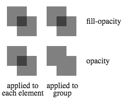
<div></div>opacity 影响整个组的透明度,而 fill-opacity 影响组内各个单独元素的透明度。 这样做的一个结果是,当这样的组内元素重叠时,使用 fill-opacity 时重叠区域会有一个复合效应,但使用 opacity 时则没有。 当对组内的每个元素或组本身应用 (fill-)opacity 为0.5 时,下图演示了此效果。
<svg height="200">
  <g transform="translate(0, 0)">
    <rect x="10" y="10" width="40" height="40"   fill-opacity="0.5"/>
    <rect x="30" y="30" width="40" height="40"   fill-opacity="0.5"/>
  </g>
  <g transform="translate(80, 0)"                fill-opacity="0.5">
    <rect x="10" y="10" width="40" height="40"/>
    <rect x="30" y="30" width="40" height="40"/>
  </g>
  <g transform="translate(0, 80)">
    <rect x="10" y="10" width="40" height="40"        opacity="0.5"/>
    <rect x="30" y="30" width="40" height="40"        opacity="0.5"/>
  </g>
  <g transform="translate(80, 80)"                    opacity="0.5">
    <rect x="10" y="10" width="40" height="40"/>
    <rect x="30" y="30" width="40" height="40"/>
  </g>
  <text transform="translate(170,45)">fill-opacity</text>
  <text transform="translate(170,125)">opacity</text>
  <text transform="translate(10,175)">applied to</text>
  <text transform="translate(0,190)">each element</text>
  <text transform="translate(90,175)">applied to</text>
  <text transform="translate(103,190)">group</text>
</svg>fill-opacity 控制填充颜色的不透明度。而 opacity 则控制整个元素的不透明度。
opacity与SVG配合使用时,发现这张表格很有帮助。我们不要忘记还有stroke-opacity和stop-opacity。| Attribute | Explanation | Applies to: |
|:--------------:|:----------------------------------:|:------------------------------------:|
| opacity | The overall opacity of the element.| Everything but gradient stops |
| fill-opacity | The opacity of the fill paint. | Elements with the attribute 'fill' |
| stroke-opacity | The opacity of the stroke paint. | Elements with the attribute 'stroke' |
| stop-opacity | The opacity of the gradient stop. | Gradient stops |
opacity='0.5'是作为某种后处理完成的,因此它将像填充+描边一样绘制,然后降低不透明度,而其他两个选项则是中间选项,因此当两者一起使用时,描边的不透明度将显示出一些填充颜色(它们重叠的地方)。还有其他区别吗? - Harry