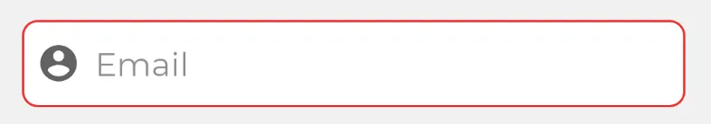
当我的电子邮件输入无效时,我希望显示自定义错误背景。
到目前为止,我只能找到如何设置和自定义错误文本的方法,并给它一个红色的背景色调。
我一直在尝试更改这个背景,但无济于事。
这是我的布局
 <com.google.android.material.textfield.TextInputLayout
            android:id="@+id/email_field"
            android:layout_width="0dp"
            android:layout_height="wrap_content"
            android:layout_marginStart="24dp"
            android:layout_marginTop="24dp"
            android:layout_marginEnd="24dp"
            android:elevation="2dp"
            app:boxBackgroundMode="none"
            app:errorEnabled="true"
            app:hintEnabled="false"
            app:layout_constraintEnd_toEndOf="parent"
            app:layout_constraintStart_toStartOf="parent"
            app:layout_constraintTop_toBottomOf="@+id/textView">

            <EditText
                android:id="@+id/input_email"
                android:layout_width="match_parent"
                android:layout_height="48dp"
                android:background="@drawable/input_field"
                android:drawableStart="@drawable/ic_baseline_account_circle_24"
                android:drawablePadding="8dp"
                android:fontFamily="@font/app_font_regular"
                android:hint="@string/label_email"
                android:imeOptions="actionNext"
                android:inputType="textEmailAddress"
                android:maxLines="1"
                android:padding="8dp"
                android:textColor="@color/textColor" />
        </com.google.android.material.textfield.TextInputLayout>
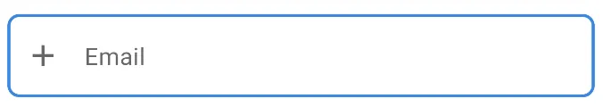
这是我的 输入框 图标
<?xml version="1.0" encoding="utf-8"?>
<selector xmlns:android="http://schemas.android.com/apk/res/android">
    <item android:state_focused="true">
        <shape android:shape="rectangle">
            <corners android:radius="8dp" />
            <stroke android:width="1dp" android:color="@color/colorPrimary" />
            <solid android:color="@color/inputField" />
        </shape>
    </item>

    <item android:state_checked="true"  >
        <shape android:shape="rectangle">
            <corners android:radius="8dp" />
            <stroke android:width="1dp" android:color="@color/failed" />
            <solid android:color="@color/inputField" />
        </shape>
    </item>

    <item>
        <shape android:shape="rectangle">
            <corners android:radius="8dp" />
            <stroke android:width="1dp" android:color="@color/inputFieldBorder" />
            <solid android:color="@color/inputField" />
        </shape>
    </item>
</selector>
为了显示错误信息,我使用
TextInputLayout的这个方法。email_field.error = "Invalid Email"
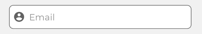
这是我的UI没有错误的样子:
 这是我设置错误后的UI:
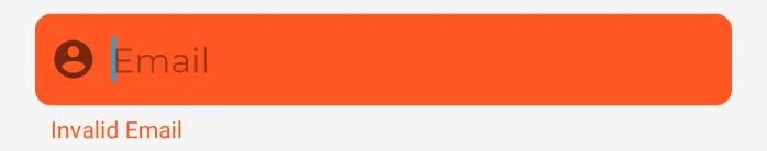 这是我希望实现的UI: