我正在尝试按照以下条件将两个 div 放置在一起:
- 这两个 div 必须在同一行上。
- 左侧 div 应该优先显示,尽可能显示更多文本,直到溢出时使用省略号。
- 右侧 div 的文本应该右对齐。如果溢出,应使用省略号。
- 文本是动态的,因此不能使用百分比或固定宽度。
- 仅需要在基于
webkit的浏览器中工作,因此首选CSS3解决方案。
以下是一些演示图片:
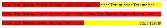
输入
<div class='left'>I should always fit. If not, ellipsis should be used.</div><div class='right'>Right align and fit me if space available here.</div>
输出

输入
<div class='left'>I should always fit. If not, ellipsis should be used. And some more text and more, and more text.</div><div class='right'>Right align and fit me if space available here.</div>
输出

输入
<div class='left'>This text is left aligned.</div><div class='right'>This text is right aligned.</div>
输出

$(window).resize(function(){ $('#right').width($(window).width() - $('#left').width()); });- Matthew