我正在尝试使用Angular Material 2创建一个导航栏,使其在小屏幕设备(如移动设备和平板电脑)上折叠。
我只能找到md-button,但找不到 Angular Material 中的 md-menu-bar。
我正在尝试使用Angular Material 2创建一个导航栏,使其在小屏幕设备(如移动设备和平板电脑)上折叠。
我只能找到md-button,但找不到 Angular Material 中的 md-menu-bar。
这是我使用 Angular2+ Material 2 和 flex-layout 在 angular-cli 应用中构建响应式 nav-bar 所使用的内容。
(请访问安装 Angular Material 和 Angular CDK)
1)安装 flex-layout
npm install @angular/flex-layout -save
2)在您的app.module.ts中包含flex-layout
import {FlexLayoutModule} from "@angular/flex-layout";
3) 导入
imports: [
 BrowserModule,
 FormsModule,
 HttpModule,
 RoutingModule,
 FlexLayoutModule,
MyOwnCustomMaterialModule // Please visit the link above "Install Angular Material and Angular CDK", and check (Step 3: Import the component modules).
],
app.component.html
<mat-toolbar color="primary">

    <button mat-button routerLink="/">
    <mat-icon>home</mat-icon>
        {{title}}</button>

    <!-- This fills the remaining space of the current row -->
    <span class="fill-remaining-space"></span>
    <div fxLayout="row" fxShow="false" fxShow.gt-sm>
        <button mat-button routerLink="/products">Products</button>
        <button mat-button routerLink="/dashboard">Dashboard</button>
    </div>
    <button mat-button [mat-menu-trigger-for]="menu" fxHide="false" fxHide.gt-sm>
     <mat-icon>menu</mat-icon>
    </button>

</mat-toolbar>
<mat-menu x-position="before" #menu="matMenu">
    <button mat-menu-item routerLink="/products">Products</button>
    <button mat-menu-item routerLink="/dashboard">Dashboard</button>
    <!--<button mat-menu-item>Help</button>-->
</mat-menu>
app.component.css
.fill-remaining-space {
   /*This fills the remaining space, by using flexbox.
  Every toolbar row uses a flexbox row layout. */
  flex: 1 1 auto;
}
注意:测试时请调整页面大小。
请查看flex-layout文档。
以下是我的最喜欢的在Angular中创建响应式导航栏的方法。如果您使用Angular 6,请确保使用版本6.1+。
Stackblitz上的工作示例:https://stackblitz.com/edit/angular-v6xwte
在较小屏幕上的示例:
在较大屏幕上的示例:
以下是详细步骤:
1)安装必要的软件包。在终端中输入以下命令:
npm install --save @angular/material @angular/cdk @angular/animations

npm install @angular/flex-layout --save
2) 在你的 app.module.ts 中导入必要的模块。
import { BrowserAnimationsModule } from '@angular/platform-browser/animations';
import { FlexLayoutModule } from '@angular/flex-layout';
import {
  MatIconModule, MatButtonModule, MatSidenavModule, MatToolbarModule
} from '@angular/material';
记得将这些模块添加到下面的导入数组中。
3) 在你的index.html中添加Material Icons链接
链接必须在任何Angular内容之前。
<link href="https://fonts.googleapis.com/icon?family=Material+Icons" rel="stylesheet">
4) 在你的 styles.css 文件中添加 Angular 主题并将边距设置为 0%
@import "~@angular/material/prebuilt-themes/indigo-pink.css";
body{
    margin: 0%;
}
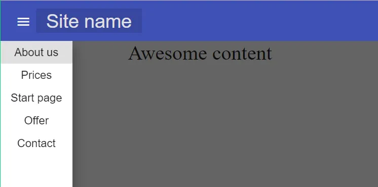
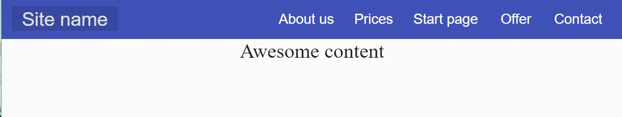
5) 在您的 app.component.html 文件中添加工具栏HTML代码。
<div style="height: 100vh;">
<mat-toolbar color="primary">
    <div fxShow="true" fxHide.gt-sm="true">
      <button mat-icon-button (click)="sidenav.toggle()">
        <mat-icon>menu</mat-icon>
      </button>
    </div>
    <a mat-button class="companyName" routerLink="/">
      <span>Site name</span>
    </a>
    <span class="example-spacer"></span>
    <div fxShow="true" fxHide.lt-md="true">
      <a mat-button routerLink="/about-us">About us</a>
      <a mat-button routerLink="/prices">Prices</a>
      <a mat-button routerLink="/start-page">Start page</a>
      <a mat-button routerLink="/offer">Offer</a>
      <a mat-button routerLink="/contact">Contact</a>
    </div>
  </mat-toolbar>
  <mat-sidenav-container fxFlexFill class="example-container">
    <mat-sidenav color="primary" #sidenav fxLayout="column" mode="over" opened="false" fxHide.gt-sm="true">
      <div fxLayout="column">
        <a mat-button routerLink="/about-us">About us</a>
        <a mat-button routerLink="/prices">Prices</a>
        <a mat-button routerLink="/start-page">Start page</a>
        <a mat-button routerLink="/offer">Offer</a>
        <a mat-button routerLink="/contact">Contact</a>
      </div>
    </mat-sidenav>
    <mat-sidenav-content fxFlexFill>
      Awesome content
    </mat-sidenav-content>
  </mat-sidenav-container>
</div>
6) 在你的 app.component.css 文件中为工具栏设置样式。
.companyName{
    font-size: 150%;
}
div {
    overflow: inherit;
}
a{
    text-decoration: none;
    font-size: 110%;
    white-space: normal;
}
button{
    font-size: 110%;
    min-width: min-content;
}
.example-icon {
    padding: 0 14px;
  }

  .example-spacer {
    flex: 1 1 auto;
  }
  .mat-sidenav-content{
      font-size: 200%;
      text-align: center;
  }
使用 Angular CLI 的 schematics 是使用 Material 创建响应式导航栏的最简单方法。
(如果运行 ng add @angular/material 时出现“无法解析集合“@angular/material””,请参见 这里)
然后使用生成的组件 <app-my-nav></app-my-nav>,将上述标记添加到您的主组件中。
在桌面电脑上查看响应式视图:
低分辨率时的响应式折叠菜单:
这篇文章最初出现在 Angular 的博客 上。
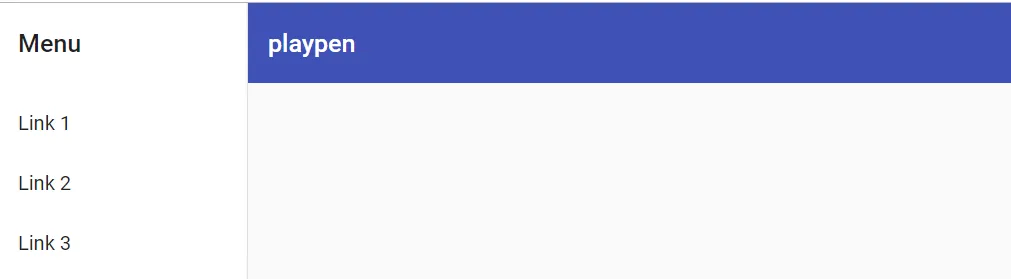
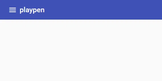
这是我的初步尝试,使用新的组件名称来实现抽屉式工具栏的修改,与angular-material 5.0.2一起使用。
待完成任务:需要修复所有标题链接的CSS。菜单图标应该是透明的。
https://responsivematerial2.stackblitz.io/
.mat-sidenav-container {
  background: rgba(0, 0, 0, 0.08);
}

.blank-grow {
  flex: 1 1 auto;
}<mat-sidenav-container fullscreen>
<mat-sidenav #sidenav>
<mat-nav-list>
<a mat-list-item>
<mat-icon mat-list-icon>home</mat-icon>
<span mat-line>home</span>
</a>
<a mat-list-item>
<mat-icon mat-list-icon>backup</mat-icon>
<span mat-line>Backup</span>
</a>
</mat-nav-list>
</mat-sidenav>
<mat-toolbar color="primary">
<button mat-icon-button (click)="sidenav.open()" fxHide="false" fxHide.gt-sm>
<mat-icon>menu</mat-icon>
</button>
<span> Big Header</span>
<span class="blank-grow"></span>
<div fxLayout="row" fxShow="false" fxShow.gt-sm>
<a>
<mat-icon mat-list-icon>home</mat-icon>
<span mat-line>home</span>
</a>
<a>
<mat-icon mat-list-icon>backup</mat-icon>
<span mat-line>Backup</span>
</a>
</div>
</mat-toolbar>
</mat-sidenav-container>angular2-material项目。以下是他们已发布的材料设计组件列表:
https://www.npmjs.com/~angular2-material
此外,我认为要么是md-sidenav,要么是md-toolbar是你想要的。
md-sidenav - https://www.npmjs.com/package/@angular2-material/sidenav
md-toolbar - https://www.npmjs.com/package/@angular2-material/toolbar
请注意:该项目仍处于alpha版本,这意味着其API可能会发生重大变化。不建议用于生产。npm install @angular/flex-layout -save
3) 在您的 app.module.ts 中引入 flex-layout
import {FlexLayoutModule} from "@angular/flex-layout";
4) 导入相关的材料和 Flex 模块
imports: [
 ...,
 FlexLayoutModule,
 MatToolbarModule,
 MatIconModule,
 MatMenuModule,
 MatButtonModule,
],
app.component.html
<mat-toolbar color="primary">
    <button mat-button routerLink="/">
        <mat-icon>home</mat-icon>
        {{title}}
    </button>

    <span class="fill-remaining-space"></span>

    <div fxLayout="row" fxHide fxShow.gt-sm>
        <button mat-button routerLink="/products">Products</button>
        <button mat-button routerLink="/dashboard">Dashboard</button>
    </div>
    <button mat-button [mat-menu-trigger-for]="menu" fxShow fxHide.gt-sm>
     <mat-icon>menu</mat-icon>
    </button>

</mat-toolbar>
<mat-menu x-position="before" #menu>
    <button mat-menu-item routerLink="/products">Products</button>
    <button mat-menu-item routerLink="/dashboard">Dashboard</button>
</mat-menu>
app.component.css
.fill-remaining-space {
   /*This fills the remaining space, by using flexbox.
  Every toolbar row uses a flexbox row layout. */
  flex: 1 1 auto;
}
注意事项:
我的演示文稿,创建用户喜爱的企业级UI界面,涵盖了一些Angular Material的模式。StackBlitz示例的链接在演讲者注释中。
响应式按钮栏与溢出菜单: 可以放置在或下方TopNav中。 https://stackblitz.com/edit/material-responsive-button-bar?file=app%2Fbutton-bar%2Fbutton-bar.component.ts
动态嵌套TopNav菜单: 请注意,此菜单不是完全可访问的。需要更多的工作来完全支持良好的可访问性体验。 https://stackblitz.com/edit/dynamic-nested-topnav-menu?file=app/app.component.ts
动态嵌套SideNav菜单: 如果您使用变换模式将您的TopNav在移动设备上切换到SideNav,这将展示如何构建动态的SideNav菜单。 https://stackblitz.com/edit/dynamic-nested-sidenav-menu?file=app%2Fapp.component.html
md-menu-item可能更合适。 - Deniss M.