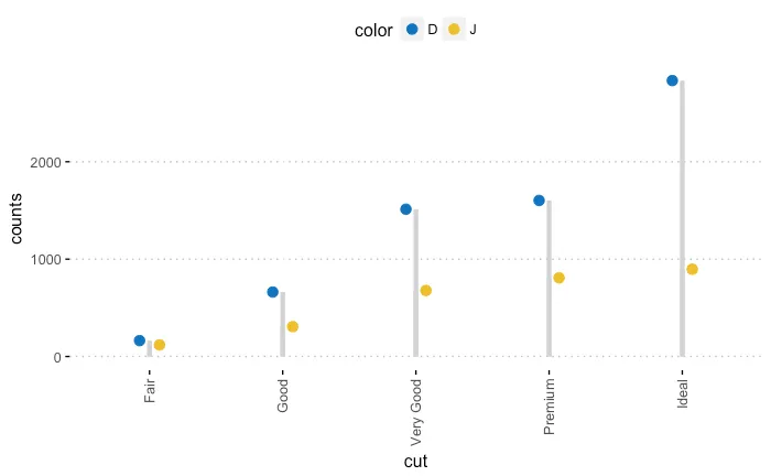
使用ggpubr中的示例包代码,ggdotchart函数不会像示例中所示创建单独的分段,而是只有一个单一的分段,尽管点似乎被放置在正确的方向上。 有人有什么关于问题可能是什么的提示吗? 我认为可能是因素、tibbles vs. df,但我还没有确定问题。
代码:
df <- diamonds %>%
  filter(color %in% c("J", "D")) %>%
  group_by(cut, color) %>%
  summarise(counts = n())

ggdotchart(df, x = "cut", y ="counts",
           color = "color", palette = "jco", size = 3,
           add = "segment",
           add.params = list(color = "lightgray", size = 1.5),
           position = position_dodge(0.3),
           ggtheme = theme_pubclean()
           )
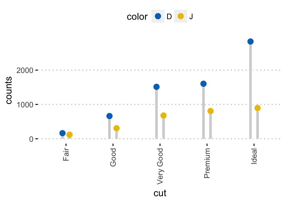
期望输出为:
但实际输出为:
geom_segments不支持躲避,现在一切都说得通了!感谢 @markus - Jenks