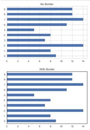
最近我一直在使用 matplotlib 中的样式表。我非常喜欢 seaborn-white 的简洁外观,希望能够将其边框添加到其他样式中,例如 ggplot 或 seaborn-whitegrid。
如何在来自 fig,ax = plt.subplots() 的 ax 对象周围添加黑色边框?
import pandas as pd
import numpy as np
from collections import *
Se_data = pd.Series(Counter(np.random.randint(0,10,100)))
with plt.style.context("seaborn-whitegrid"):
fig, ax = plt.subplots()
Se_data.plot(kind="barh", ax=ax, title="No Border")
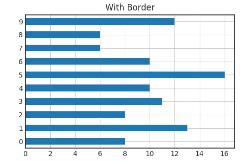
with plt.style.context("seaborn-white"):
fig, ax = plt.subplots()
Se_data.plot(kind="barh", ax=ax, title="With Border")
回应下方的答案:
Se_data = pd.Series(Counter(np.random.randint(0,10,100)))
with plt.style.context("seaborn-whitegrid"):
    fig, ax = plt.subplots()
    Se_data.plot(kind="barh", ax=ax, title="No Border")
    ax.spines['bottom'].set_color('0.5')
    ax.spines['top'].set_color(None)
    ax.spines['right'].set_color('0.5')
    ax.spines['left'].set_color(None)
    ax.patch.set_facecolor('0.1')
    plt.grid(b=True, which='major', color='0.2', linestyle='-')
    plt.grid(b=True, which='minor', color='0.2', linestyle='-')
    ax.tick_params(axis='x', colors='0.7', which='both')
    ax.tick_params(axis='y', colors='0.7', which='both')
    ax.yaxis.label.set_color('0.9')
    ax.xaxis.label.set_color('0.9')
    ax.margins(5)
    fig.patch.set_facecolor('0.15')