Matplotlib表格设置行边缘颜色

6

我有一个使用matplotlib绘制为表格的pandasDataFrame(来自这个答案)。

现在我想设置给定行的底部边框颜色,我有以下代码:

import pandas as pd
import numpy as np
import matplotlib.pyplot as plt
import matplotlib
import six

df = pd.DataFrame()
df['date'] = ['2016-04-01', '2016-04-02', '2016-04-03', '2016-04-04']
df['calories'] = [2200, 2100, 1500, 1800]
df['sleep hours'] = [2200, 2100, 1500, 1500]
df['gym'] = [True, False, False, True]

def render_mpl_table(data, col_width=3.0, row_height=0.625, font_size=14,
                     header_color='#40466e', row_colors=['#f1f1f2', 'w'], edge_color='w',
                     bbox=[0, 0, 1, 1], header_columns=0,
                     ax=None, **kwargs):
    if ax is None:
        size = (np.array(data.shape[::-1]) + np.array([0, 1])) * np.array([col_width, row_height])
        fig, ax = plt.subplots(figsize=size)
        ax.axis('off')

    mpl_table = ax.table(cellText=data.values, bbox=bbox, colLabels=data.columns, **kwargs)

    mpl_table.auto_set_font_size(False)
    mpl_table.set_fontsize(font_size)

    for k, cell in six.iteritems(mpl_table._cells):
        cell.set_edgecolor(edge_color)
        if k[0] == 0 or k[1] < header_columns:
            cell.set_text_props(weight='bold', color='w')
            cell.set_facecolor(header_color)
        else:
            cell.set_facecolor(row_colors[k[0]%len(row_colors) ])
    return ax

def get_table(ax):
    table = None
    for child in ax.get_children():
        if isinstance(child, matplotlib.table.Table):
            table = child
            return table
    return table

def set_row_edge_color(ax, row, color):
    table = get_table(ax)
    for k, cell in  six.iteritems(table._cells):
        if (k[0] == row):
            cell.set_edgecolor(color)

ax = render_mpl_table(df, header_columns=0, col_width=2.0)
set_row_edge_color(ax, 2, 'k')
plt.show()

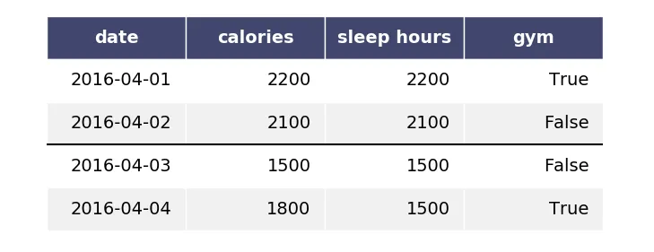
我无法仅设置行底部的颜色,它会像这样设置:

在此输入图片描述

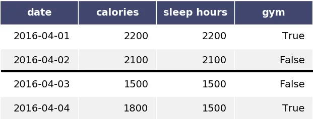
有没有办法仅设置行底部的颜色,如下图所示:

在此输入图片描述

或者有没有一种方法可以找到图表/绘图中的行并绘制一条水平线?


1
要绘制一条水平线,您可以使用 ax.axhline() - G. Anderson
1个回答

7
在matplotlib中,没有一般的方法可以使单个单元格(Rectangle)的不同边线具有不同的粗细或颜色。在这个问题的情况下,由于表填充整个坐标轴的边框,因此可以通过ax.axhline()(由@GAnderson评论)很容易地解决。
您需要首先将坐标轴的数据范围设置为在表中行数之间的范围。然后您只需在所选位置上绘制一个axhline
只有两行代码被更改(我用注释标记了),似乎您可以完全摆脱get_table函数。
import pandas as pd
import numpy as np
import matplotlib.pyplot as plt
import matplotlib
import six

df = pd.DataFrame()
df['date'] = ['2016-04-01', '2016-04-02', '2016-04-03', '2016-04-04']
df['calories'] = [2200, 2100, 1500, 1800]
df['sleep hours'] = [2200, 2100, 1500, 1500]
df['gym'] = [True, False, False, True]

def render_mpl_table(data, col_width=3.0, row_height=0.625, font_size=14,
                     header_color='#40466e', row_colors=['#f1f1f2', 'w'], edge_color='w',
                     bbox=[0, 0, 1, 1], header_columns=0,
                     ax=None, **kwargs):
    if ax is None:
        size = (np.array(data.shape[::-1]) + np.array([0, 1])) * np.array([col_width, row_height])
        fig, ax = plt.subplots(figsize=size)
        ax.axis('off')
    ax.axis([0,1,data.shape[0],-1])                ## <---------- Change here
    mpl_table = ax.table(cellText=data.values, bbox=bbox, colLabels=data.columns, **kwargs)

    mpl_table.auto_set_font_size(False)
    mpl_table.set_fontsize(font_size)

    for k, cell in six.iteritems(mpl_table._cells):
        cell.set_edgecolor(edge_color)
        if k[0] == 0 or k[1] < header_columns:
            cell.set_text_props(weight='bold', color='w')
            cell.set_facecolor(header_color)
        else:
            cell.set_facecolor(row_colors[k[0]%len(row_colors) ])
    return ax


def set_row_edge_color(ax, row, color):
    ax.axhline(y=row, color=color)                  ## <---------- Change here

ax = render_mpl_table(df, header_columns=0, col_width=2.0)
set_row_edge_color(ax, 2, 'k')
plt.show()

enter image description here


1
mpl_table.get_celld() 是官方支持的访问单元格的方式,而 mpl_table._cells 则是一个隐藏属性,在未来版本中可能会继续工作或停止工作。 - jez
@jez 正确。但那部分只是从问题中复制的。 - ImportanceOfBeingErnest

网页内容由stack overflow 提供, 点击上面的
可以查看英文原文,
原文链接