很遗憾,这不是一项微不足道的任务。
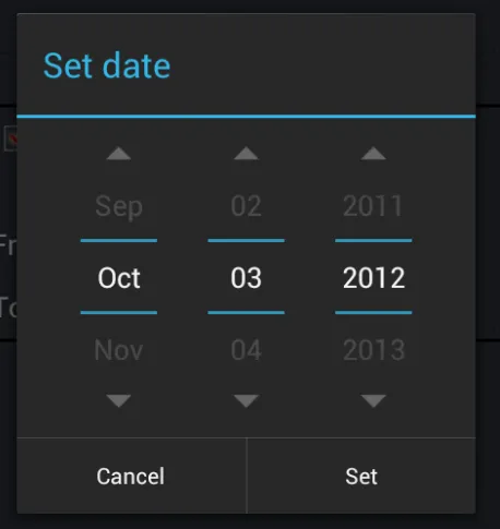
DatePickers在内部使用小部件NumberPicker和CalendarView。例如,您发布的图像正在使用3个NumberPickers。而您所说的分隔符来自于NumberPicker属性:selectionDivider。问题在于,此属性不是公共属性,numberPickerStyle也不是,通过它设置该属性。
我最近将CalendarView和NumberPicker向后移植到API 8中,主要是为了好玩。由于代码readily可用(查找android源代码中的android.widget.NumberPicker等),所有这个任务只需要时间和一些挖掘android源代码即可。例如:
简单 ==> 您将不得不从View类的私有变量更改为其访问器方法
mLeft(View类中的protected变量) ==> getLeft()(公共访问器方法)
最耗时的任务是恢复Accessibility方法。
无论如何,如果您决定编写DatePicker的自定义实现,那么您还必须为NumberPicker和CalendarView(可选)编写它们。
更容易的方法:
向后移植的DatePicker可在此处作为库使用:Android-DatePicker。如上所述,您将与此DatePicker一起使用后向移植的CalendarView和NumberPicker。
您需要更改的内容:
使用{library-numberpicker} / res / drawable-xxxx / np_numberpicker_selection_divider.9.png作为模板,将“蓝色”颜色更改为绿色(我使用了pixlr)。如果您想彻底摆脱蓝色分隔符,可以直接保存相同名称的文件,或者使用不同的名称并在{library-numberpicker} / res / values / themes.xml中进行更改。
如果选择不同的名称,则需要在themes.xml中进行以下更改:
<style name="NPWidget.Holo.NumberPicker" parent="NPWidget.NumberPicker">
    ....
    <item name="selectionDivider">@drawable/new_nine_path_drawable_name</item>
    ....
</style>
就是这样了。
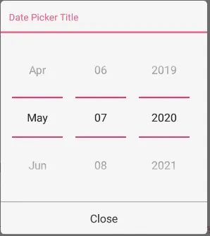
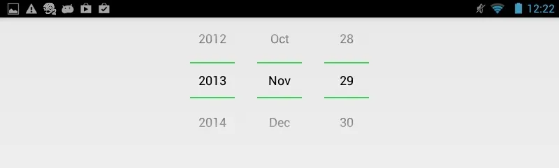
使用库输出:
编辑:
android:divider 是指 datepicker 中的分隔符吗?我如何使用它来更改颜色?
divider 属性实际上来自于 LinearLayout。 NumberPicker 继承了此属性,因为 NumberPicker 扩展了 LinearLayout。但是,此 divider 具有不同的用途。传递给此属性的 drawable 位于 LinearLayout 的子视图之间。
android:showDividers 属性用于更改此分隔符的位置,可能的值为:
- none: 不显示分隔符
- beginning: 在第一个子视图之前显示分隔符
- middle: 在每个子视图之后显示分隔符,但不在最后一个子视图之后显示
- end: 在最后一个子视图之后显示分隔符
android:dividerPadding 属性很容易理解。
虽然 NumberPicker 继承了此属性,但它不使用它。这可以从您自己的研究和试验中看出: 我尝试了各种组合,但似乎无法使其工作。
要查看分隔符属性,请执行以下操作:
<LinearLayout xmlns:android="http://schemas.android.com/apk/res/android"
    android:layout_width="wrap_content"
    android:layout_height="wrap_content"
    android:orientation="horizontal"
    android:divider="@android:drawable/ic_media_play"
    android:showDividers="middle" >

    <TextView
        android:layout_width="wrap_content"
        android:layout_height="wrap_content"
        android:text="Hello" />

    <TextView
        android:layout_width="wrap_content"
        android:layout_height="wrap_content"
        android:text="World," />

    <TextView
        android:layout_width="wrap_content"
        android:layout_height="wrap_content"
        android:text="Again" />

</LinearLayout>
使用java反射的hack-ish解决方法:
这个回答在这里给了我灵感。总的来说,我讨厌使用反射,主要是因为这个答案中列出的原因。虽然我在此处列出它以保证完整性,但我建议您不要使用它。
public class CDP extends android.widget.DatePicker {

    public CDP(Context context, AttributeSet attrs) {
        super(context, attrs);

        Class<?> internalRID = null;
        try {
            internalRID = Class.forName("com.android.internal.R$id");
        } catch (ClassNotFoundException e) {
            e.printStackTrace();
        }

        Field month = null;
        try {
            month = internalRID.getField("month");
        } catch (NoSuchFieldException e) {
            e.printStackTrace();
        }

        NumberPicker npMonth = null;
        try {
            npMonth = (NumberPicker) findViewById(month.getInt(null));
        } catch (IllegalArgumentException e) {
            e.printStackTrace();
        } catch (IllegalAccessException e) {
            e.printStackTrace();
        }

        Field day = null;
        try {
            day = internalRID.getField("day");
        } catch (NoSuchFieldException e) {
            e.printStackTrace();
        }

        NumberPicker npDay = null;
        try {
            npDay = (NumberPicker) findViewById(day.getInt(null));
        } catch (IllegalArgumentException e) {
            e.printStackTrace();
        } catch (IllegalAccessException e) {
            e.printStackTrace();
        }

        Field year = null;
        try {
            year = internalRID.getField("year");
        } catch (NoSuchFieldException e) {
            e.printStackTrace();
        }

        NumberPicker npYear = null;
        try {
            npYear = (NumberPicker) findViewById(year.getInt(null));
        } catch (IllegalArgumentException e) {
            e.printStackTrace();
        } catch (IllegalAccessException e) {
            e.printStackTrace();
        }

        Class<?> numberPickerClass = null;
        try {
            numberPickerClass = Class.forName("android.widget.NumberPicker");
        } catch (ClassNotFoundException e) {
            e.printStackTrace();
        }

        Field selectionDivider = null;
        try {
            selectionDivider = numberPickerClass.getDeclaredField("mSelectionDivider");
        } catch (NoSuchFieldException e) {
            e.printStackTrace();
        }

        try {
            selectionDivider.setAccessible(true);
            selectionDivider.set(npMonth, getResources().getDrawable(
                       R.drawable.np_numberpicker_selection_divider_green));
            selectionDivider.set(npDay, getResources().getDrawable(
                       R.drawable.np_numberpicker_selection_divider_green));
            selectionDivider.set(npYear, getResources().getDrawable(
                       R.drawable.np_numberpicker_selection_divider_green));
        } catch (IllegalArgumentException e) {
            e.printStackTrace();
        } catch (NotFoundException e) {
            e.printStackTrace();
        } catch (IllegalAccessException e) {
            e.printStackTrace();
        }
    }
}
我们在这里做的事情:
- 扩展DatePicker
- 如果您在
sdk/platforms/android-xx/res/layout中打开date_picker.xml,则会看到三个NumberPicker具有id month、day和year。我们访问android.internal.R.id以获取这些NumberPickers的资源id。
- 我们使用这些id使用
findViewById(int)方法创建三个NumberPicker对象。
- 然后,使用反射访问和检索字段
mSelectionDivider。
- 将该字段设置为可访问的(因为它被声明为final),并使用
Field#set(Object, Object)方法设置其值。第一个参数是我们执行此操作的对象。第二个参数是我们要设置的对象。
我使用的可绘制资源可以从此处下载:here。